
2. Descriptive Statistics: Frequency Data (Counting)
2.3 SPSS Lesson 1: Getting Started with SPSS
The following lesson will take you through an introduction to IBM® SPSS® Statistics software (referred to hereafter as “SPSS”).
First, you need to open SPSS. Ways to do that are detailed in the Front Matter of this book, in the section “Statistical Software Used in this Book“. Also in the Front Matter you will find the collection of provided Data Sets; download the file “HyperactiveChildren.sav” and open it in SPSS.
You should see:
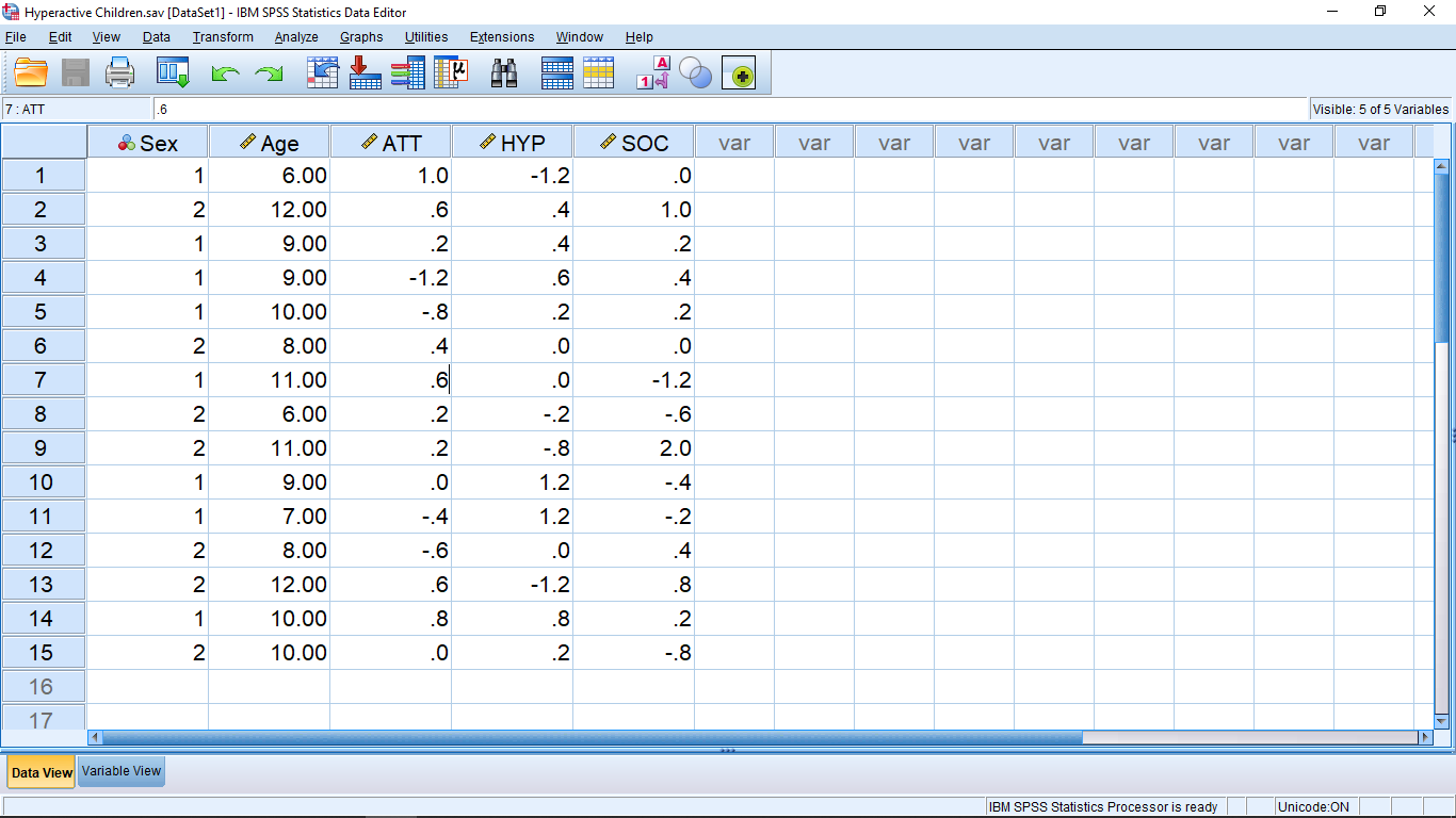
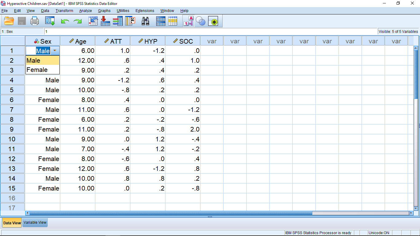
This is the “Data View” window. It is one of the three windows you will see when you use SPSS. The other two windows are the “Variable View” window and the “Output” window. You can get to the Variable View window either by clicking on the Variable View tab at the bottom of the window, or by double clicking one of the column headings (the “variable name”). But let’s talk about what’s on the Data View window before we look at the other two windows.
The Data View window is arranged in the form of a “data matrix”, which is an essential structure for multivariate statistics. This is the first trap that people who try to use SPSS fall into — they collect data, put the data into SPSS and then go looking for an appropriate statistical test using help or the built-in “statistics coach”. Multivariate statistics is advanced. We need to learn a whole lot of basics before we can competently use multivariate statistics. This textbook covers univariate statistics. We are only going to learn how to deal with one dependent variable at a time. So many of the first SPSS lessons will be about how to combine multiple variables into one variable for analysis.
Back to the Data View window and the data matrix. The rows represent individual subjects in the study. In Psychology, the subjects (“participants”) are generally people but they could also be rats or schools or cities or whatever. To fix ideas, suppose the subjects are people. One line for each person in the study. The columns represent variables. SPSS doesn’t care what kind of variables you define (e.g. independent or dependent) so you need to keep track of their meaning yourself. As we said, we only need one independent variable for univariate tests.
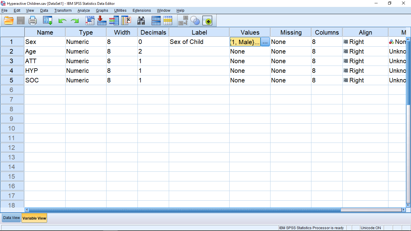
The variables need to be defined. This is done by either double clicking on the variable name at the top of a column or by clicking the “Variable View” button at the bottom. Either way, you’ll end up in the Variable View window that looks like :

Each line in the Variable View window lists the attributes of the variables listed in the Data View window. You can usually leave most of the attributes as they come by default. The big exception is the Values attribute — it’s important and we’ll come back to that after a quick look at the other attributes.
The Name attribute gives the name of the variable as it appears at the top of the columns in the Data View window. Type should be Numeric if you want to use the variable in any kind of statistical calculation. Having this set to String will cause errors if you are trying to use the variable as a qualitative variable (selection is via a pull down menu that appears when you click on a cell). Qualitative variables need to be Numeric and they are handled with the Values attribute — as we’ll see shortly! The Width and Decimals attributes are just to format the appearance of the numbers in the Data View sheet; totally not critical. The Label is left over from early FORTRAN days. SPSS’s heart is written in FORTRAN and variable names in FORTRAN used to be limited to eight characters which frequently makes it awkward to have good name for the variable. With Label you can give the variable a good name. If the is a value for Label then that value will be used on table and graph outputs that SPSS makes. If Label is blank then SPSS will use Name on table and graph outputs. We will largely ignore missing value issues in this course so leave the Missing attribute at None. Columns and Align are again used to make the Data View presentation look a little better; totally not critical. Leave Measure at Unknown or Scale, otherwise SPSS will try to interpret your data for you. SPSS is not very good at that and will tend to give strange errors that will make no sense to you, so leave Measure at Unknown or Scale. Leave Role at Input; this is a relatively new feature of SPSS and I don’t know what it does, so don’t muck with it.
Finally — the Values attribute! Here is where you make the link between a qualitative variable and the discrete values it needs to work in a computer setting. Let’s take a look at the gender variable. Clicking in the cell brings up a thing with three dots :
Clicking on the thing with three dots brings up a menu where you can define the connection between the qualitative description and your discrete number assignments :
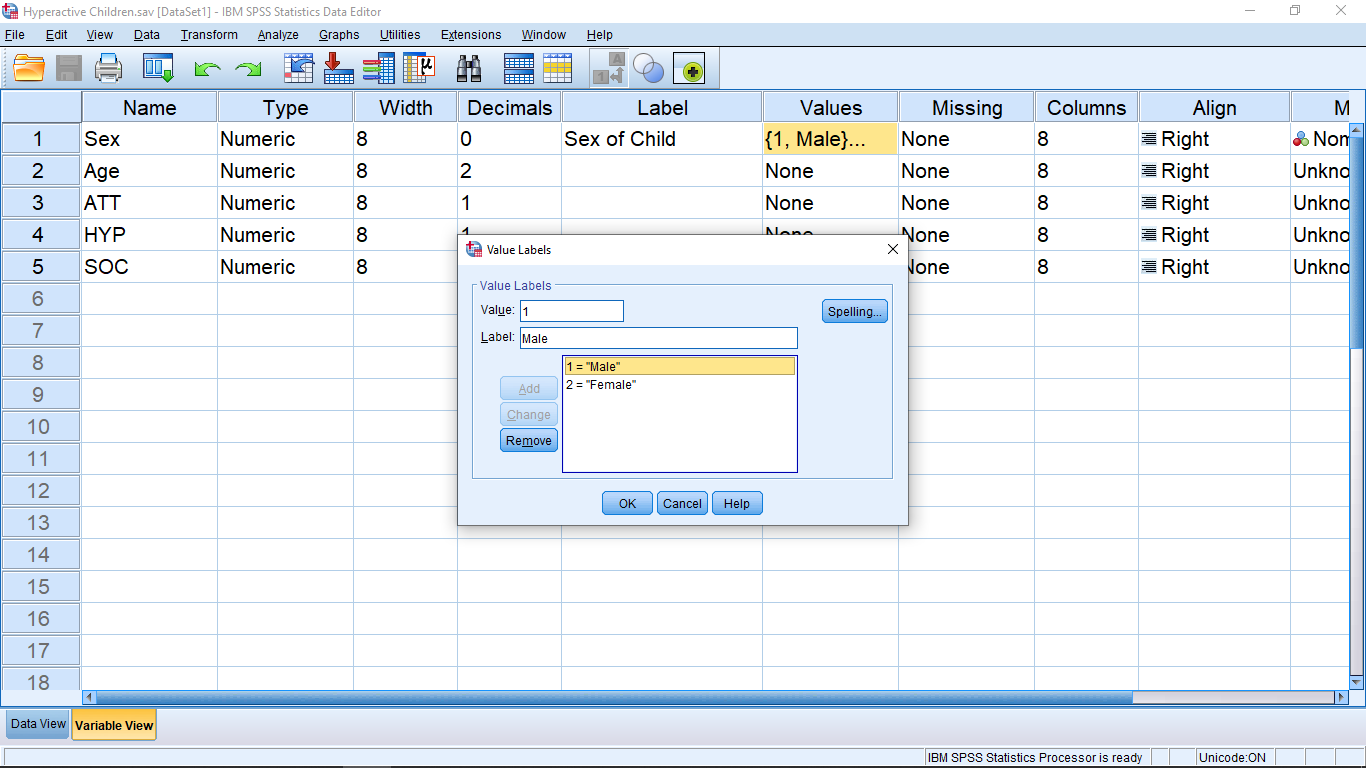
Here I have clicked on the 1.00 = “Male” line to show that the Value is 1 (arbitrary discrete quantitative) and the Label is Male (qualitative). To enter new values, type them in the Value and Label box and then click Add to add them to the list.
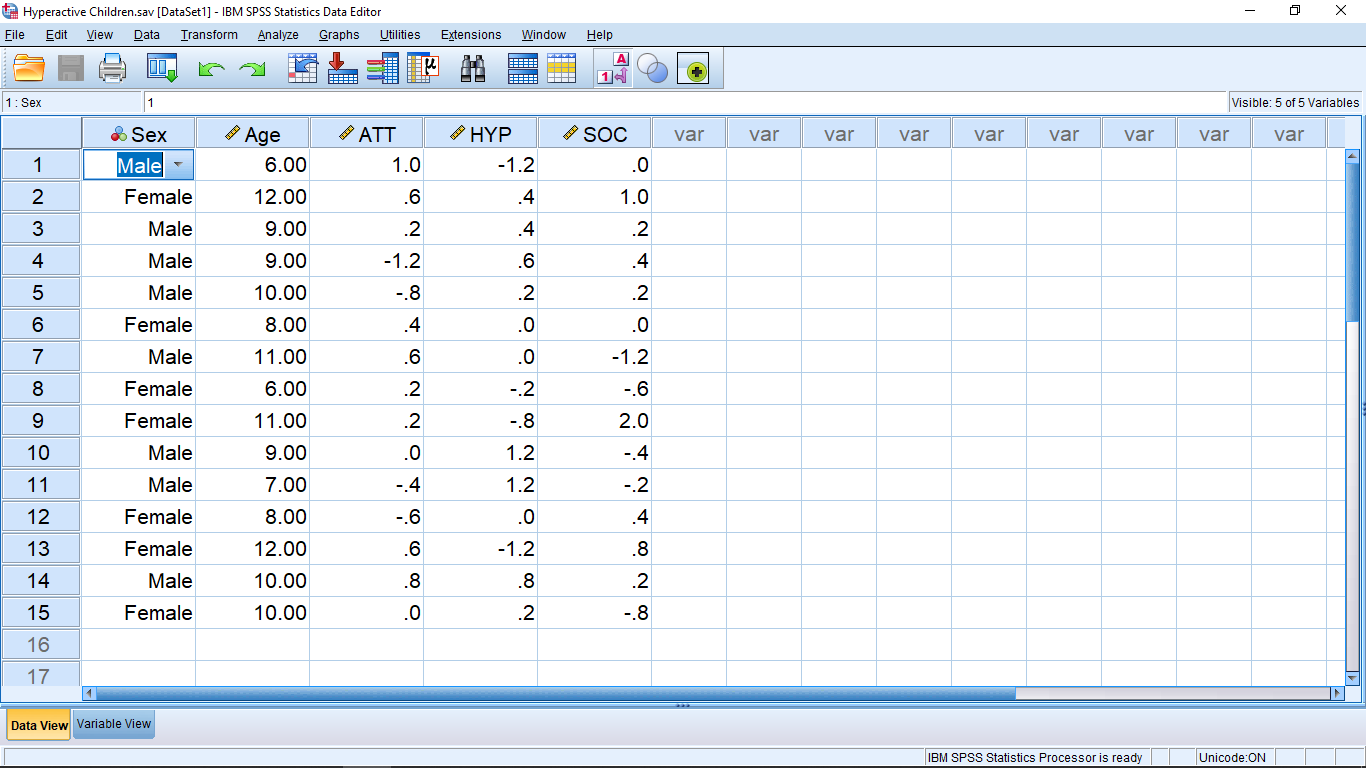
Let’s go back to the Variable View window to see how quantitative variables with discrete number assignments are handled. Look at the values in the sex variable column in the first image. The numbers 1 and 2 are shown which represent Male and Female. To see that representation explicitly, click on the 1-A icon at the top of the window. You will then see:
There’s more. If you click on a cell in the gender variable, you will get a thing on the side of the cell and if you click on that thing, you will see:
This pop-up allows you to change the value by clicking on the appropriate value. In one of your assignments you will get practice with entering qualitative data this way. In general, to enter data into SPSS from scratch, you can start by typing data into the Data View window and then fix up the attributes later in the Variable View window. For qualitative variables the best approach is to define the variable first in Variable View, getting the proper values into the Values attribute. Then you can go back to the Data View window and enter the qualitative data either by pulling down the menu when the mode of the 1-A icon is to show the labels or by remembering the number assignment and entering the numbers when the 1-A icon is set to show values.
Let’s move on to do some descriptive statistics and see what results will look like in the Output window. For this load in the “Caregiver.sav” file from the Data Sets:
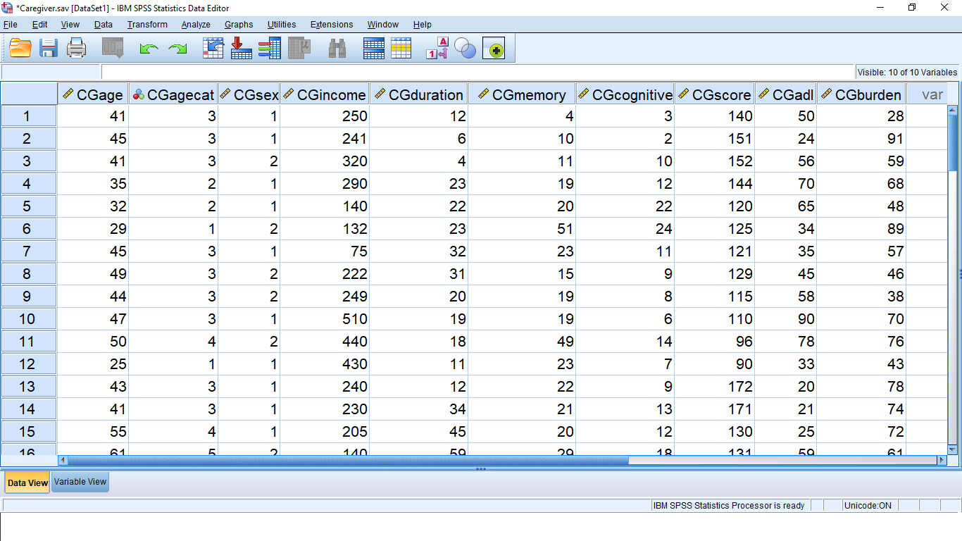
There are 50 subjects in this file and 10 variables. One of the things we’ll be learning, in later SPSS Lessons, is how to combine more than one variable into one variable. This is because we are studying univariate statistics which means we only want to deal with one dependent variable at a time. For now, lets pick on the variable CGDUR and see how we can generate descriptive statistics output. There are three ways to do this and they all begin in the Analyze  Descriptive Frequencies menu which looks like this (on a PC; very similar on a Mac):
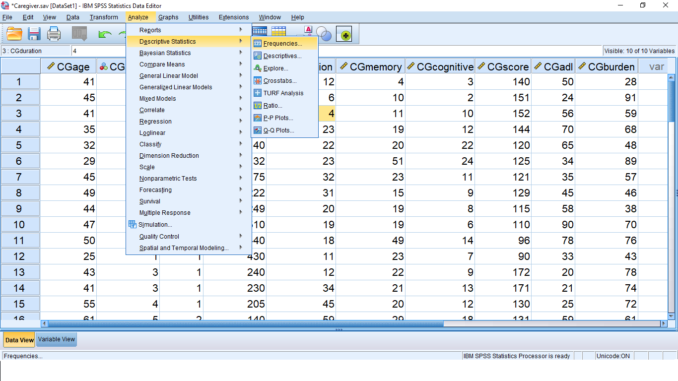
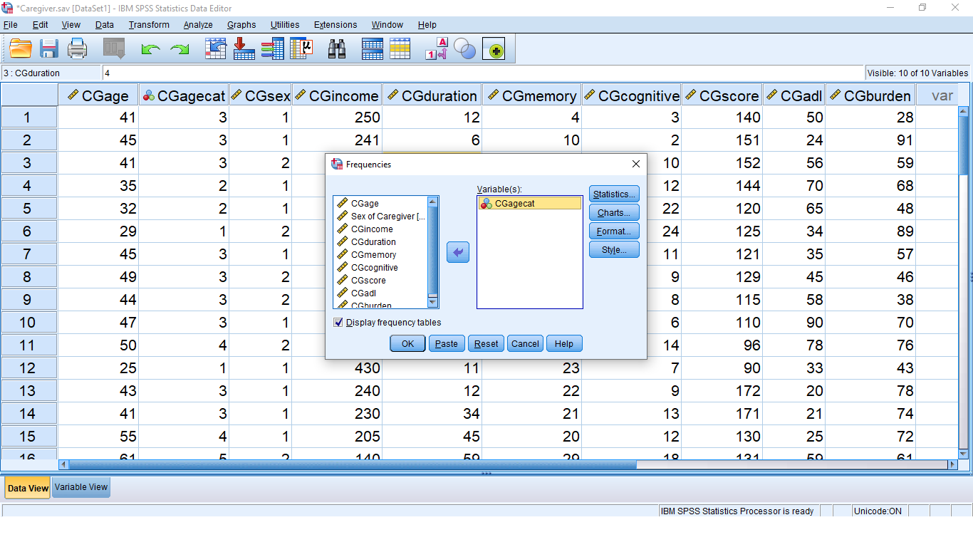
Pick Frequencies… which brings up:
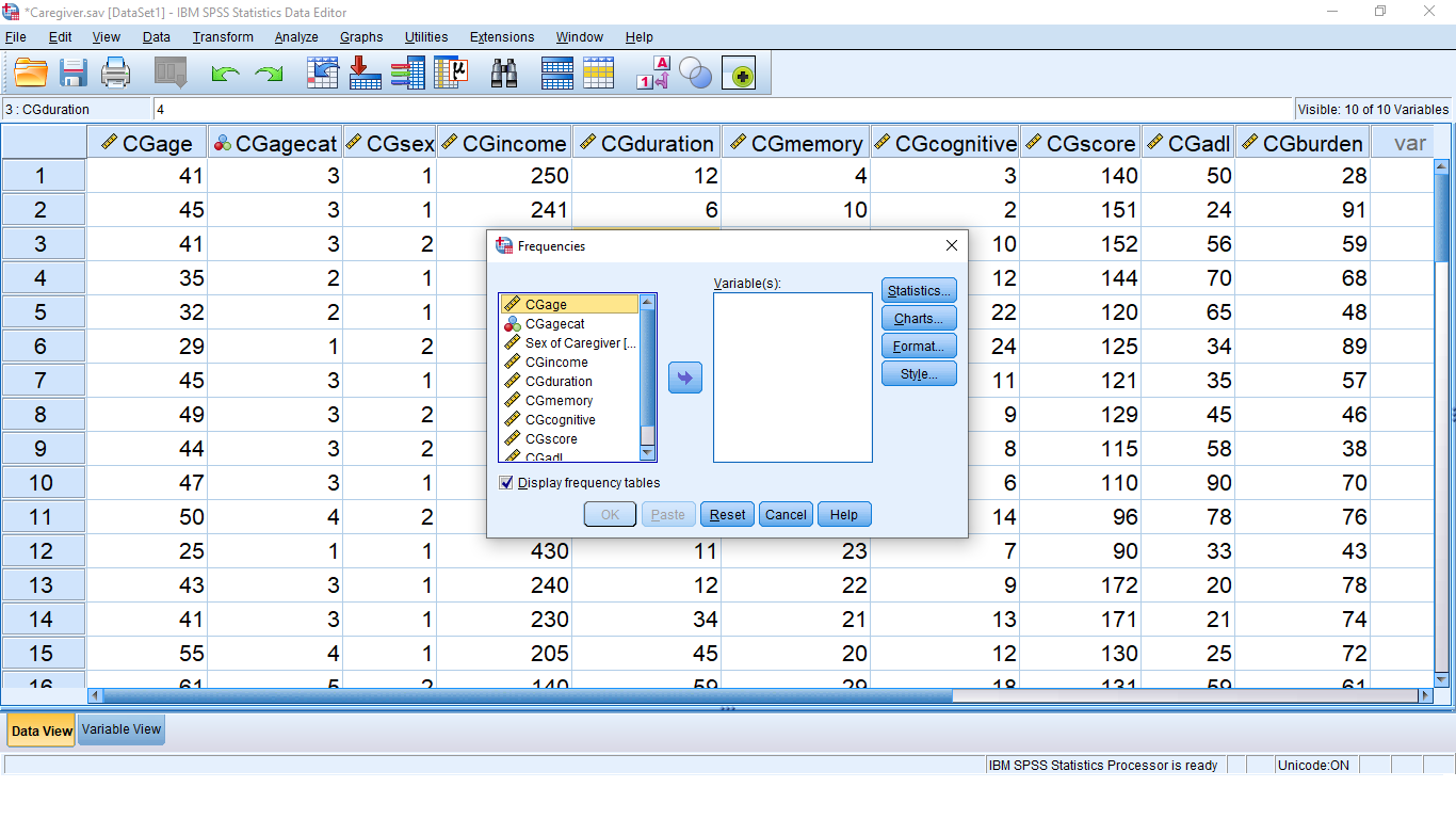
Move the CGagecat variable over by clicking on the variable then the arrow button or just drag the variable over to get:
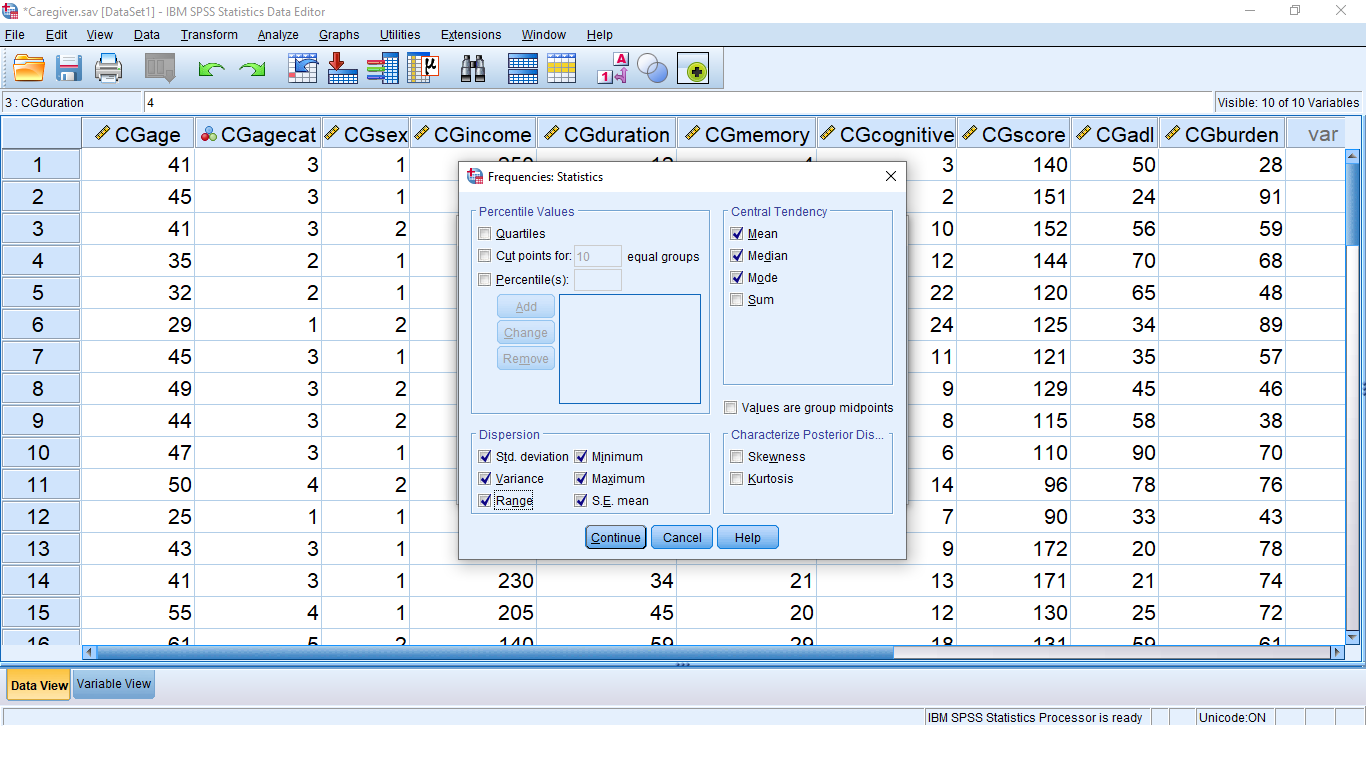
Let’s take a look at the submenus and set them up before we hit OK. First the Statistics… submenu. In that menu check off Mean ( ), Median (MD), Mode, Skewness, Kurtosis, Std. deviation (
 ), Variance (
 ), Range (
 ), Minimum (
 ) and, Maximum (
 ). We we look at all of those descriptive statistics in Chapter 3.
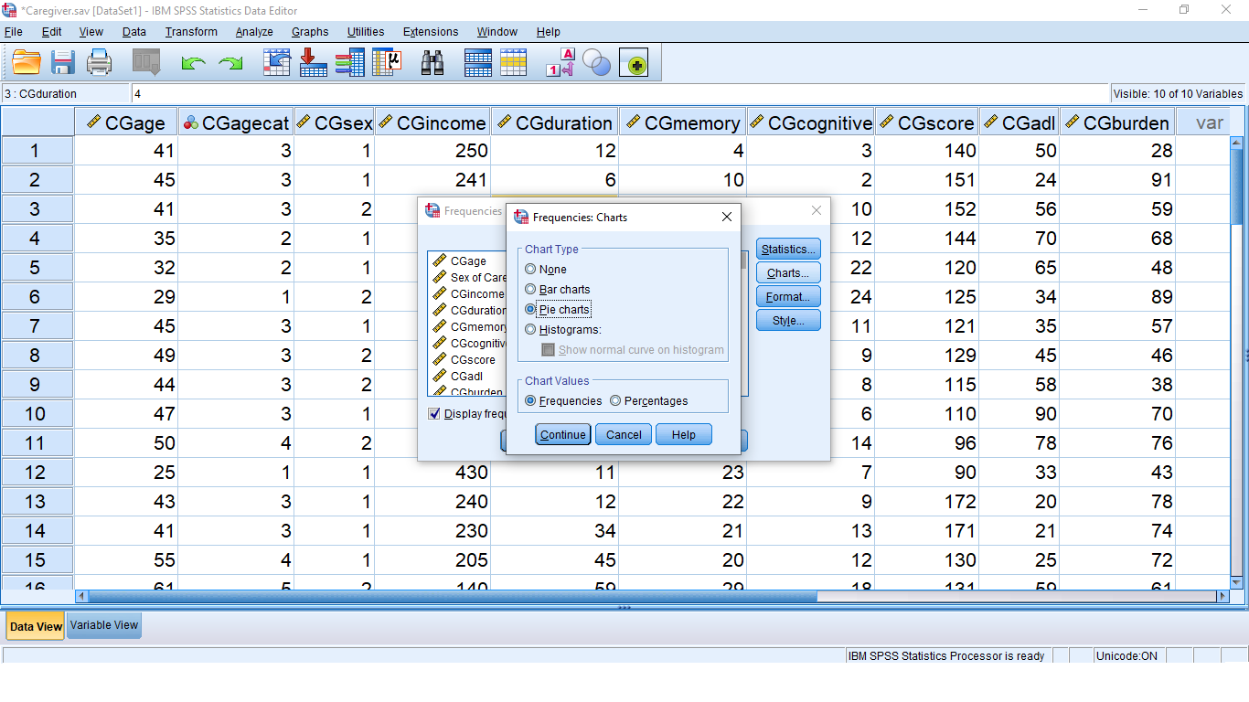
Hit Continue, look at the Charts… menu and check off pie charts, just for fun:
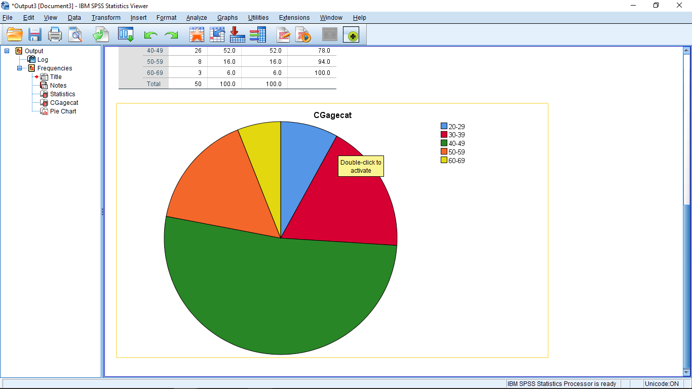
Hit Continue. You can look at the Format… and Style… menus if you want, they are not particularly interesting. Make sure “Display frequency tables” is checked (this will be important when you do the assignments), then hit OK. The Output window will pop up and in that window you will see:
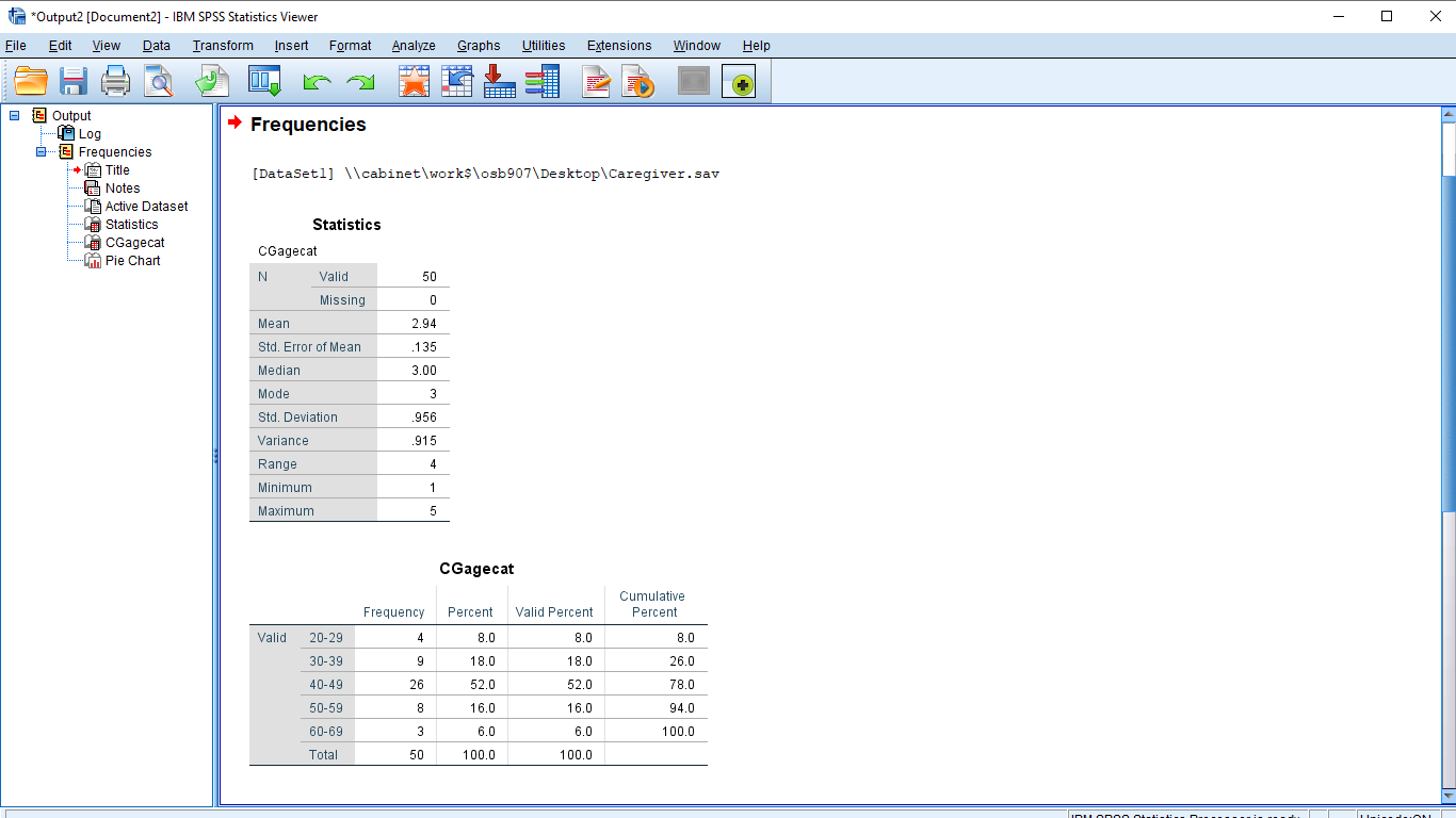
The first table, Statistics, shows the descriptive statistics you asked for. Note, especially, for future reference (when we hit skewness in Chapter 3), the value of the skewness. It is  . More to the point it is
  , or positive, meaning that the data set (CGagecatn) is right skewed or positively skewed. The second table, labeled “highestQualification” is the frequency table (note how the variable Name and not the Label was used because the Label attribute for the highestQualification variable was blank). The structure of the frequency table is slightly different from how we will learn to construct one by hand. There is nothing you can do to make SPSS produce a frequency table that matches exactly like what you might want. There are limitations to using canned statistics software.
Scrolling down the Output window you will see the pie chart:
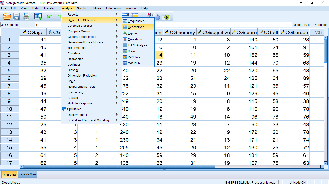
Lets look at the Descriptives… menu next:
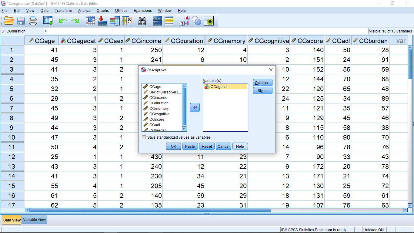
Move the CGagecat variable over as before and make sure to check off the “Save standardized values as variables”. We’ll learn about standardized values ( -values) in Chapter 3. Take note, this is the only way to get SPSS to compute -values :
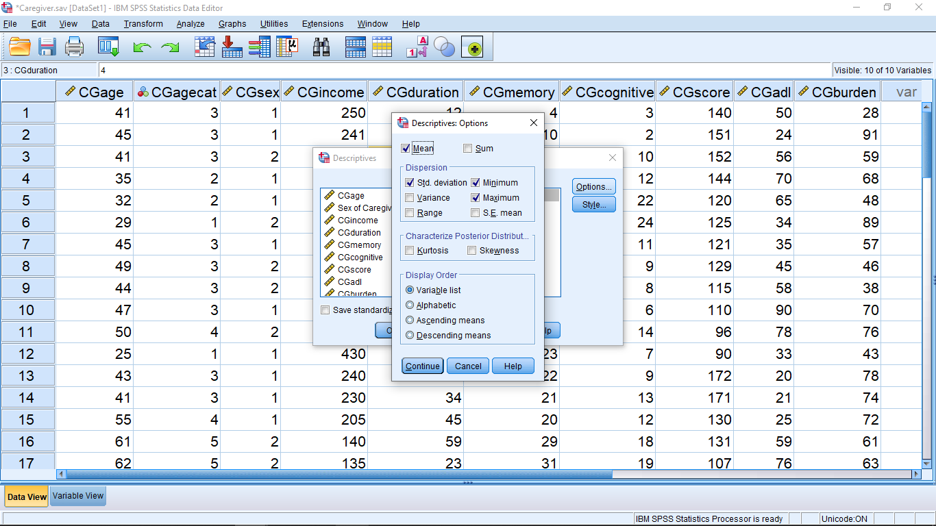
Click the options menu and check off descriptive statistics to compute, as before (S.E. mean is Standard Error of the mean which we’ll get to eventually also, we’ll just leave it off for now):
Hit Continue then OK and look at the results in the Output window. The output is straightforward:

In Chapter 3 we will learn that the mean of a -transformed variable is zero and the standard deviation is one. That is confirmed here. If you left the “Save standardized values as variables” box checked when you ran this, you’ll get another variable added in the Data View window — the -transform of the -transform. It’s the same, the -transform of a -transform give back the same numbers. But note that the skewness () of the -transformed variable is the same as the skewness of the original variable. This means that -transforming a variable doesn’t change anything about the variable except its mean and standard deviation. This is important when it comes to using and interpreting any analyses based on the -transformed variable.
Finally, let’s look at the Explore… menu:

Move CGagecat into the “Dependent List”. Don’t worry about “Factor List”, you should leave it blank (for future reference, “factor” is synonymous with “independent variable”):
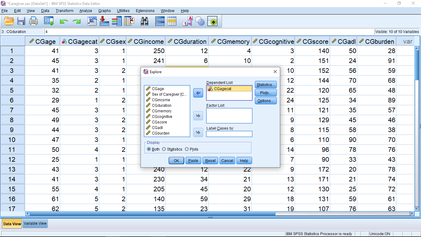
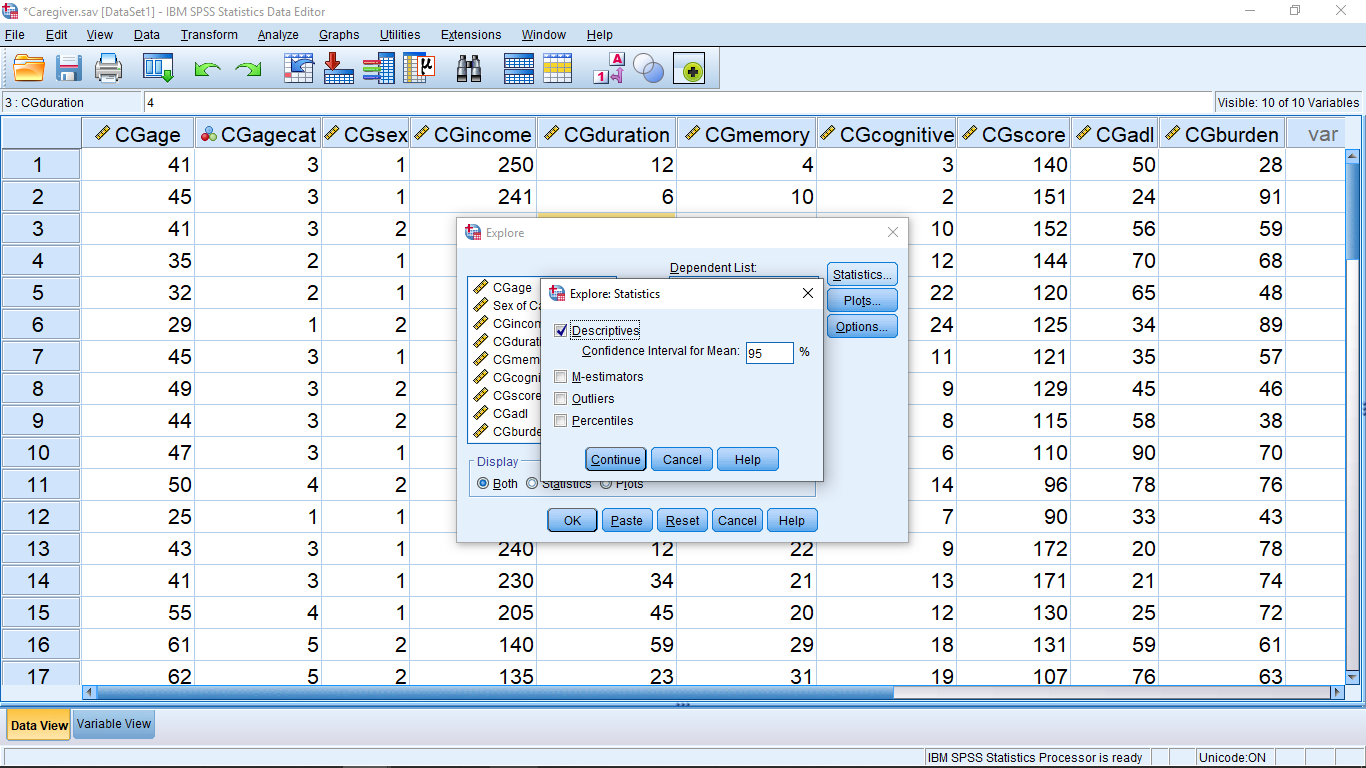
Take a look at the Statistics… menu. You can leave it as it is (we’ll be learning about Confidence Intervals later):
Hit Continue and open the Plots… menu and check off the items as shown:
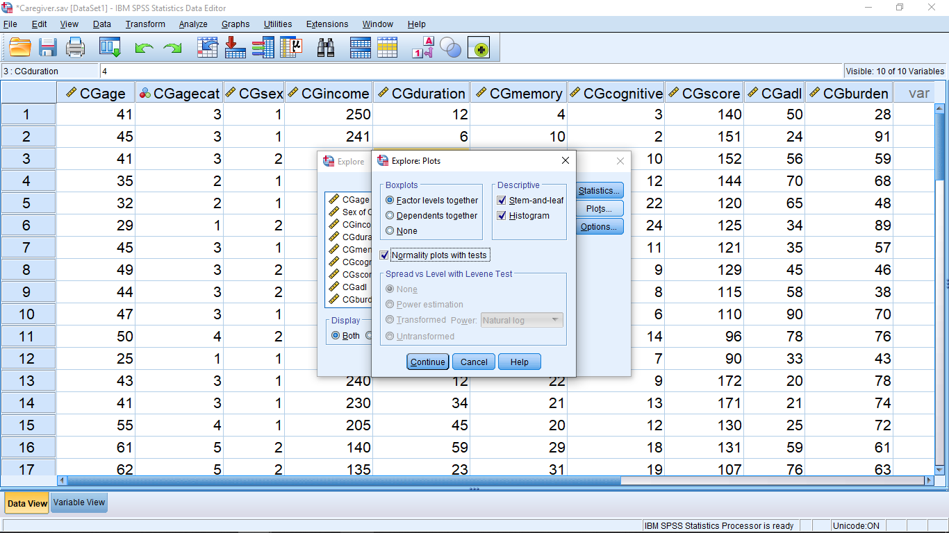
We will talk about these different plots soon. For now, hit Continue, the OK and look at the output. First the tables:
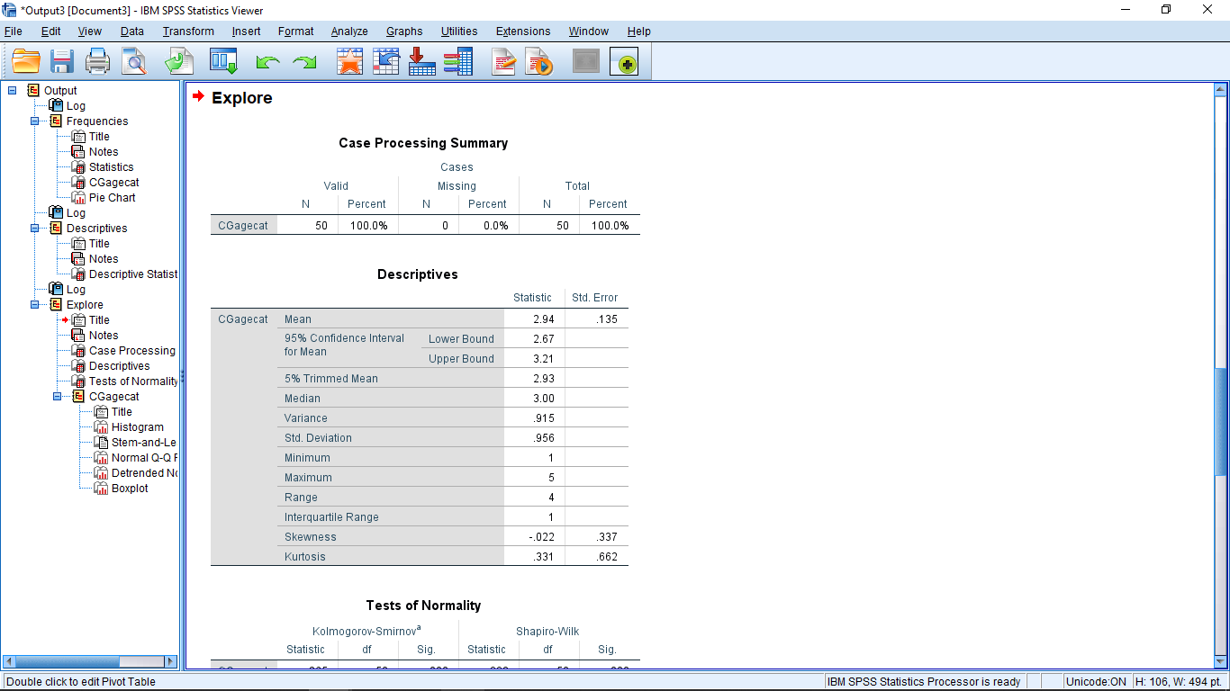
The first table is a “missing data report” that many SPSS procedures will output as a matter of course. You can ignore the missing data reports. Pay attention to the “Descriptive” table (it is something you could be asked about on exams!). You can ignore the “Tests of Normality” table. Next the plots. The first one is a histogram:
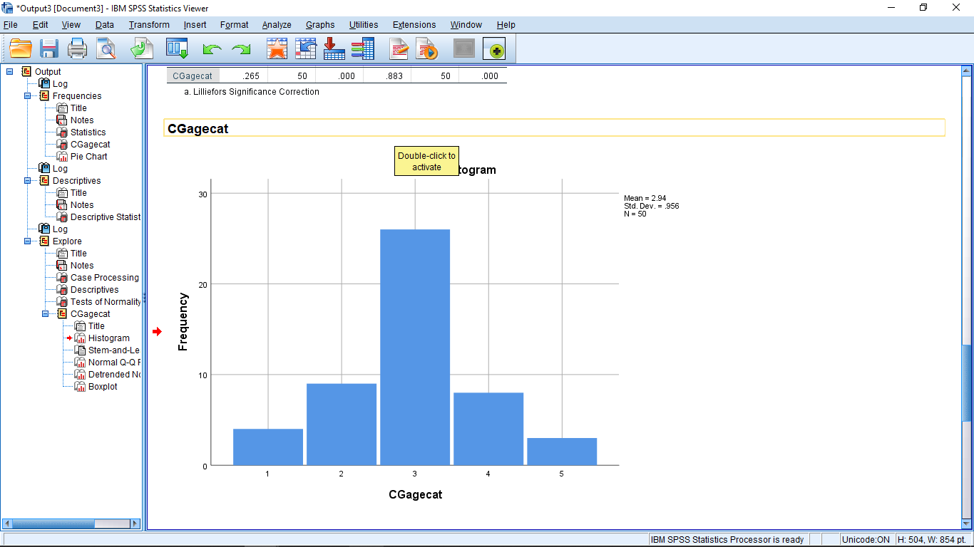
After we cover skewedness in Chapter 3, come back to this picture and note how the histogram is right skewed.
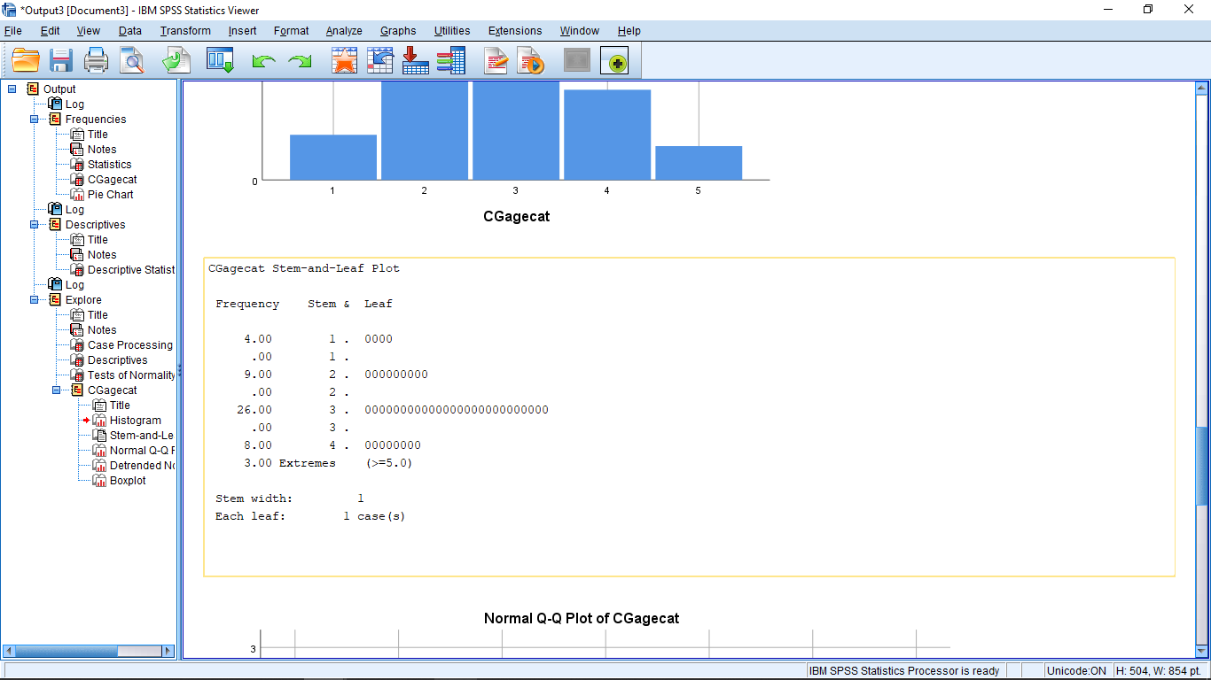
Next is the stem and leaf plot. Remember that the way to a stem and leaf plot in SPSS is through the Explore menu:
You can ignore the Q-Q plots but note that a boxplot is produced:
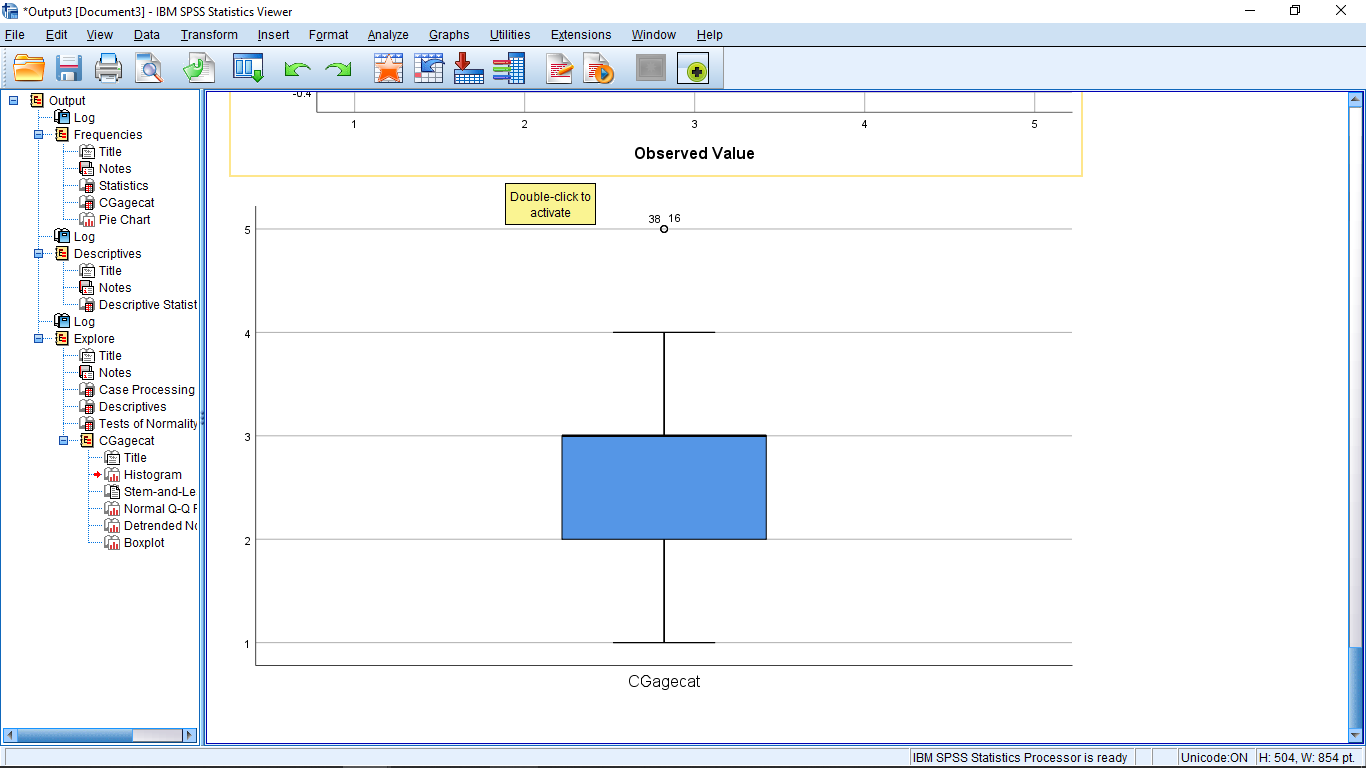
This is not a very good boxplot. Again, we’ll be learning about boxplots later.
Looking at stuff here in SPSS before covering the concepts in class is a very real situation that people face in real life. They will go to a program like SPSS in the hopes that it is all they need for data analysis. But it will likely produce output that you don’t understand if you don’t have a basic education in statistics. If provided with output from SPSS (e.g., on an exam) you should able to explain what the output means. For example, if given one of the tables shown above you should be able to determine what the standard deviation of a data set is and be able to use that number in a further calculation. It is also a good idea to do some calculations by hand when you first use SPSS for a procedure. If you can produce the same numbers as SPSS then you are sure you know what it is doing.
