
14. Correlation and Regression
14.1 Scatter Plots
You can make a scatter plot of your data when you have values for two or more variables for each subject. Here we will only be interested in the case where we have a pair of variables (2D plot).
Of the two variables, for application to regression, one will be an independent variable (IV) and the other a dependent variable (DV). The IV is usually a variable that is known with a high degree of precision (like age). The idea with regression (when we get to it) is to come up with a formula that allows you to predict what the DV will be if you know the IV. We will use the symbol  for the IV and
  for the DV.
The best way to see what a scatter plot is is to plot one. With the data:
| Student | No. of absences, |
grade, |
| A | 6 | 82 |
| B | 2 | 86 |
| C | 15 | 43 |
| D | 9 | 74 |
| E | 12 | 58 |
| F | 5 | 90 |
| G | 8 | 78 |
the scatterplot is:
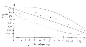
A couple of things to notice in the plot are: 1. An eyeball best line fit has been drawn through the scatterplot points. With regression we will calculate exactly what that best fit line is. 2. If and are linearly related then the points will fall inside an ellipse. If the ellipse is long and skinny, and are said to to be highly correlated. If the ellipse is more like a circle the and are not correlated. By looking at a scatter plot you can judge if and are linearly related. If your scatterplot looks like:
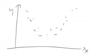
then you could conclude that and are not linearly related and it will not make much sense to try and fit a line through the data or to compute a correlation coefficient.
