
2. Descriptive Statistics: Frequency Data (Counting)
2.2 Plotting Frequency Data
In general you may present your data, say in a report or paper, in tabular form or graphical form. Personally, I prefer graphical form — “a picture is worth a thousand words”. For frequency data, the frequency table is the tabular form. There are several ways of presenting the same data graphically, the primary way being the histogram:
- Histogram – plot of frequency data using steps (mathematically: “step functions”).
- Frequency polygon – plot of frequency data using straight lines (mathematically: “piece-wise linear functions”).
- Cumulative frequency graph.
- Pie charts, Pareto charts, Stem & Leaf plots – alternate ways of plotting frequency data
As a first step to plotting frequency data, you will need to construct a frequency table.
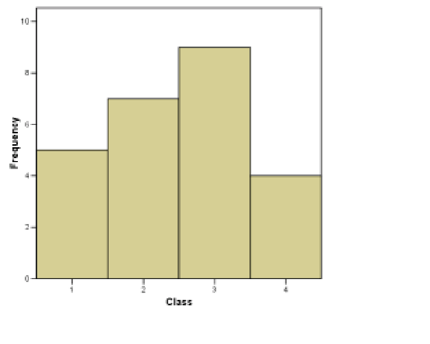
Example 2.3 : Continuing with the frequency table produced from the data given in Example 2.1 :
| Class | Frequency | Cumulative Freq. | Relative Freq |
| A | 5 | 5 | 0.20 |
| B | 7 | 12 | 0.28 |
| O | 9 | 21 | 0.36 |
| AB | 4 | 25 | 0.16 |
We will demonstrate most of the graph types using these data.
1. Histograms. First, the straight forward histogram is as shown in Figure 2.1. This is a plot of the data in the frequency column of the frequency table.
Next, still under the category histograms, is the relative frequency histogram. The relative frequency histogram for the blood type data is shown in Figure 2.2. It is a plot of the data in the relative frequency column of the frequency table.

Very Important Concept : Look at Figure 2.2 and define the width of each class to be 1. Then the area under the histogram “curve” is  . So, if we image that our data sample of the 25 army inductees is a whole population, then the relative frequency histogram may be interpreted as giving the following probabilities for getting a particular blood type for someone selected randomly from the population:
The probability of having type A blood is 0.20 (or 20 ).
).
The probability of having type B blood is 0.28 (or 28).
The probability of having type 0 blood is 0.36 (or 36).
The probability of having type AB blood is 0.16 (or 16).
2. Frequency Polygons. Frequency polygons are just another form of histogram. We have been talking about “area under the curve” to represent probability. The curve of a frequency polygon is a little bit smoother than the curve of a traditional histogram. Frequency polygons can, of course be made for either straight frequency or relative frequency data. A frequency polygon for the relative frequency blood type data is shown in Figure 2.3.

 -value of the relative frequency then connect the dots as shown.
3. Cumulative Frequency Graph. Plotting the cumulative frequencies from the frequency table results in a cumulative frequency graph as shown in Figure 2.4. Cumulative relative frequencies can also be computed (add up relative frequencies as you move down the column) and plotted.
The cumulative frequency graph shows the “area under the curve” (of the traditional histogram) from the beginning of the first class up to the given point. Cumulative frequencies or cumulative relative frequencies with therefore show up later as areas under probability distribution curves up to a given point (it represents the probability of having a value equal to or less than the given value if that quantity is pulled at random from the population.)
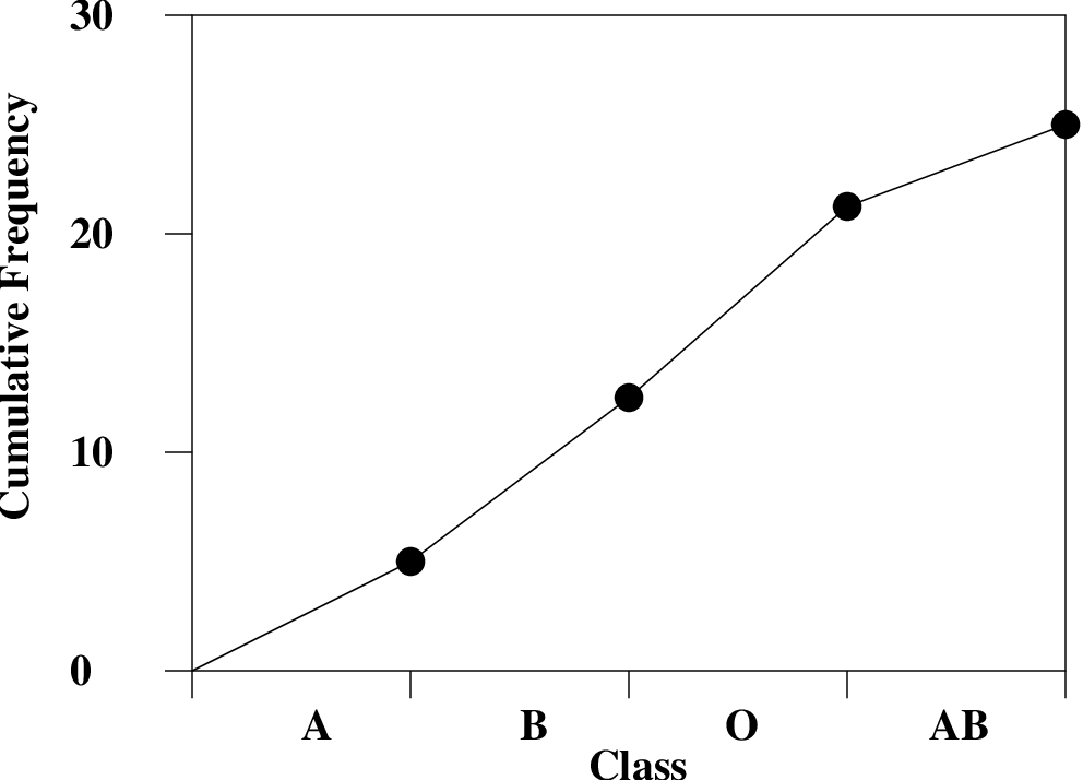 -value equal to the cumulative frequency. Then connect the dots as shown.
4. Pie Chart. A pie chart is a round histogram. Everyone has seen a pie chart, it is intuitive. The angles in the pie chart are computed using:
Angle = Relative Frequency  .
.
For the blood type data, the explicit angle calculations are :
| Class | Angle |
| A | 0.20 =  |
| B | 0.28 =  |
| O | 0.36 =  |
| AB | 0.16 =  |
Check Sum =  |
The pie chart for the blood type data is shown in Figure 2.5.

5. Pareto Chart. The Pareto chart is just an ordered histogram with classes ordered from highest to lowest frequency. The classes need to be qualitative for this reordering to make sense of course. To construct a Pareto chart, writing an ordered frequency table down first will help :
| Class | Frequency |
| A | 5 |
| B | 7 |
| O | 9 |
| AB | 4 |

The Parato chart is plotted in Figure 2.6. The frequencies as ordered in a Parato chart can be given statistical meaning but that is a subject beyond the scope of this course. Here you just have to be aware that such a chart exists and know how it is made.
2.2.1 Stem and Leaf Plots
A stem and leaf plot is a fancy kind of histogram that lets you see all your data instead of just class frequency information.
The steps for making a stem and leaf plot are :
- Order the data (this is a frequently used, tedious, step for many procedures as we’ll see).
- Divide into classes of 10’s or 5’s (low decade and high decade).
- Use “leading” and “trailing” digits of the data values to make the plot.
For step 3 you need to know what “leading” and “trailing” digits are. Let’s illustrate that with an example.
Example 2.4 : Given classes: 50-54, 55-59, 60-64, 65-69, 70-74, 75-79 or equivalently, divide the classes into 5’s and the data in order (i.e. with the tedious ordering step 1 already done) :
|50,51,51,52,53,53,|55,55,56,57,57,58,59,|62,63,|65,65,66,66,67,68,69,69|72,73,|75,75,77,78,79|
where the bars illustrate the division of the data into low and high decades, step 2. The first number of each data point is the leading digit (stem), the last, the trailing digit (leaf). So with this, step 3 leads to :
| Stem | Leaf |
| 5 | 0 1 1 2 3 3 |
| 5 | 5 5 6 7 7 8 9 |
| 6 | 2 3 |
| 6 | 5 5 6 6 7 8 9 9 |
| 7 | 2 3 |
| 7 | 5 5 7 8 9 |
Notice how, since the numbers are all nicely lined up, that the stem and leaf plot is a histogram on its side. So you can visualize frequency information and see the values of the individual data points as well. One could use that information to compute accurate means from stem and leaf plots whereas, as we’ll see, “class centers” need to be used with histogram (frequency table) data to estimate means with grouped data formulae.
