
12. ANOVA
12.6 SPSS Lesson 9: Two-way ANOVA
From the Data Sets, open the file “Relief.sav” :
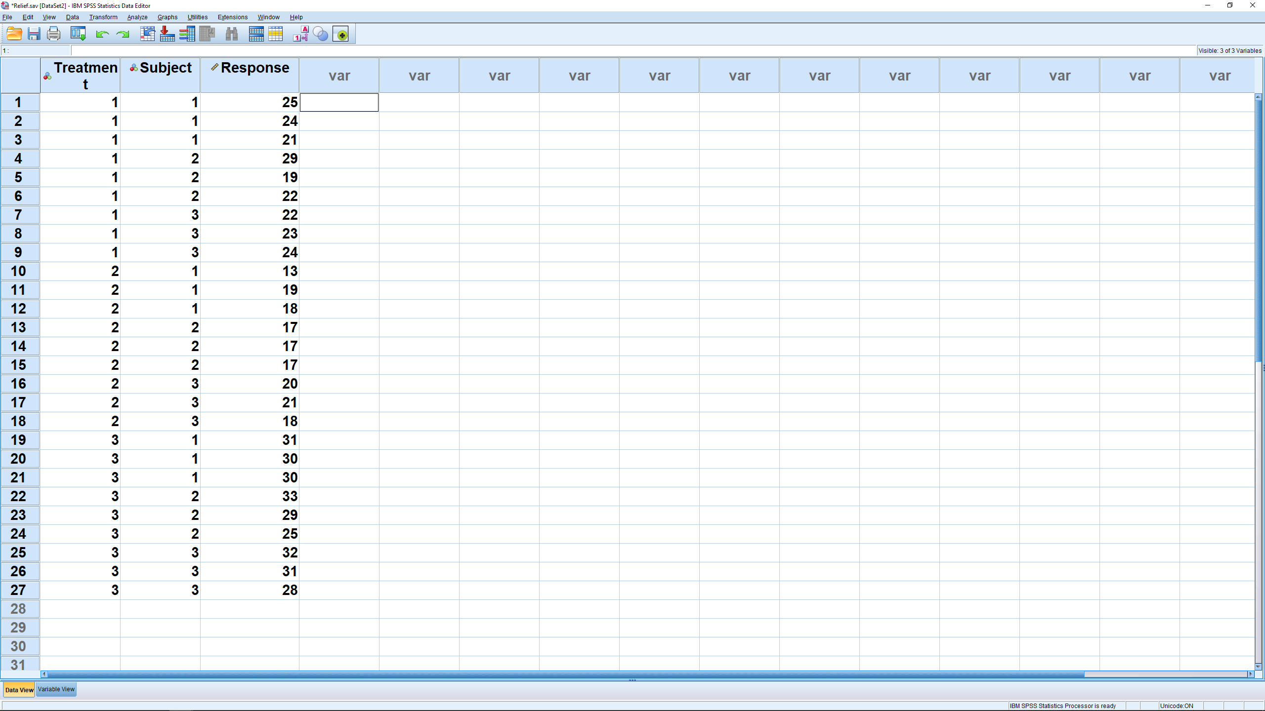
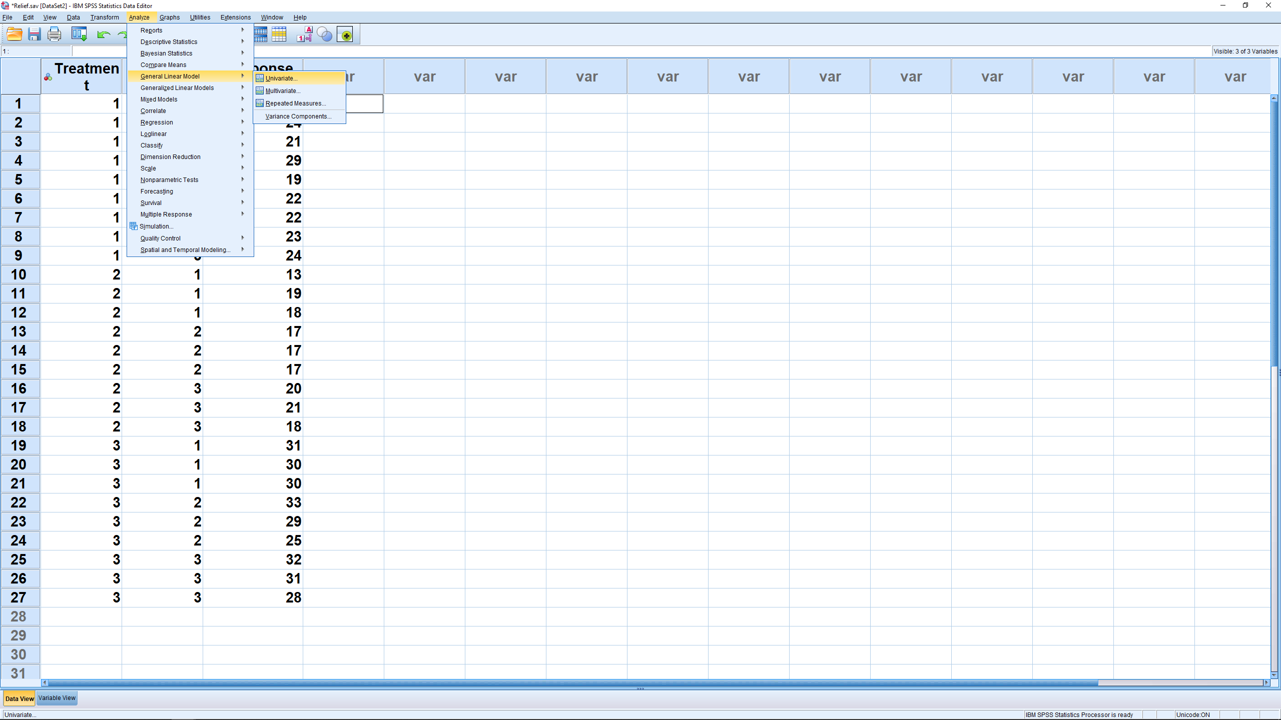
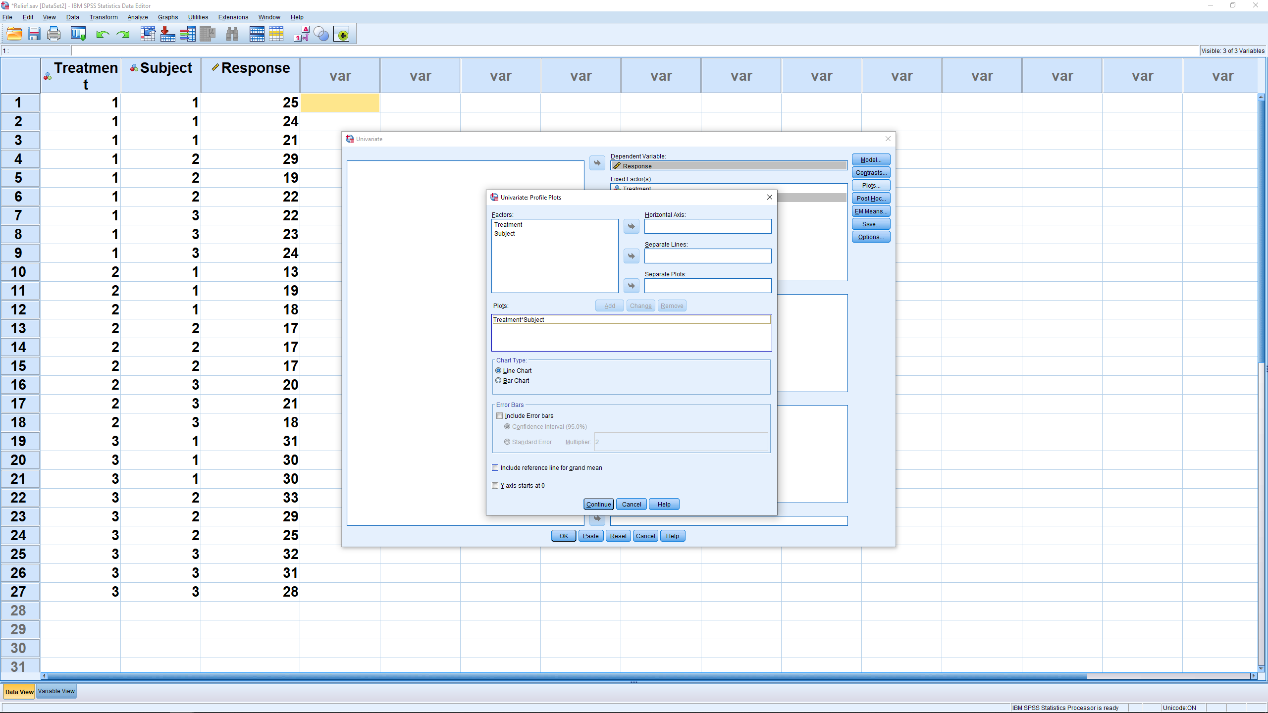
Note that there are now two independent variables, Treatment and Subject; Treatment has 3 levels, Subject has 3 levels. The cell structure is somewhat hard to see so you will have to be organized when you enter data on your own. The dependent variable is Response. To run the ANOVA, select Analyze → General Linear Model → Univariate :
which will give you this menu :
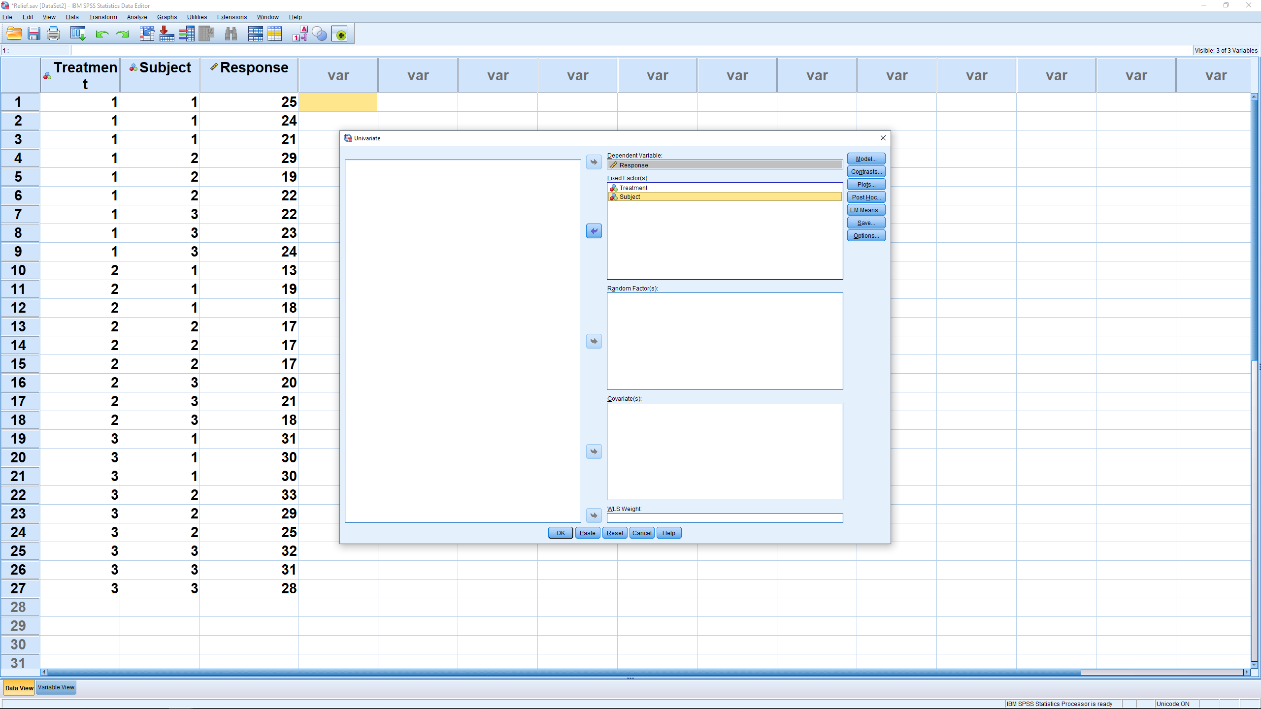
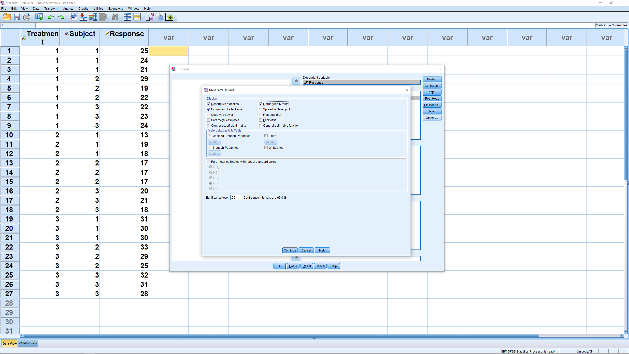
where we have entered the independent variable, the factors, into the Fixed Factor box and the dependent variable into the dependent box. The submenus setups will be left pretty much alone, as with the one-way ANOVA. There are post-hoc tests available but we will not worry about that for this course. In the Model menu, there is a check box for “intercept” which, if checked, will result in an extra line in the ANOVA table output that we will need to ignore. We will look at the output, below, that is generated if that box is checked. In the Options menu, check off Descriptive statistics (this will give cell means), Estimates of effect size (this will give  ) and Homogeneity tests (Levine’s test for homoscedasticity) :
The Plots menu is where you set up the profile plot output. Recall that you can view the 3D profile plot from two directions: along the A factor axis with the B factor plotted as separate lines or along the B factor axis with the A factor as horizontal lines. Here is what the menu looks like just before you hit the Add button :
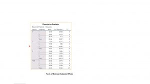
Finally, hit the OK button to get the output. First comes the descriptive statistics where you can see the cell means and sample standard deviations :

The important ANOVA table output looks like :
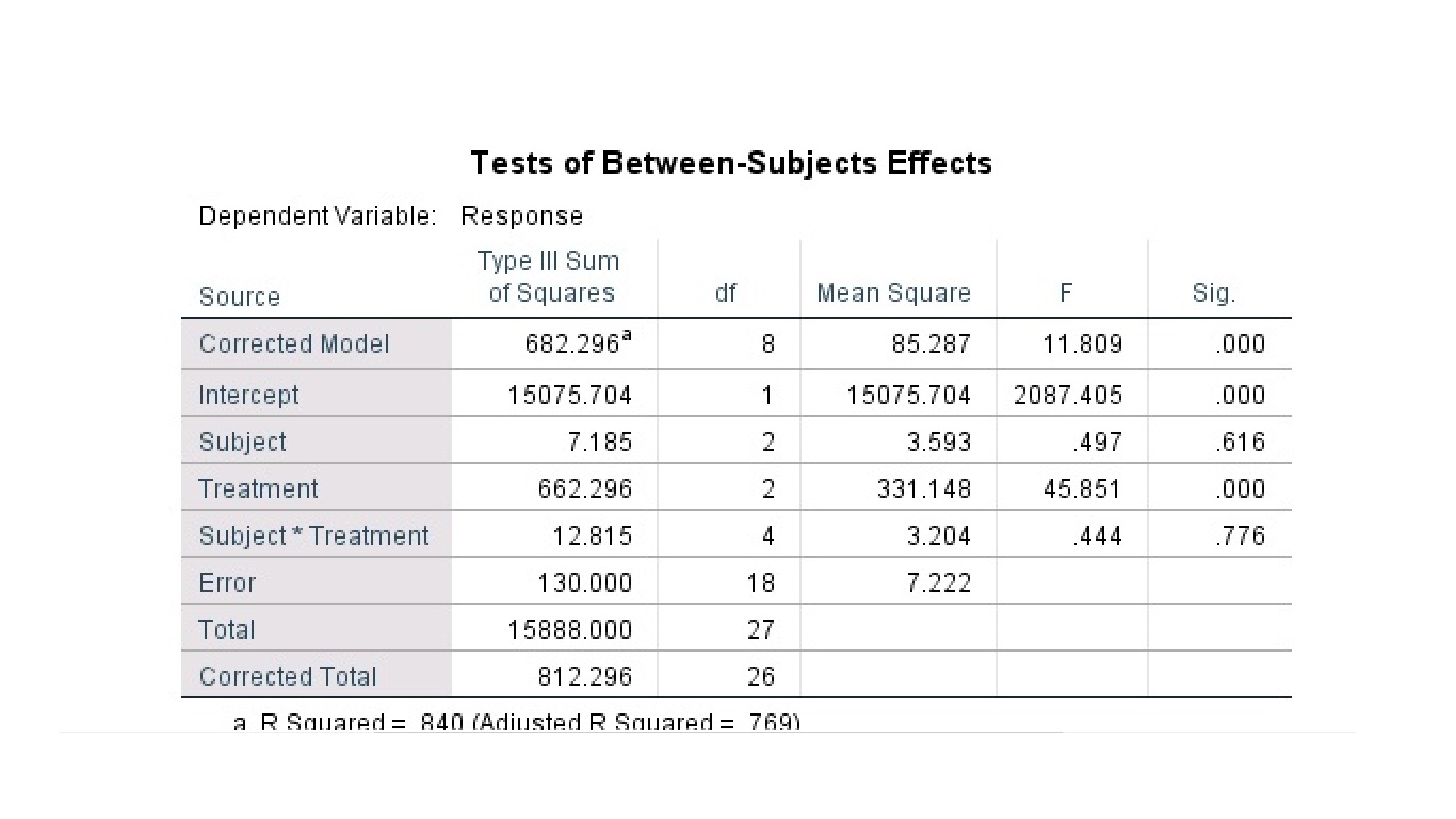
As usual, ignore the Corrected Model, the Intercept and the Total source lines. Factor  is the gender source line, factor
  is the method source line, treatment*group is the
  interaction source and Error is the within variance source. The Corrected Total is the correct total of the , , and error SS and degrees of freedom. Interpretation is the thing you want out of this so looking at the
  values we see that there is no main effect of , group, there is a main effect of , method and there is an interaction. No , and . The of the ANOVA as a whole shows up on the corrected model line and is the same as the
  reported at the bottom of the table,
  ; it is a measure of how well the data fit the group means – a measure of how well the data fit the ANOVA model. We’ll explore the general linear ANOVA model in Chapter 17.
The profile plots come out as :
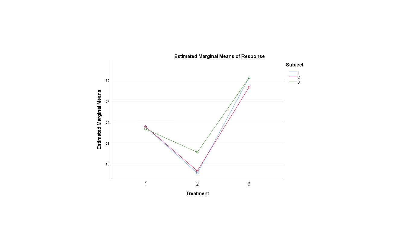
Look at the two line plot on the left and we clearly see the interaction in the “non-parallel” lines. Look at that interaction in another way: look at the difference, the separation, between the group values for each of the 3 methods and image a profile plot of those values. A one-way ANOVA on those values (remember, this is what the interaction hypothesis test does) finds a significant difference; in particular the difference between groups is greater for group 2 than for the other groups.
Plotting this the other way, as on the right above, we see the interaction manifest as non-parallel lines, but the difference of differences angle is harder to see. What you need to do to see it is, for each of the groups, look at the average difference of methods with the mean of the methods. There is a significant difference between the average difference value for the groups. The main effect of method shows up as a significant difference between the center of the three lines.
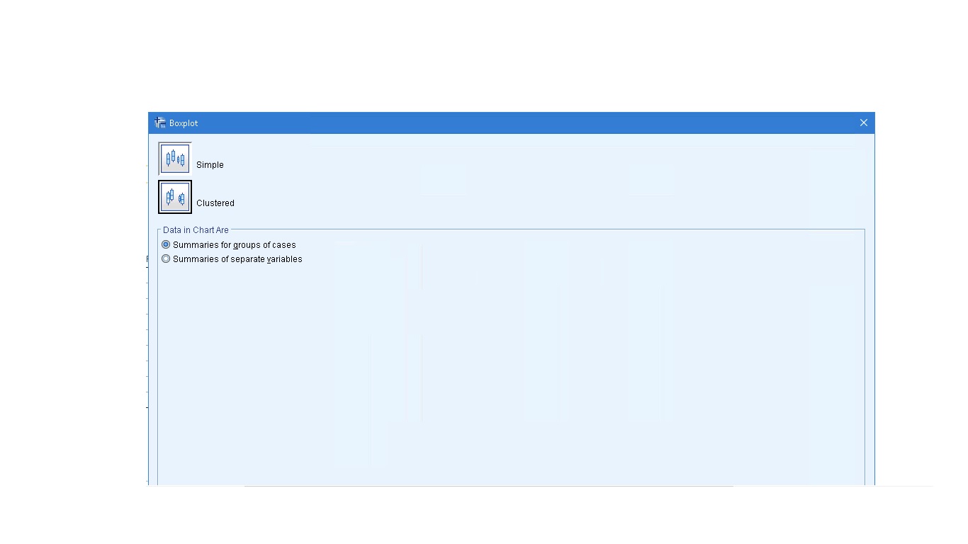
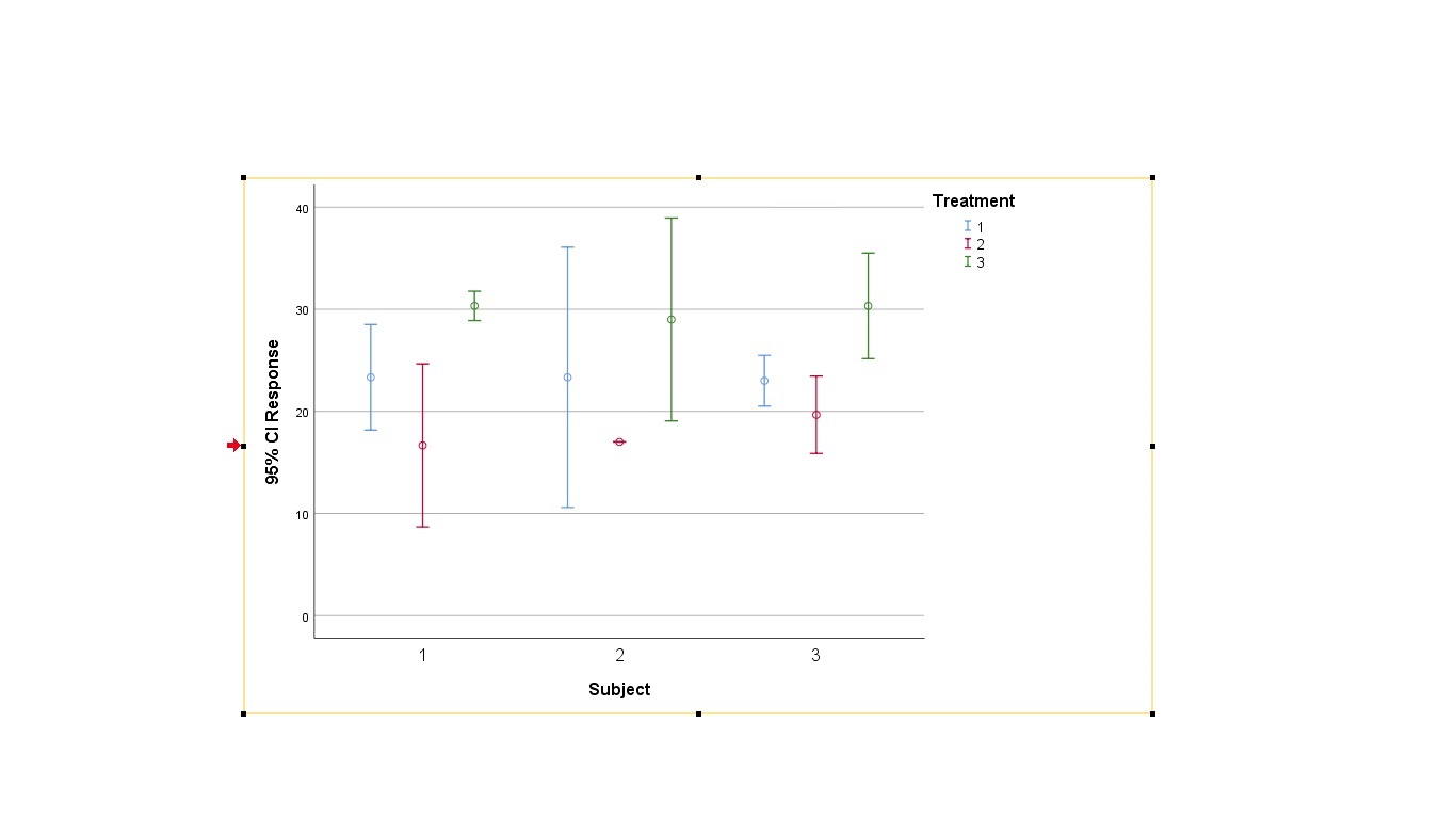
If you want to present a profile plot in a paper, you should show some error bars. Here’s how to get such a plot out of SPSS: first pick Graphs → Legacy Dialogs → Error Bars (pick boxplots to do boxplots). Then pick clustered with “Summaries are for groups of cases” :
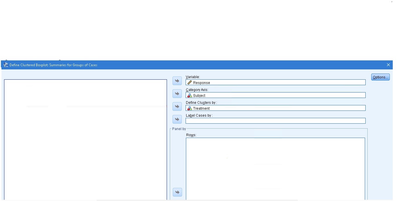
Set up the plot as follows :
The resulting plot is not that great (there’s no way here to create the lines):
The boxplot version looks a little better, at least there are clearer colors there to show the line factor:
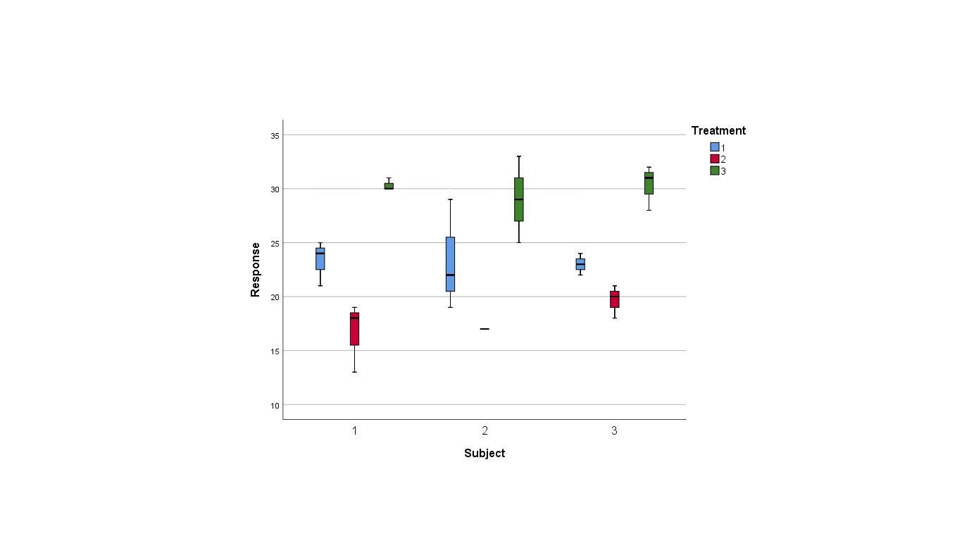
Compare this boxplot profile plot to the profile plot that came from running the two-way ANOVA.
