
14. Correlation and Regression
14.3 SPSS Lesson 10: Scatterplots and Correlation
Open “Hypertension.sav” from the Data Sets and pick Analyze → Correlate → Bivariate:
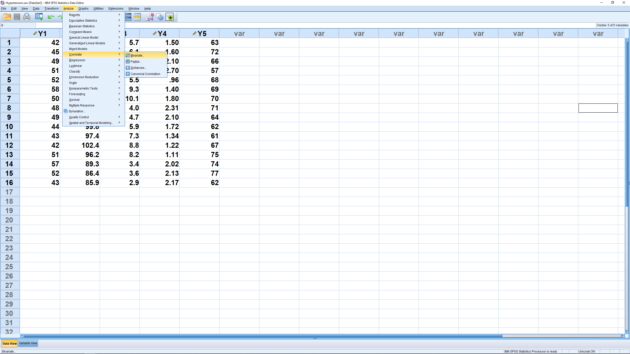
In the menu that pops up, move all the variables over:

and hit OK to get the following output:

This result, when you just look at the Pearson correlation coefficients, is a correlation matrix. Specifically, the correlation matrix for these four variables, looking at the SPSS output is:
![\[ \left[ \begin{array}{ccccc} 1 & -0.201 & 0.074 & 0.113 & 0.479 \\ -0.201 & 1 & 0.255 & -0.286 & -0.219 \\ 0.074 & 0.255 & 1 & -0.318 & -0.169 \\ 0.113 & -0.286 & -0.318 & 1 & -0.212 \\ 0.479 & -0.219 & -0.169 & -0.212 & 1 \end{array} \right] \]](https://openpress.usask.ca/app/uploads/quicklatex/quicklatex.com-a12bd13a4f74d93d5bf7abefbb83ac77_l3.png "Rendered by QuickLaTeX.com")
Note that the correlation matrix has ones on the diagonal — a variable is perfectly correlated with itself. The matrix is also symmetric which means that the numbers above the ones are the same as the ones directly across below the ones — the correlation between  and
and  is the same as the correlation between and . We’ll be introduced to matrices more systematically in Chapter 17. The correlation matrix is at the heart of multivariate statistics in a way that standard deviation is at the heart of univariate statistics.
Other thing to notice in the SPSS output is the significance of the correlation coefficients. This significance is determined using the  statistic given in Section 14.2. SPSS puts ** by
  values that have
  and a * by those correlations with
  . The
. The  -values themselves are also given in the SPSS output.
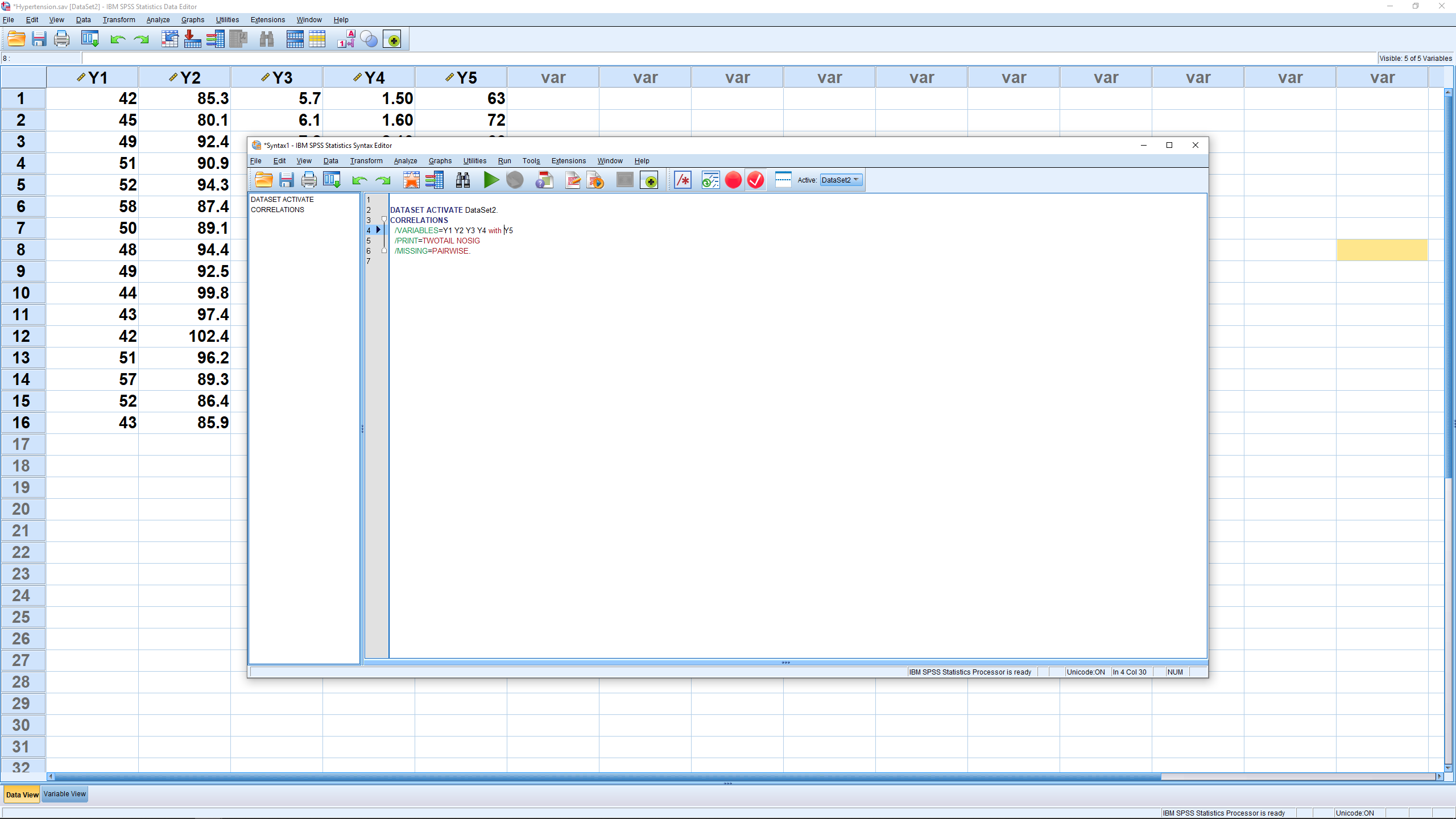
Sometimes you will not be interested in the complete correlation matrix but only in the correlations of one group of variables with another group. For example here we may want to lump the variables academic common friend and intimate together and see what their correlations are with the general variable. To get the associated partial correlation matrix, open the Analyze → Correlate → Bivariate dialog again, move all the variables over (if they are not already there) and hit Paste instead of OK. That will bring up the syntax editor. In the /VARIABLES line, add the word “with” between academic and general as shown:
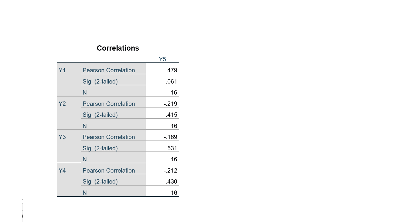
Then hit the big green triangle (“run”) to get:
Next, let’s do some scatterplots. First, a simple scatterplot of two variables. Pick Graphs → Legacy dialogs → Scatter/Dot to get:
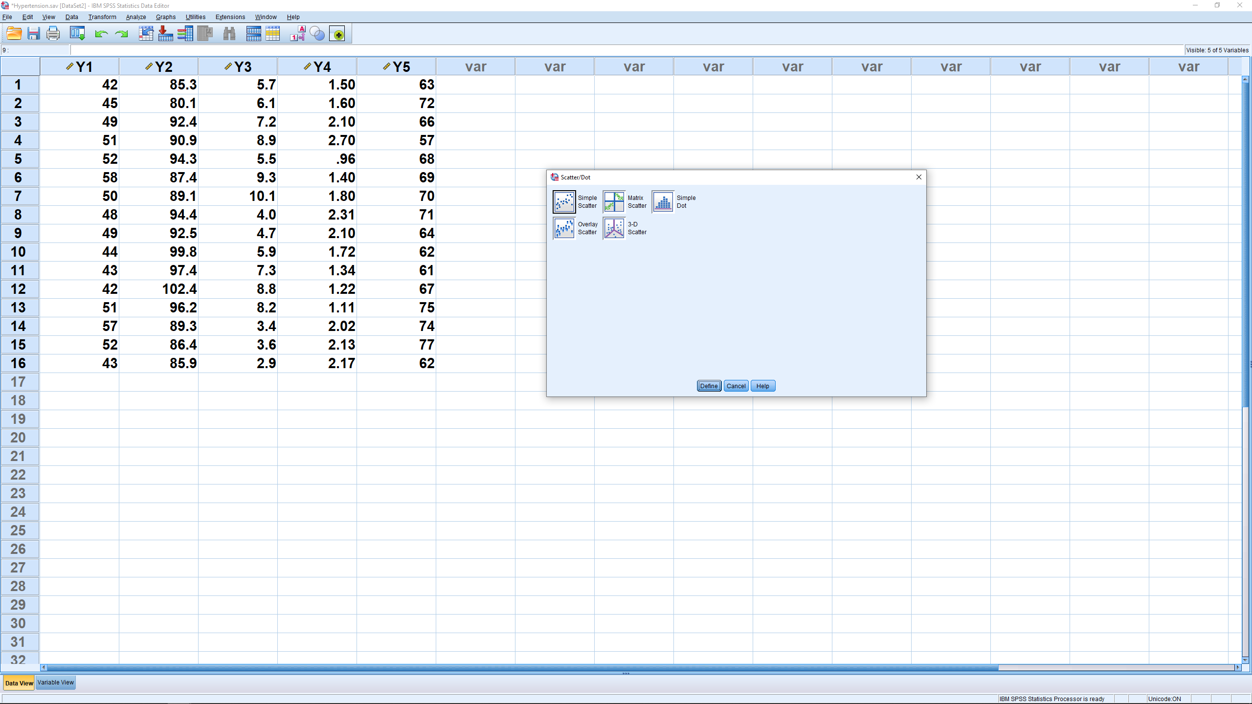
where we pick Simple. This gives:
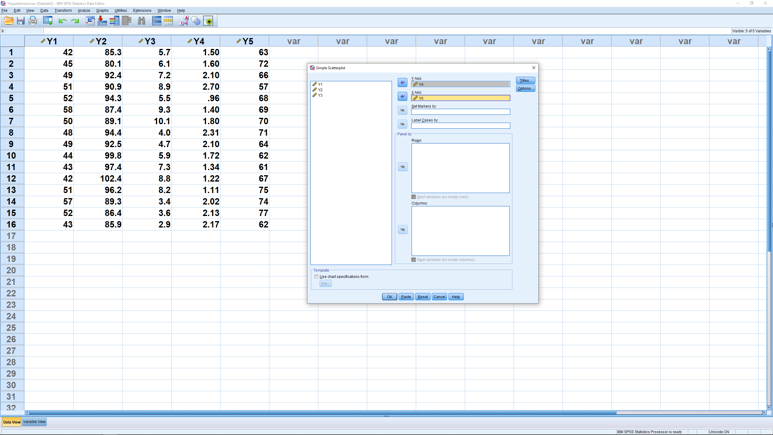
where two variables have been picked for plotting. (Note that if we had a variable with subject names, we could move that variable into the labels slot and get scatter plots with each point labeled by the subject name.) The result, after hitting OK, is:
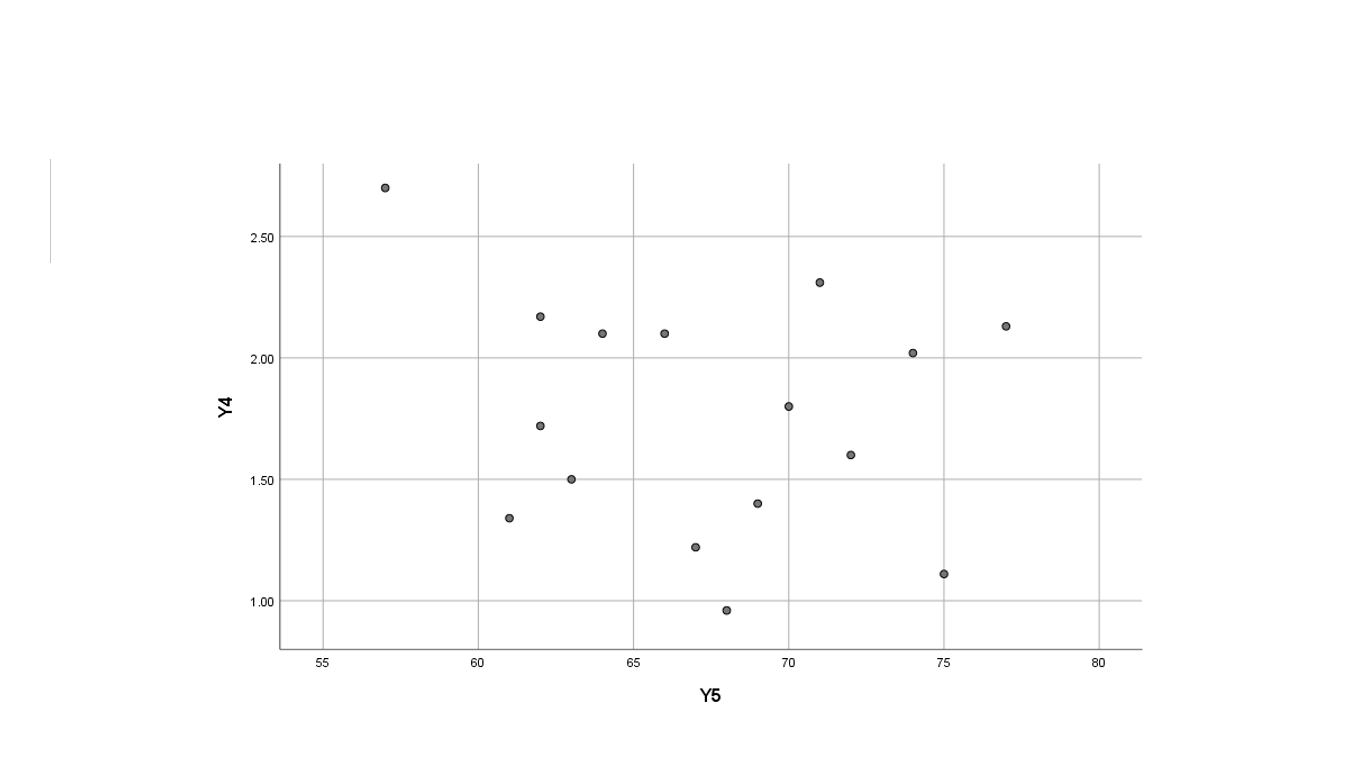
The correlation matrix output above reported that the correlation between these two variables was not significant and it does not appear that the points in the scatterplot are contained in a longish ellipse.
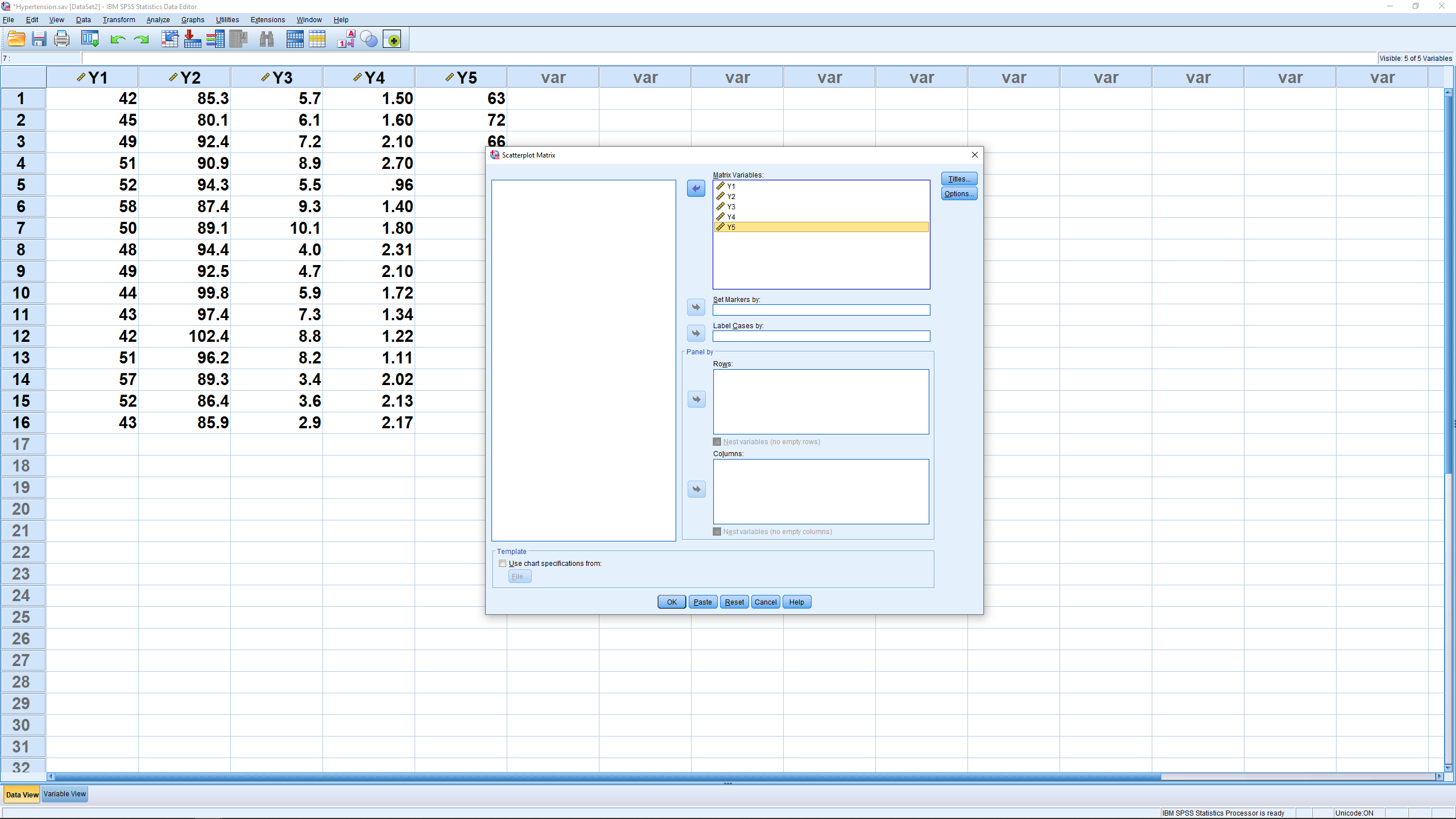
Instead of picking Simple in the graph pop up menu, pick Matrix Scatter and move all of the variables over for analysis in the menu that pops up after that:
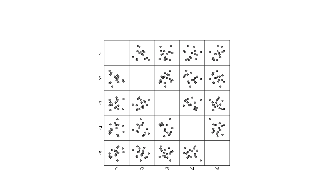
The result is a matrix of scatterplots:
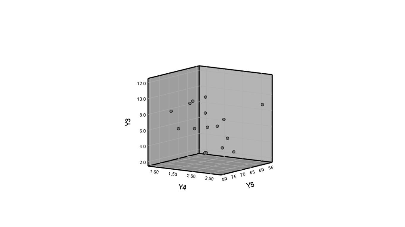
Finally, for fun, pick 3D scatter in the first pop up menu and then pick three variables to get:
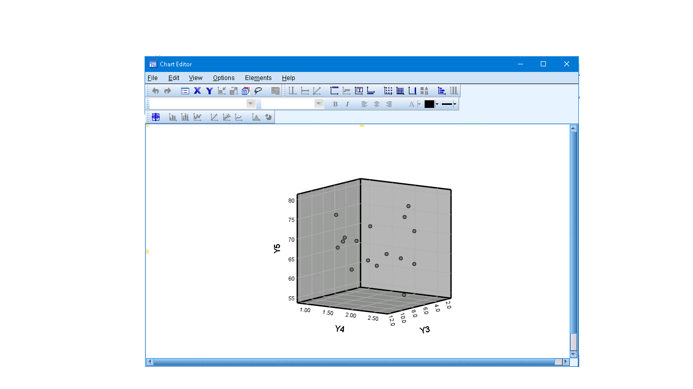
If you double click on the graphic, it will pop out into a Chart Editor and you can select a 3D rotation icon at the top (the little helper pop ups can help you find it):
After you click the 3D rotation icon at the top, you can grab the 3D plot with the mouse and rotate it around.
