
16.2 Causes of Climate Change
What Is Climate?
Our day-to-day experience of the Earth system is in the form of the conditions we experience at Earth’s surface. The daily conditions that we think of as weather—the temperature, presence or absence of precipitation, winds, humidity, and so on—are a snapshot of the state of the Earth system at a particular instant in time and in a particular location. The weather that we get is variable, but in Saskatchewan most people would not be surprised to experience summer days with temperatures of 20 °C to 30 °C, and winter days with temperatures between –20 °C to –30 °C. Our notion of what summers and winters are generally like reflects our understanding of Saskatchewan’s climate. If we get a day in July with a daytime high of 10 °C, that would seem like unusually cold weather because we know it is uncharacteristic of the climate over all.
We characterize the climate by collecting data about the weather every day, and then calculating the average conditions over a period of decades. The Government of Canada provides averages for the periods 1961 to 1990, 1971 to 2000, and 1981 to 2010 in an online database that is searchable by geographic location or station. Data measured at Saskatoon’s Diefenbaker International Airport show that the average annual temperature from 1981 to 2010 is 0.6 °C higher than the annual average from 1961 to 1990, due warmer conditions in the winter and early spring (Figure 16.3).

The climate as represented by the 1961 to 1990 interval was slightly cooler than the climate represented by the 1981 to 2010 interval. People who lived in Saskatoon between 1961 and 2010 may or may not have a sense that the weather they experienced from day to day was different for those intervals. In fact, some may have the record high of 35.3 °C on September 4, 1978 seared into their memory, and feel that Septembers just aren’t as hot as they used to be. They would be correct that as of 2017, there are no September temperatures recorded at the Diefenbaker International Airport weather station with a daytime high greater than 35.3 °C. But if that gave them the impression that Septembers are cooler on average today than in the past, that would not be consistent with the data.
Climate-Forcing Mechanisms
A climate-forcing mechanism is a process that causes climate to change. Climate forcings work by initiating changes in how heat energy moves into, through, and out of the Earth system. When we discuss a particular climate change event, the climate-forcing mechanism is what initiated the change. Feedbacks also alter climate, but we want to know what triggered the feedbacks in the first place.
Climate Forcing by Changes in Insolation
Insolation, or incoming solar radiation, refers to how much of the sun’s energy reaches Earth’s surface in a given period of time. Insolation is measured in Watts per square meter (W/m2).
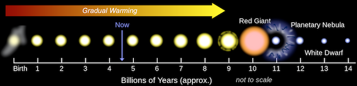
Long-term Solar Evolution
Over the long term (billions of years), stars like our sun become larger, brighter, and hotter (Figure 16.4). Earth receives 40% more heat from the sun today than it did 4.5 billion years ago. In Figure 16.4, the blue Now arrow shows the sun’s current point in its life history. Although the blue arrow appears to indicate an instant in time, the time interval reflecting the duration of human existence on Earth is but a tiny fraction of the width of the line. As far as human experience is concerned, the long-term evolution of the sun is so slow that it has made no difference at all on insolation for the entire time humans have existed.
Orbital Cycles
Insolation is also affected by cyclical changes in Earth’s orbit and rotation. Over intervals of approximately 100,000 years, the eccentricity of Earth’s orbit changes. Eccentricity is a measure of how elliptical a circle is. Higher eccentricity means that the orbit is more elliptical (Figure 16.5, left, blue orbit), whereas lower eccentricity means the orbit is more circular (Figure 16.5, left, red orbit). Eccentricity is important because when it is high, the Earth-sun distance varies more from season to season than it does when eccentricity is low.
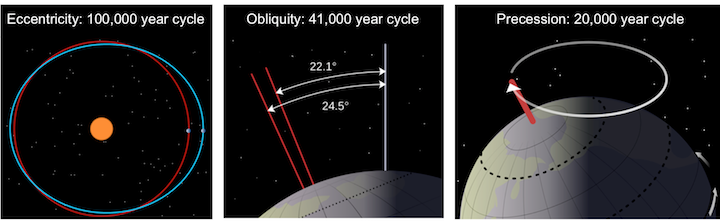
Over intervals of approximately 41,000 years, the obliquity of Earth’s axis of rotation changes (Figure 16.5, middle). This results in a nodding motion that alters how directly the sun shines on Earth’s poles. When the angle is at its maximum (24.5°), Earth’s seasonal differences are accentuated. When the angle is at its minimum (22.1°), seasonal differences are minimized.
Cycles of precession happen over intervals of approximately 20,000 years, causing Earth’s axis of rotation to wobble (Figure 16.5, right). This means that although the North Pole is presently pointing to the star Polaris (the pole star), in 10,000 years it will point to the star Vega.
The importance of eccentricity, tilt, and precession to Earth’s climate cycles (now known as Milanković Cycles) was first pointed out by Yugoslavian engineer and mathematician Milutin Milanković in the early 1900s. Milanković recognized that although the variations in the orbital cycles did not affect the total amount of insolation that Earth received, it did affect where on Earth that energy was strongest. Glaciations are most sensitive to the insolation received at latitudes of approximately 65°. As continents are configured today, this is most significant at 65° N, because there is almost no land at 65° S.
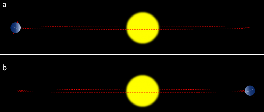
The most important factors are whether the northern hemisphere is pointing toward or away from the sun at its closest or farthest approach, and how eccentric the sun’s position is in Earth’s orbit. For example, if the northern hemisphere is at it farthest distance from the sun during summer (Figure 16.6, top), this means cooler summers. If the northern hemisphere is at its closest distance to the sun during summer (Figure 16.6, bottom), this means hotter summers. Cool summers — as opposed to cold winters — are the key factor in the accumulation of glacial ice, so the upper scenario in Figure 16.6 is the one that promotes glaciation. This factor is greatest when eccentricity is high.
The effects of all three cycles are evident in geochemical climate data. Figure 16.7 shows the “signals” for obliquity (A), eccentricity (B), and precession (C) over a period from 800,000 years in the past, to 800,000 years in the future. The vertical black line running down the middle of the diagram marks the present day. When the insolation from all three signals is determined, the result is a more complex waveform (D) with times of low variation in insolation, and times with higher variation in insolation.
The graphs E and F are climate information measured in microfossils dwelling at the ocean floor (E) and in water from ice cores (F). Peaks in temperature in F correspond to peaks in the oxygen isotope record in E, which indicate that it was warmer, there was less ice, and sea level was higher. Troughs are times when Earth was deep within an ice age. It was cooler, there was ice on land, and sea level was lower.
The vertical dashed lines on the left-hand side of Figure 16.7 mark the times of peak warm temperatures and allow for comparison of the timing of the temperature peaks with the timing of the orbital cycles. Peak temperature events are approximately 100,000 years apart, suggesting that the eccentricity cycle might be the most important contributor. Indeed, in B most (but not all) of the peak temperature events correspond to a time when Earth’s orbit was at or near peak eccentricity for that cycle.
It is tempting to conclude that eccentricity is the most important orbital cycle for climate change over all. However, this pattern only began a little over 1 million years ago. For 1.5 million years before that, the 41,000-year obliquity cycle seems to dominate insolation cycles.
In general, times of warmest or coolest temperatures don’t line up perfectly with orbital cycles. There is no one orbital cycle that is most important for all of Earth history. It is also the case that changes in insolation due to orbital cycles are not sufficient to cause temperatures to change as much as the geological record says they have; feedbacks must be factored in to explain the observed temperature changes.
Sunspot Cycles
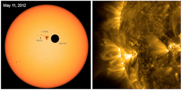
Sunspots are dark patches that appear on the surface of the sun as a result of intense local disturbances in the sun’s magnetic field (Figure 16.8, left). Loops of plasma (gas with electrical charge, Figure 16.8, right) follow along magnetic field lines from one sunspot to another.
Sunspots appear dark because they are lower-temperature regions on the sun’s surface. For that reason you might think that more sunspots means a reduction in insolation. In fact, just the opposite is true, because sunspots are a side-effect of increased solar activity. Peaks in the number of sunspots counted annually since approximately 1870 (Figure 16.9, blue), coincide with peaks in measurements of solar energy output from the same time period (Figure 16.9, pink).
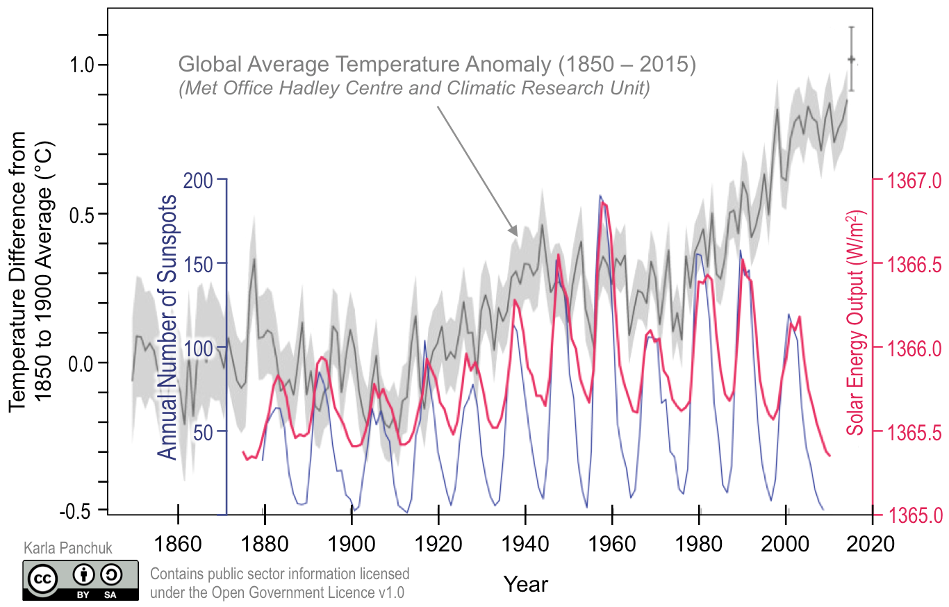
Sunspot cycles happen over approximately 11 year intervals, and the changes in insolation that occur during these cycles are relatively small. In the end the effect of sunspot cycles on climate can be lost amidst other factors. In Figure 16.9 there is no clear relationship between the sunspot cycles and the global average temperatures (in grey) reported for the same period.
Be Aware of Graph Scales
Figure 16.9 shows three kinds of data: temperatures, sunspot numbers, and solar energy flow. Each of these data sets is a different type of information, so each needs its own vertical axis. The vertical axes are scaled so that the data fill the area of the graph as much as possible. Stretching the vertical scale to fit the full plotting area makes it easier to see how well the peaks and troughs in each record line up with each other. Unfortunately, this can also skew our impression of the data. For example, in the period from 1880 to 1920, all three records have a similar vertical distance from peak to trough. In other words, all three records have approximately the same size of wiggles. This does not mean that the change in insolation from sunspot cycles was big enough to cause all of the variation in the temperature record. From this graph alone, there is no way to tell how much the change in insolation due to sunspot cycles mattered to global temperatures during the period 1880 to 1920.
Climate Forcing by Changes in Heat Transport
The ocean transports large amounts of heat around the Earth through a conveyor-belt-like system of currents. The ocean has surface currents that are driven by wind, but it also has deeper currents that are not wind-driven. The deeper currents behave like stacked rivers because they are different temperatures and have different salt contents, and therefore different densities. The differences in density between these water masses are what drive circulation. Circulation that is driven by density is called thermohaline circulation; thermo refers to heat and haline refers to salt.
To see how this works, consider the warm and saline Gulf Stream current (Figure 16.10, top). It flows northward past Britain and Iceland into the Norwegian Sea, and cools as it moves north, becoming denser. Its high salinity contributes to its density, and it sinks, or downwells, deep beneath the surrounding water, forming the North Atlantic Deep Water (NADW) current that flows south. Meanwhile, at the southern extreme of the Atlantic, very cold water adjacent to Antarctica also sinks to the bottom to become the Antarctic Bottom Water (AABW) current. The AABW flows north, beneath the NADW.
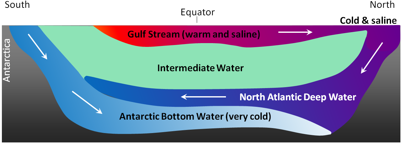
The water that sinks in the areas of deep water formation in the Norwegian Sea and adjacent to Antarctica moves very slowly at depth. It eventually resurfaces, or upwells, in the Indian Ocean between Africa and India, and in the Pacific Ocean, north of the equator (Figure 16.11).

Some ocean currents move warm water from the equator toward the poles. As in the example of the Drake Passage, the path of warm currents can have a significant impact on the climate of a region, and potentially of the planet as a whole. Processes that disrupt the density of seawater can slow or stop currents, preventing warm water from reaching higher latitudes. The recovery from the last ice age is characterized by sudden returns to glacial conditions over as little as 3 years. This is thought to be the result of enormous glacial lakes forming on continents as the glaciers melted, then being suddenly released into the ocean by a burst ice dam. The glacial water would be very cold, but it would also be fresh, making it less dense than the ocean water. The fresh glacial water would form a cap and slow the downwelling conveyor belt at high latitudes.
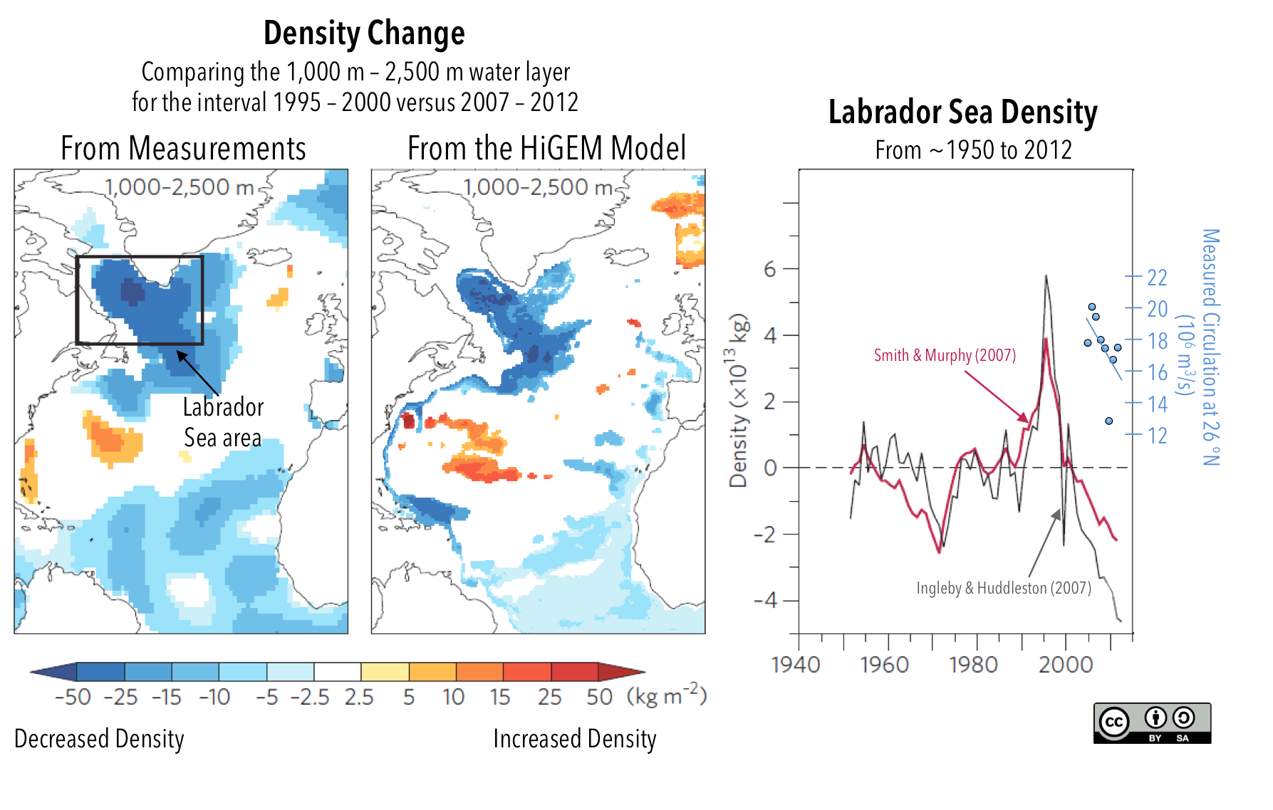
Scientists are trying to determine the current and past state of the Atlantic-basin system of circulation, called the Atlantic Meridional Overturning Circulation (AMOC), to tell whether it is changing in response to warming and adding fresh water from melting ice sheets. The AMOC varies considerably on decadal cycles because of cycles in the wind patterns in the Atlantic, so it is important to distinguish these cyclical changes from any longer-term underlying changes.
Because of these studies, we have an idea of what the physical properties of the Atlantic Ocean look like when circulation is stronger or weaker. When circulation slows, the density is lower in the downwelling regions (Figure 16.12, blue patch in the Labrador Sea). The density is higher south of this region, along the eastern coast of the United States and southern Canada (Figure 16.12, orange patch). Model simulations are used to confirm that the changes in density we observe are consistent with how we understand the circulation system to work.
Measurements of the actual flow rate at depth in the Atlantic Ocean (Figure 16.12, right, blue dots) confirm that density decreases in downwelling regions (black and red lines) when circulation slows. A more recent study (Caesar et al., 2018) has shown that observed and model temperatures follow the same pattern, with cooling where the blue patches are in Figure 16.12, and warming in the region of the orange patches. This is to be expected because the slowdown in circulation affects how heat is moved northward.
Is Atlantic Circulation Slowing Down More than Usual?
Changes in the Atlantic meridional overturning circulation (AMOC) happen from decade to decade. To know whether circulation is changing compared to what is normal, it is necessary to get information about what circulation looked like in the past. This is difficult to do, because measurements of circulation rates, temperature, and salinity don’t go back as far as we need them to.
In a new study, Thornalley et al. (2018) have used geochemical analyses of microfossils to build a longer-term record of temperatures, then used that record to look for the temperature “fingerprint” of slowing AMOC, an increasing difference in the temperatures of surface waters compared to deeper waters in the downwelling zone (Figure 16.13, top). They observe a longer-term cooling trend beginning at the close of the Little Ice Age, suggesting that less heat is being moved toward the downwelling zone (labelled A on the globe in Figure 16.13).
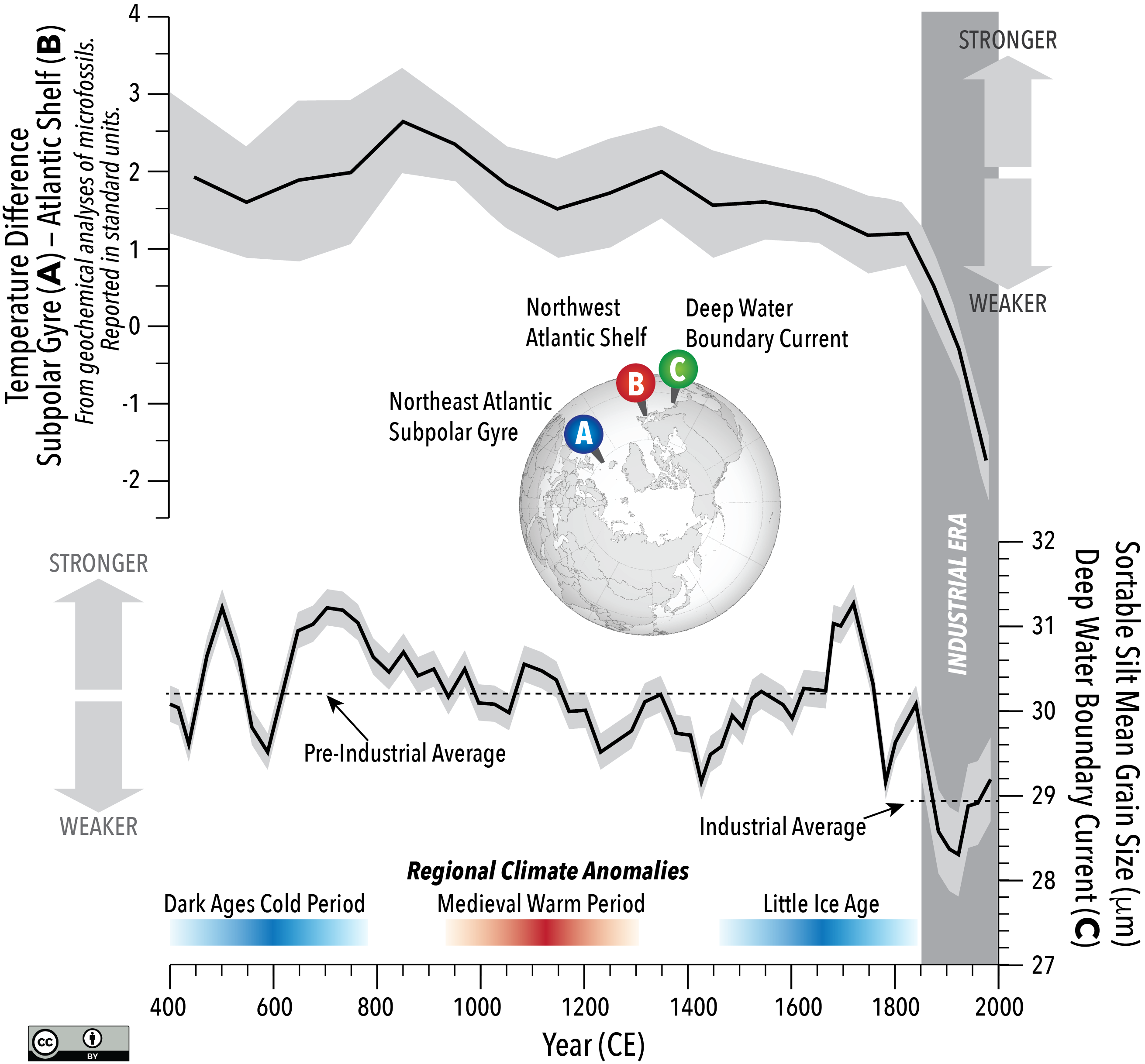
They also measured the size of silt grains on the sea floor, above which a southward-moving component of the AMOC system flows (location labelled C on the globe in Figure 16.13). Grain size is used as a substitute for a direct measure of ocean current velocity because the velocity determines what grain size can be carried. They identified a lower average grain size over the past ~150 years compared to the average grain size from earlier (Figure 16.13, bottom, dashed lines). The authors of the study note that the average grain size changes more during cold events in the Northern Hemisphere (the Dark Ages Cold Period and the Little Ice Age).
Thornalley et al (2018) conclude that the AMOC has been weaker on average during the past ~150 years than during the previous ~1,500 years. However, they cannot say for sure how much of that change is from melting that occurred at the close of the Little Ice Age, from melting triggered by warming since the Industrial Revolution, or some combination of the two. Direct measurements of density and current velocity tell us that as of 2017, the AMOC continues to weaken.
Plate Tectonics and Heat Transport
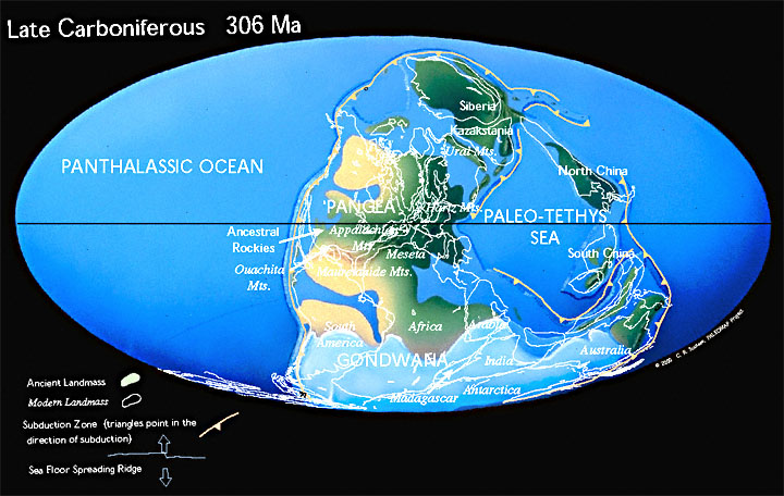
The opening of the Drake Passage is one example of how plate tectonic changes can affect ocean heat transport, and therefore climate. Plate tectonic changes that build or break up continents also play a role. When continents become large, ocean currents warm their margins, but the interiors can be much cooler. Anyone living on the Canadian prairies who has shivered through -40 °C temperatures in the winter, while watching news reports of rain in Vancouver will be familiar with this effect. When the supercontinent Gondwana was over the south pole approximately 300 million years ago (Figure 16.14), this triggered an ice age. The build-up of ice was hastened by the ice albedo feedback effect.
Short-Term Cycles in Heat Transport: El Niño Southern Oscillation
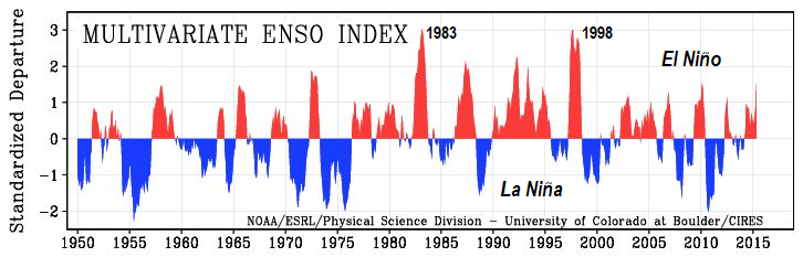
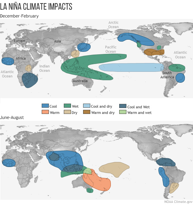
The El Niño Southern Oscillation (ENSO) operates on a much shorter timescale than climate forcings driven by plate tectonics or orbital cycles, alternating between El Niño and La Niña events on timescales of between two and seven years (Figure 16.15).
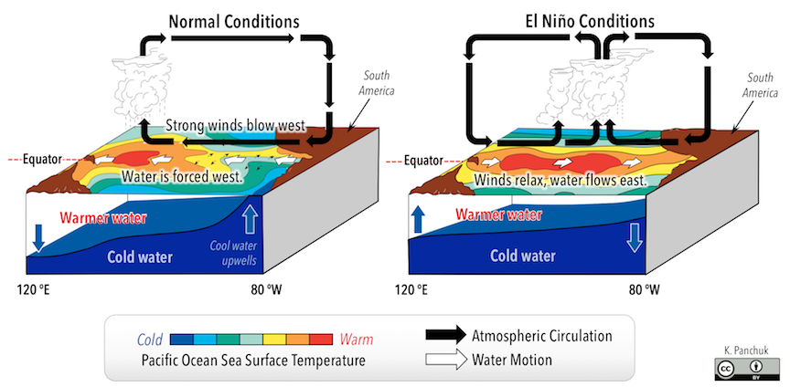
Under normal conditions, strong winds blowing westward across the Pacific cause water to pile up in the western Pacific. This forces deeper colder water to the surface in the eastern Pacific (Figure 16.16, left). During La Niña events, further intensification of winds causes even more cold water to upwell. During an El Niño event, the winds weaken, allowing water to flow back to the east (Figure 16.16, right). The cold water settles deeper once again, meaning that warmer water is present along the eastern margin of the Pacific Ocean.
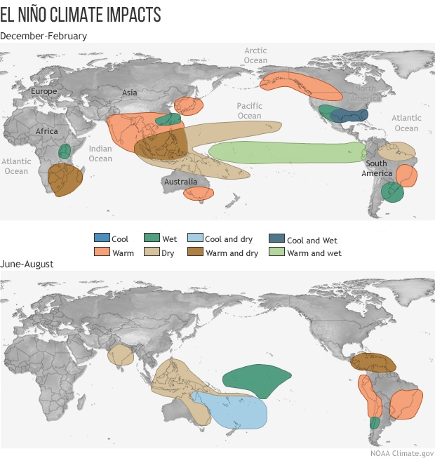
ENSO events affect weather on a global scale (Figures 16.17 and 16.18). In western Canada, El Niño years have warmer than average winters, whereas La Niña years have cooler than average winters.
Climate Forcing by Changes in the Atmosphere’s Energy Budget
Earth’s atmosphere regulates climate by controlling how much energy from Earth’s surface escapes to space, and how much of the sun’s energy reaches Earth’s surface.
Albedo
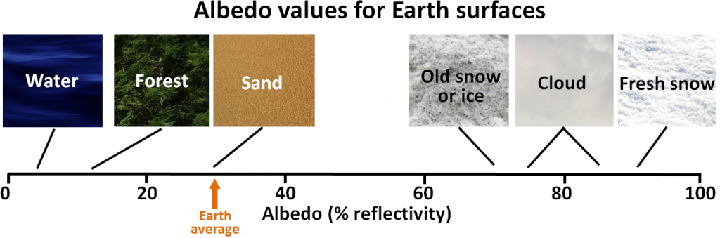
Albedo is a measure of the reflectivity of a surface. Earth’s various surfaces have widely differing albedos, expressed as the percentage of light that reflects off a given material. This is important because most solar energy that hits a very reflective surface is not absorbed and therefore does little to warm Earth. Water in the oceans or on a lake is one of the darkest surfaces, reflecting less than 10% of the incident light. Clouds and snow or ice are among the brightest surfaces, reflecting 70% to 90% of the incident light (Figure 16.19).
Albedo, Feedbacks, and the Acceptance of Milanković Cycles as a Climate Forcing Mechanism
When Milanković published his hypothesis in 1924, it was widely ignored, partly because it was evident to climate scientists that the forcing produced by the orbital variations alone was not strong enough to drive the climate changes of the glacial cycles. Those scientists did not recognize the power of positive feedbacks. It wasn’t until 1973, 15 years after Milanković’s death, that sufficiently high-resolution data were available to show that the Pleistocene glaciations were indeed driven by the orbital cycles, and it became evident that the orbital cycles were just the first step, initiating a range of feedback mechanisms that made the climate change, many of which were related to albedo.
Consider the following:
- When large volumes of ice melt — such as the continental ice sheets of Antarctica and Greenland, as well as alpine glaciers— this decreases albedo. More solar energy is then absorbed by land, amplifying the increase in temperature.
- When sea ice melts and exposes water, the albedo of the exposed area decreases drastically, from approximately 80% to less than 10%. Far more solar energy can be absorbed by the water compared to the previous ice cover, amplifying the temperature increase.
- Sea level rises when ice and snow melt on land, and because seawater expands when heated. Higher sea level means a larger proportion of the planet is covered with water, which has a lower albedo than land. More heat is absorbed, amplifying the temperature increase. Since the last glaciation, a rise in sea level of approximately 125 m has flooded vast areas of land.
Exercise: Albedo Impacts of Vegetation Changes
Changes in climate can cause forests to be replaced by grasslands, which have higher albedo than dark forest cover. If deserts expand, vegetated areas can be replaced by higher-albedo sand. Many human activities affect albedo, including adding urban surfaces to an environment, and planting crops. Figure 16.20 shows a forest that has been clear-cut. If a clear-cut has an albedo similar to that of sand, how would clear cutting change the albedo of the area?
Note that trees cool their environment through transpiration, when they release water vapour from their leaves. Changes in local temperatures when trees are clear-cut also include the effects of reduced evaporative cooling. Changes in vegetative cover also affect the rates of CO2 uptake by plants.
Greenhouse Gases (GHGs)
All molecules vibrate at various frequencies and in various ways, and some of those vibrations take place at frequencies within the range of the infrared radiation that is emitted by Earth’s surface. Gases with two atoms, such as O2, can only vibrate by stretching (back and forth; Figure 16.21 top), and those vibrations are much faster than that of IR radiation. Gases with three or more atoms (such as CO2) can vibrate in other ways, such as by bending (Figure 16.21 bottom). Those vibrations are slower and allow the molecules to absorb and release infrared radiation.
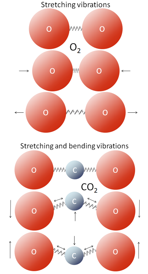
When infrared radiation interacts with CO2 or with one of the other GHGs, the molecular vibrations are enhanced because there is a match between the wavelength of the light and the vibrational frequency of the molecule. This makes the molecule vibrate more vigorously, heating the surrounding air in the process. These molecules also emit infrared radiation in all directions, some of which reaches Earth’s surface. Heating due to the vibrations of greenhouse gas molecules is called the greenhouse effect. Water molecules (H2O), and methane molecules (CH4) also interact with infrared radiation when they vibrate, so they are greenhouse gases as well.
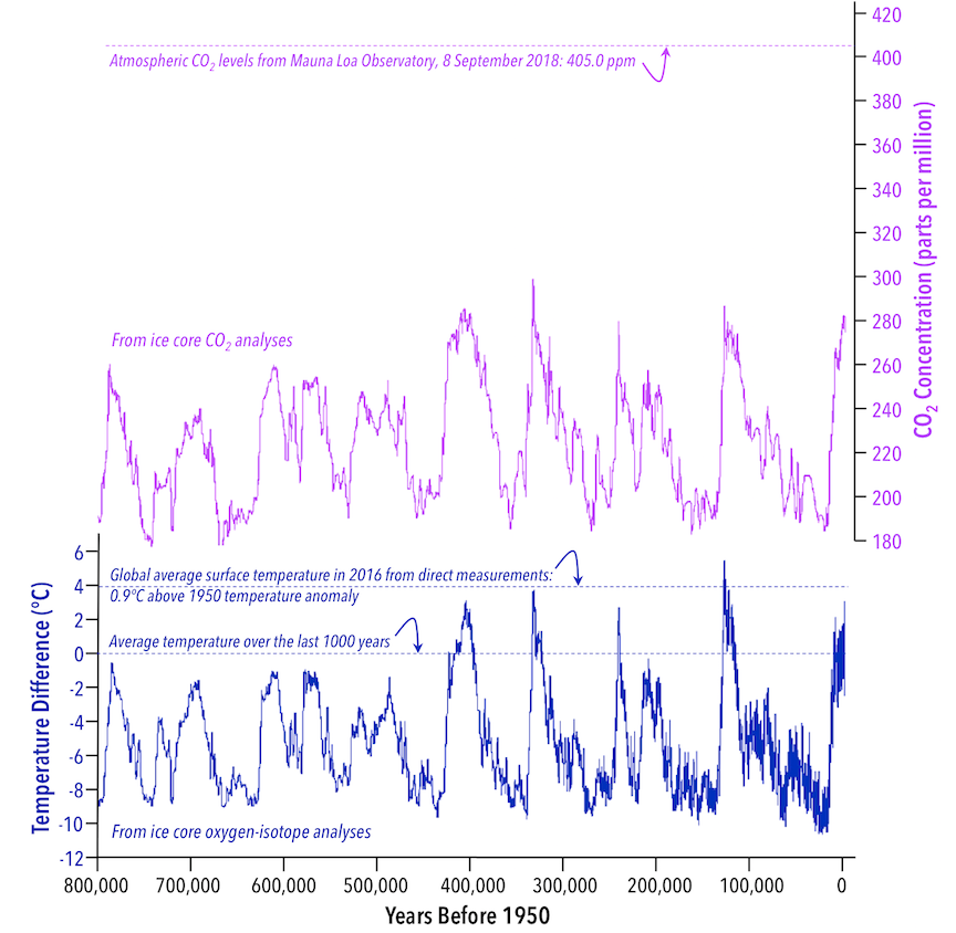
Ice core records show that over the last 800,000 years, rapid cycles into and out of glacial temperatures are associated with similarly-timed cycles in atmospheric CO2 levels (Figure 16.21).
Earth-System Response Time
You might have noticed that for most of the 800,000-year record in Figure 16.22, there is a fairly consistent relationship between scale of change in atmospheric CO2 levels and the resulting change in temperature. You might also have noticed that compared to most of the record, the rise in temperature since 1950 is unexpectedly small, given the increase in atmospheric CO2 levels since that time. The reason for the relatively small temperature increase in response to the recent CO2 increase is in large part because the recent rise in CO2 is happening far more rapidly than other parts of the Earth system can respond. The ocean in particular is slowing down the response.
The ocean takes up heat from the atmosphere, and thus helps to determine surface temperatures. A relatively cool ocean can take up more heat from the atmosphere, reducing warming. The fastest way for the ocean as a whole to take up heat is through the “stirring” that happens with ocean circulation, but circulation happens on thousand-year timescales. The slow rate of circulation means that centuries from now, there will still be cool water rising up from the deep ocean that has yet to be exposed to the warmer surface conditions. At other times in the 800,000-year record, changes in CO2 levels happened on timescales much closer to those at which the ocean takes up heat.
Atmospheric Effects of Volcanic Eruptions
Volcanic eruptions don’t just involve lava flows and exploding rock fragments. Eruptions also release particles and gases into the atmosphere. Important volcanic gases include water vapour, CO2, and sulphur dioxide (SO2). Volcanic CO2 emissions can contribute to climate warming if a greater-than-average level of volcanism is sustained over a long time. At the end of the Permian Period, the massive Siberian Traps were produced by eruptions lasting at least a million years. Large quantities of CO2 were released, warming the climate and triggering a cascade of Earth-system responses. The end of the Permian Period at 252 Ma is marked by the greatest mass extinction in Earth history.
Over the shorter term, however, volcanic eruptions can have the opposite effect, cooling the climate. SO2 reacts with water in the atmosphere to make droplets of sulphuric acid. The sulphuric acid droplets scatter sunlight, reducing how much of the sun’s energy can reach Earth’s surface. They also affect cloud formation. The volcanic cooling effect is relatively short-lived, because the particles settle out of the atmosphere within a few years.
Exercise: Climate Change at the end of the Cretaceous Period
References
Caesar, I., Rahmstorf, S., Robinson, A., Feulner, G., & Saba, V. (2018). Observed fingerprint of a weakening Atlantic Ocean overturning circulation. Nature 556. 194-196. https://doi.org/10.1038/s41586-018-0006-5 View abstract
Ingleby, B., & Huddleston, M. (2007). Quality control of ocean temperature and salinity profiles—Historical and real-time data. Journal of Marine Systems, 65, 158-175. doi:10.1016/j.jmarsys.2005.11.019 Full text
Jouzel, J., Masson-Delmotte, V., Cattani, O., Dreyfus, G., Falourd, S., Hoffmann, G., Minster, B., Nouet, J., Barnola, J.M., Chappellaz, J.A., Fischer, H., Gallet, J.C., Johnsen, S.J., Leuenberger, M., Loulergue, L., Luethi, D., Oerter, H., Parrenin, F., Raisbeck, G.M., Raynaud, D., Schilt, A., Schwander, J., Selmo, E., Souchez, R., Spahni, R., Stauffer, B., Steffensen, J.P., Stenni, B., Stocker, T.F., Tison, J.L., Werner, M., & Wolff, E.W. (2007). Orbital and Millennial Antarctic Climate Variability over the Past 800,000 Years. Science 317(5839), 793-797. Get data
Lüthi, D., Le Floch, M., Bereiter, B.; Blunier, T., Barnola, J.M., Siegenthaler, U., Raynaud, D., Jouzel, J., Fischer, H., Kawamura, K., & Stocker, T.F. (2008). High-resolution carbon dioxide concentration record 650,000-800,000 years before present. Nature (453), 379-382. Get data
Met Office Hadley Centre (n.d.) EN3: quality controlled subsurface ocean temperature and salinity data. Visit website (data available). Note: EN4 data set (new version) available here.
RAPID-AMOC (n.d.) RAPID: monitoring the Atlantic Meridional Overturning Circulation at 26.5°N since 2004. Visit website (data available)
Robson, J., Hodson, D., Hawkins, E., & Sutton, R. (2014). Atlantic overturning in decline? Nature Geoscience 7(2-3). https://doi.org/10.1038/ngeo2050 Open access version
Shaffrey, L.C., Stevens, I., Norton, W. A., Roberts, M. J., Vidale, P. L., Harle, J. D., Jrrar, A., Stevens, D. P., Woodage, M. J., Demory, M. E., Donners, J., Clark, D. B., Clayton, A., Cole, J. W., Wilson, S. S., Connelley, W. M., Davies, T. M., Iwi, A. M., Johns, T. C., King, J. D., New, A. L., Singlo, J. M., Slingo, A., Steenman-Clark, L., & Martin, G. M. (2009). U.K. HiGEM: The New U.K. High-Resolution Global Environment Model—Model Description and Basic Evaluation. Journal of Climate 22, 1861 – 1896. doi:10.1175/2008JCLI2508.1 Full text
Smith, D. M., & Murphy, J. M. (2007). An objective ocean temperature and salinity analysis using covariances from a global climate model. Journal of Geophysical Research, 112(C02022). doi:10.1029/2005JC003172
Thornalley, D. J. R., Oppo, D. W., Ortega, P., Robson, J. I., Brierley, C. M., Davis, R., Hall, I. R., Moffa-Sanchez, P., Rose, N. L., Spooner, P. T., Yashayaev, I., & Keigwin, L. D. (2018). Anomalously weak Labrador Sea convection and Atlantic overturning during the past 150 years. Nature 556, 227-230. https://doi.org/10.1038/s41586-018-0007-4 View abstract
