
5 Maps as Communication
Cartography as Communication
Cartography is a form of communication. The communication is largely visual and relies on various, but stringent, application of rules and guidelines. While language is a less visual form of communication, it is useful to use the concepts of grammar and syntax as they relate to cartography. Unlike language, maps and cartography involve iterative and complex decisions about what to include on the map and how is should be included. Using a variety of tools, such as colour, shape, and pattern in combination with the unalterable spatial relationships of the geography being mapped, the cartographer can compose a meaningful and communicative representation. Additionally, by treating cartography as communication it allows us (students, cartographers, researchers, etc.) to tap into the rich knowledge associated with the semantics of communication.
Grammar: set of rules governing sentence structure
Syntax: how sentences are laid out in order to create grammatical sentences
Semiotics: theory that sumarizes the relationship between reality, reference and those things that represent reality (signs)
Semantics: relationship between a sign (or symbol) and that which it signifies
Pragmatics: practical application of a sign
Unlike many other forms of visual and graphical communication, cartographers are limited by the need to accurately portray the geography of the part of the world being mapped. Furthermore, they need to use established coordinate systems, map projections, and restrict their map to a scale that is reasonable for the spatial extent being mapped and the format of the media being used to display the map. Maps can be displayed in a variety of sizes, from a section of a relatively small-paged book to a wall mounted map several feet in dimension. When combined with the geographic extent of the area being mapped (a city, state, province, country, etc.) and that area’s shape, the scale of the final product might be constrained, leaving the cartographer little flexibility.
Maps are symbols, maps are composed of symbols, therefore maps represent a form of symbolic communication. Furthermore, maps are simplifications of reality. The nature of this simplification is multifaceted and complex. A single map employs a cartographic scale to establish the quantitative relationship between the representation and what is being represented. Once a scale is put in place, the cartographer can set about making decisions about what to include on the map and how to include it, keeping in mind that a theme or topic and spatial extent (area of study) has been set. The unit of analysis might not yet be established, but based on the area of study and theme, it has likely been constrained.
When creating maps we must simplify geography, both its spatial and non-spatial aspects. In chapter 1 (Intro to Geomatics) the concept of combining spatial and non-spatial data to create geographic information was introduced. The non-spatial aspects are generally simplified into variables for which data is recorded. Each variable contains values that are a summary for a spatial entity (like an enumeration area, province, or neighbourhood, but the spatial entity doesn’t have to be an area). As a result, a social phenomenon (affluence, poverty, health, etc.) is summarized in a way that can be assessed and then assigned a value. That value is considered data. The value doesn’t have to be numeric, but it can be. The amount and type of information that is present in a piece of data is referred to as its Level of Information, there are four levels of information: Nominal, Ordinal, Interval, and Ratio, these are summarized below. The spatial/geographic components of what is mapped is also simplified. We’ve already seen (generally) how cartographic scale, geodetic datums, and map projections simplify reality, but cartography also simplifies the geometry of geography. Features that are “drawn” on a map are drawn as points, lines, or areas (even if they are not recorded as such in a database). By associating the spatial and non-spatial we have enough information to map geography.
Levels of Information
There are four levels of information, each level contains a specific amount of information.
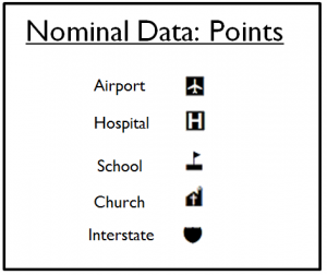
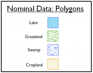
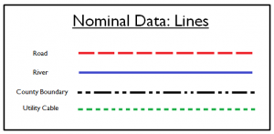
Nominal Information: Data is put into classes with distinct labels or names (nom); classes have no relationship to one another and are given no relative value (eye colour is an example). Nominal data is categorical and is not numeric. A common dilemma with nominal data occurs when the categories are recorded as numbers, it is important to distinguish between numbers that represent nominal categories and cannot (should not) be treated as numbers (added, subtracted, considered larger or smaller based on their numeric value).
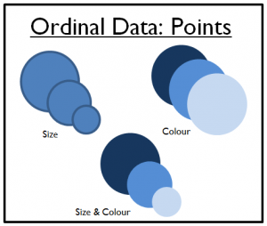
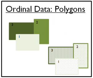
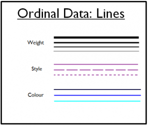
Ordinal Information: Data can be placed in ranked categories; categories are differentiated by position in the ranked scale; values can be greater or less than one another, but the magnitude of the difference between neighbouring values on the ranked scale cannot be determined (category 2 is not double or half of category 1). Differences cannot be measured; for height, all we can know is that A is taller than B, B is taller than C, and subsequently A is taller than C).
Interval Information: Data is given a value that is based on a fixed scale with no true zero value (arbitrary zero). Interval data may appear as though it can have complex operations performed on it, such as performing a ratio, division, multiplying, etc., but this is not true (i.e. 10˚C is not twice as warm as 5˚C).
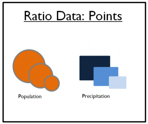
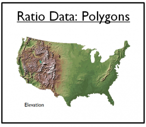
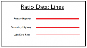
Ratio Information: Data exists on a scale with a constant interval between values and has an absolute 0. Ratio data can be multiplied by a constant, have a ratio applied to observations, and support complex analytical operations.
Levels of information are essential to many aspects of cartography and GIS. This importance is closely associated with how information is used to represent reality, or other information. In cartography, the map is a representation of reality that accurately depicts the geographic and non-geographic aspects of reality (those aspects important to the map’s objective).
So, from the very first steps in the mapping process the map maker is simplifying reality into information. The amount of information in that initial representation will affect the map making decisions that follow. Once something has been summarized as data, with a certain level of information, that is all the information we have. There is no going back to increase the amount of information available (without recollecting the data). Therefore, we have to be considerate of the amount of information available for mapping.
Symbology of Levels of Information
On the map, the symbols we use to display information also have a capacity for information. These are referred to as symbol variables. A symbol can have different colours applied to it (nominal) or be presented in different sizes (ratio, although size can be used to communicate ordinal, interval, or ratio information). A good guideline is to match the level of information in the map symbol to the level of information in the variable being represented. So, if the information is categorical (ethnicity, political party, etc.) then the map symbol variable should also be categorical (colour, shape, etc.). This matches the nominal level of information in the variable being mapped with the level of information in the map symbol.
Nominal:
Ordinal:
Ratio:
In a later chapter we will look at the special properties of colour and how the three elements of colour can be used to convey information. As a teaser, the three elements of colour are: Hue, what we would describe as different colours (purple, brown, magenta, etc.); Value, the amount of grey added to a colour (more grey is LOWER value); and Saturation, for a given value, this is the colour’s brightness.
Hue:![]()
Value: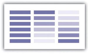
Saturation:![]()
Summary of the Levels of Information
