7 Cartographic Design
Maps are designed to communicate themes, reveal patterns, and store information. Achieving these goals relies on design principles that are both general and specific. Specific design decisions include composing a title, choosing a projection, map scale, spatial extent, classification scheme, and sharing references to data and sources. General design decisions include selecting colour schemes and typefaces for text and laying out the geographic space to be mapped and non-map elements (title, legend, north arrow, scale, etc.).
Map Elements
The following map elements are LOOSELY ordered based on the extent to which they are required, thematically essential, or optional. In selecting and applying each element, as with all decisions regarding map layout and design, decisions should made based on their service to the map’s objective.
Title: maps need titles, even a reference map. The map should pithily convey the maps theme and not overlap in content with the title of the legend. If the title “needs to be long,” this is an opportunity to consider how the title can be split between the Title and the Legend Title.
Legend: communicating the symbology of the map is accomplished via the legend. Legend content should be determined by the map, not the constraints on the legend’s position, size, orientation, etc. As a rule of thumb, the title of the legend should focus on the content of the legend as it supports the map’s theme. The worst title for a legend is “legend.”
Neatline: the line surrounding the geographic extent of the geographic space being mapped. Nothing geographic falls outside the neatline, but other elements can be placed within, outside, or straddling the neatline (legend, scale, title, north arrow, etc.)
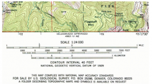
Scale: expressing the spatial relationship between the mapped space and that space’s extent in reality can be done in several ways. Like Orientation below, at very small scales, it can be hard to decide how to express scale (since the scale is often different for different parts of small scale maps). Scale can be expressed numerically as a ratio (1:50,000), “verbally” (1cm = 10km), or with a scale bar. Scale bars are elegant in their ability to communicate the scale of the map under conditions of zooming (if the final map is printed and expanded the two maps have different scales).
Orientation (North Arrow): not all maps need to have their orientation specified. Generally, as map scale decreases the need to communicate orientation (where is north) decreases. When the geography being portrayed communicates orientation, a north arrow, or other orientation information, is less necessary. Continental and world maps are good examples of maps that don’t need orientation information, in fact for small scale maps north arrows can be confusing. Place of a single north arrow might cause a map reader to wonder, “where is north from any point on the map and is a north arrow specifying the direction to north for its location on the map, for the map’s centre, or for some other location?” Orientation can be communicated by north arrow or by the inclusion of coordinate system information (lines of latitude and longitude, for instance).
Labelling: applying text to a map to indicate the names of features is useful for providing thematic context. A section on typography later in this chapter will cover labeling in more detail.
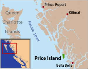
Locator Map: map of smaller dimensions AND smaller scale that indicates the geographic context of the main geographic extent of the map.
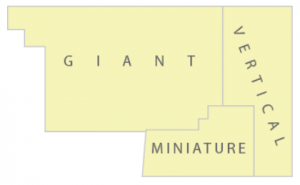
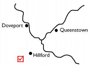
Callouts: using lines or other means to connect words or symbols with their associated place on the map. Callouts are especially useful for areas of a map that are dense with information.
Source material: basemap, spatial, and non-spatial information should be attributed to their sources. Generally this information is ancillary and should fall outside the neatline (at the very least) and not attract too much attention. Like references in written work, information about source material should be accessible but not distracting.
Text blocks (explanatory narratives): when a theme is complicated there are several means to provide information. In the previous chapter small multiples were mentioned; blocks of text can be added to provide context, extension, or simply to clarify topics of import that are complex.
Layout
There are many things to consider when laying out a map. The geography being portrayed (and its size, shape, and orientation) will help establish many of the initial parameters. Making a map of Rhode Island, Chile, or Saskatchewan presents a different geography from Montana, Canada, or the Hawaiian Islands (IMAGES). Also, the relationship between the place being mapped and the audience will determine whether a locator or inset map is necessary. The theme being mapped and that theme’s complexity will determine how many ancillary elements are required and how much space each might consume (title, legend, source material, etc.).
When a map reader first looks at a map, a cartographer should assume that they will look from top to bottom and left to right (like they might read a block of text). A good wikipedia entry on visual search can be found here: https://en.wikipedia.org/wiki/Visual_search. We can make elements of a map prominent to draw the map reader’s eye. This is sometimes called the pop-out effect; for instance, font size and colour (contrast) can be used to draw a map reader’s eye. In cartography we are sometimes constrained by the geography of our area of study and what places in that geography are important to the map’s theme. If an important cluster is located in the southern area of a north oriented map, the map reader will not immediately be drawn to that part of the map. If there is concern that such a delay might impede the map’s utility, the cartography can draw the reader’s attention with a design tool, such as drawing a prominent circle around the area or using a clear callout.
In general, when laying out a map the above set of map elements should be considered sequentially. As each element is added or considered, the previously included elements will provide context. Additionally, when a draft layout is accomplished, the map reader should consider the complete layout and return to each element, assessing its utility and whether it compliments the map’s theme and the other elements.
Figure – Ground
In design, the figure-ground relationship establishes, visually, that which appears to be in front of the other. Foreground/Background are synonyms. Various aspects of a visual display can manipulate what appears to be figure (in front) and what is the background (ground). Central position, texture, value (darker), complexity, among other things can make portions of a display appear to be in the foreground.
Typeface and Fonts for Mapping
Typography in cartography is an important ancillary component in the mapping process. The simultaneous goals are:
- to share information with the map reader that cannot otherwise be communicated visually on or with the map
- to NOT distract from the presentation of spatial and non-spatial information on the main body of the map (the geographic extent of the map)
Typeface: the collective shapes of letters that differentiate one collection from another. For a given typeface there can be many fonts (bold, narrow, italics, etc.). When a “font” is named (helvetica, garamond, georgia, etc.) that name refers to the typeface, although font is an acceptable synonym with all but the most pretentious (or typeface/font nerdy) audience.
Two categories of typefaces that are important to communication are Serif and Sans Serif forms. A serif is a small “tail” added to the of the lines that make up letters. Serif typefaces can be more easily read as the serif helps our eyes make the transition between neighbouring letters and words when reading. Serif type is often used in map titles, but not exclusively. Sans Serif type does not have these small tails. Sans Serif typefaces can be composed to lines of varying width, they are not restricted to a single line width.
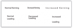
Spacing: When using text, the spaces that letters and words occupy can be manipulated. This is not a common practice in settings when large blocks of text are presented (books, manuscripts, essays, etc.) but is useful in graphic design (maps, cartoons, posters, etc.). Line spacing occurs when the space between separate lines of text is altered. Word spacing occurs when the space between separate words in a set of text is altered. Character spacing occurs when the space between separate letters in a word is altered. Kerning is the manipulation of letter-by-letter character spacing.
Arrangement: Unlike a lined page or a block of text, typography on a map is less constrained. This provides the map maker both opportunities and challenges. The text is generally shorter groups of words (or single words). Type might be ancillary to the geography (in the case of the legend and title) or it might be labeling the geography (rivers, town, landmarks, regions, etc.). In the latter case the constraint on placement is that the text should be easily associated with the feature it is labeling. There are some guidelines for features of each geometry: points, lines, and areas.
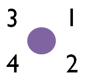
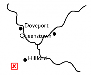
Points should be labeled so the label can be easily associated with the point symbol. The text can be above, below, or beside the symbol; generally a placement that results in the label “leading to” or “leading from” the symbol is preferred.
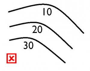
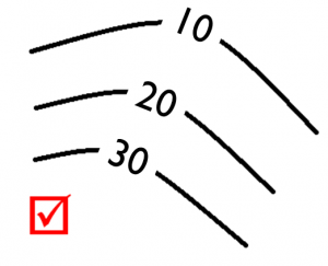
Lines should be labeled so that the text is above the line and follows its general form/shape (if the linear feature is not a straight line). Placement should result in the text flowing in a normal reading orientation (generally, upright from left to right). If the linear symbol is a complex curve (a meandering river or a mountain road) the curve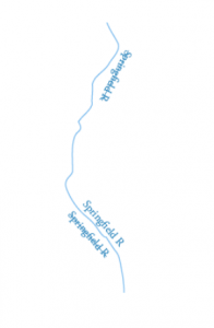 of the text should be less complex. Some linear features present themselves as special cases; the most common is waterways (rivers, creeks, lakes, etc.) that are linear but have area, (geometric polygons). In these cases the linear feature is labeled inside its area, the label follows its form, and the label might be repeated in case of long features. Furthermore, in the case of topographic maps, there are often even more guidelines that cover typeface and font characteristics. For instance, in Canada water features are labeled with a serif typeface in italics, and blue (darker than the blue of the “water” in the background). When linear features on long, text should be character-spaced, but not so much that the label is potentially unreadable; in the case of waterways, repeating the label is often preferred instead of character spacing.
Areas are labeled similarly to lines (but not identically). Labels should “fill and follow” the form of the area. Features are labeled once. For large features (or where there is a disparity between the space taken up by the label and the feature being labeled) character spacing and complimentary word spacing is recommended.