9 Colour Theory
Introduction
As described in the preceding chapter, colour is the result of how our eye processes incoming radiation in the visual portion of the electromagnetic spectrum. Interestingly, our vision, brain, and interactions between and among colours can have specific implications for what we see when presented with the same colour in different situations. Some of these interactions might be classified as optical illusions, others are simply the result of how colour is seen when placed in the context of other colours.
Colour Wheel
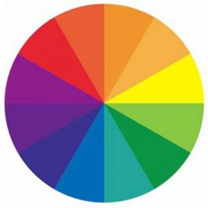
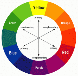
A (the) colour wheel is a useful tool for understanding and explaining the interactions and relationships between and among colour. It is arranged with colours that are near each other having similar properties. These colours (nearby) are called analogous. Colours on opposite sides of the colour wheel (such as red and green) have contrasting properties and are called complementary. Another property that is visually apparent is the non-visual feeling of colours arranged on the wheel; red, orange, and yellow are consider warm colours, which blue, green, and purple as cool colours. These properties can be useful on maps, as having a colour scheme range from cool to warm is intuitively interpreted as related to increasing value. Throughout this discussion of colour, it will be helpful to refer back to the colour wheel.
Colour Effects
There are many colour effects that are related to the integration of two or more colours on a single display or with a foreground and background colour. Rather than explain them all, you should read one of several online summaries.
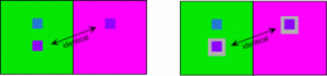
Simultaneous Contrast
When a single colour (see smaller “purple” square) is surrounded by different colours it might itself appear different. The lower square in the green box is the same color as the square in the purple box, it is easier to see this similarity (reduce the impact of the surrounding colour) by putting a neutral border around it.
Successive Contrast
When a colour influences perception immediately after seeing another colour.
For instance, stare at the box on the left, with attention on the grey box (really stare… drill into it!), after 30 seconds, switch your gaze to the box on the right, did you see a faint magenta square?
Colour Mixing
As described earlier, our eye anatomy is only sensitive to the wavelengths of three visual colours (Red, Blue, and Green). From these three incoming forms of radiation (colours) all other hues are can created.

This is accomplished through a process called Colour Mixing. As a result of different amounts of Red, Blue, and Green radiation reaching our retina our eyes generate input for a brain that produces all possible colours. If the only radiation that reaches our retina is in the red part of the electromagnetic spectrum, then we will see red. If equal amounts of red and green reach our retina we will see a different colour… YELLOW!
A good reference for colour mixing can be found at:
Colours are perceived in specific ways and the interaction of incoming red, blue, and green light is always the same for the same “amounts” of each type of radiation. We can explain the perception of different hues in two different way: Additive Colour Mixing or Subtractive Colour Mixing.
Additive Colour Mixing approaches hue production (what hue is perceived by our eye-brain matrix) from the perspective of what proportions of red, blue, and green light reach our retina, are perceived by our eyes’ cones, and are processed by our brain. The primary colours in additive colour mixing are red, blue, and green.
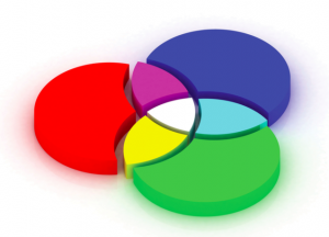
Subtractive Colour Mixing approaches hue production from the perspective of what proportions of red, blue, and green are MISSING from the light that reaches our retina. The primary colours of subtractive colour mixing are Cyan, Magenta, and Yellow. When our mind perceives the colour yellow, the only light reaching our eye is an equal mix of red and green. The primary colours for subtractive colour mixing are each the result of equal amounts of radiation reaching our retina from two of the additive primary colours.
Red + Green = Yellow
Red + Blue = Magenta
Blue + Green = Cyan
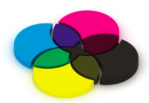
As a result, when working with paint, pigment, or other physical liquids or gels that are Yellow, Magenta, and Cyan, we can create by mixing different proportions of each all hues. Looking back at the colour wheel, it is more clear the relationships between the primary colours of each type, for each set of primary colours (additive = R, G, B and subtractive = C, M, Y) the other set of primary colours are the secondary colours.