
8 Introduction and Perceptual Elements of Colour
Introduction
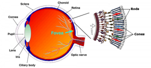
Colour is a fascinating topic; it is central to cartography, GIS, and remote sensing. Colour is important to all three cartographic traditions and is an essential element in creating images that can be used for interpretation and presentation. The concept of colour is made possible by our sense of vision. For geomatics and cartography, human vision will be categorized in two ways. First, we will discern between the two different receptors of visual information in the retina of our eyes. Our retina is the rear surface of our eye Rods and Cones (figure 1, anatomy of the human eye). Second, the cones of our retina will be classified as sensitive to different wavelengths of incoming light.
How Our Visual Perception Works
The rods are more sensitive to light than cones, and, as such, are responsible for visual perception during low light conditions. They are also more useful for picking up movement. Rods are not present at the centre of the retina (called the fovea), but are spread out across the rest its surface. Cones are highly concentrated at the centre. Cones are responsible for our ability to perceive colour. They are less sensitive to light, and the light reaching them is best perceived if it is direct.
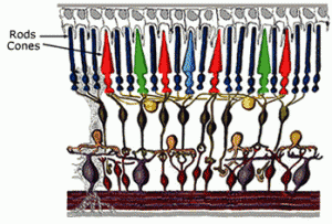
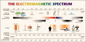
In almost all humans, our cones can be classified by the wavelength of incoming radiation (light) to which they are sensitive. Humans are called trichromats, which means our cones are sensitive to three different wavelengths of electromagnetic radiation (there are three types of cones, one for each range of wavelengths, see sidebar on electromagnetic radiation). The cones of our retina are sensitive to either red, blue, or green light. The wavelengths for red light are the longest; the cones for red are sensitive to radiation with wavelengths near 565 nm. Green light has wavelengths above and below 535 nm. Blue light has the shortest wavelengths (of the three), ranging around 420 nm. All of the colours we see are a result of different amounts of each of these three wavelengths of radiation reaching our cones. In a later section we will talk about theories of colour mixing and how different colours are created by mixing these primary colours.
(SIDEBAR) The electromagnetic spectrum is made up of radiation that ranges from long to short wavelengths (some might describe the range as very, very long to very, very short). Radiation can be of any wavelength, but ranges of wavelengths have been defined to differentiate between meaningful properties of the radiation within a range of wavelengths. The most important range of wavelengths for human vision is called the visible spectrum. It ranges from 360 nanometers (nm) and 780 nm. (SIDEBAR)
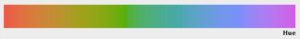
Visual Elements of Colour: Hue, Value, and Chroma
Hue is the aspect of colour that we normally associate with the names of colours, such as purple, brown, red, magenta, and chartreuse. Hues are created by combining different amounts of primary colours.
Value can be summarized as the amount of grey in a colour. At 100% the “colour” is black, but the amount of grey can range from 0% to 100%. Value increases when more of the hue is visually available, so value decreases as grey is added. Different hues respond differently (but continuously for a given hue) to the addition of grey. For instance, yellow can be perceived (as yellow) with the same percentage of grey that will make blue appear black.
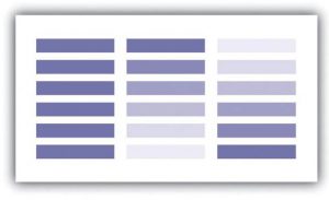
Chroma is the intensity of a hue. Like value, chroma can range from negligible (near 0%) to 100%. A colour presented with low chroma will appear light or “faded.” A low chroma colour will also be more sensitive to decreasing value (adding grey).

For cartography it is important to appreciate how the visual elements interact with the variables being mapped to communicate patterns, differentiate among variables or values, and either confuse or clarify a map’s message. Recall from earlier that both what we are communicating and how we are communicating it (the mix of colour elements we are using on a map or graphic) has an amount (level) of information, either nominal, ordinal, interval, or ratio. First, the level of information that each perceptual element conveys needs to be established. While hue (using different colours) can be used to convey value (ordinal and maybe interval, ratio) it is most logically applied to nominal variables. Value and Chroma can both be manipulated to communicate continuous change in ordinal, interval, or ratio variables. Generally, darker means more, so decreasing value or increasing chroma for higher values of a variable is a logical choice.
What can add complication is the relationship between a map’s theme and variable(s) being mapped. For instance, we can measure poverty by calculating the average household income and assigning colour to a choropleth map. However, the variable is income, so higher income indicates less poverty. In this case, it might be useful to reverse to application of the visual element being varied on the map (value or chroma) so that lower income values are assigned darker or brighter colours to indicate higher rates of poverty. It IS complicated; it is possible still, that such a map would be misinterpreted as many people will associated less income with poverty and might expect income to the variable used to represent poverty (or affluence).
