
Chapter 9. Earthquakes
Exercises on Earthquakes
Adapted by Joyce M. McBeth, Sean W. Lacey, Tim C. Prokopiuk (2018) University of Saskatchewan from Deline B, Harris R, & Tefend K. (2015) “Laboratory Manual for Introductory Geology”. First Edition. Chapter 13 “Earthquakes” by Randa Harris, CC BY-SA 4.0. View Source. Last edited: 23 Mar 2020
Name: _______________
NSID and student number: ____________
Date and lab section time: _____________
TAs’ names: _______________
Please hand in this lab to your TAs at the end of the lab period.
9-E1 LAB EXERCISE – LOCATING AN EPICENTER
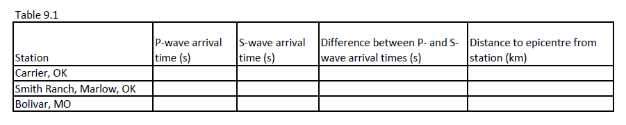
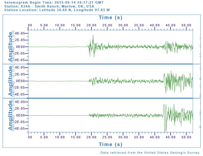
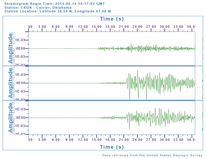
You will determine the location of an earthquake epicenter using seismograms from Carrier, Oklahoma, Smith Ranch in Marlow, Oklahoma, and Bolivar, Missouri. These are actual seismograms that you will be reading, from an actual earthquake event. For each seismogram, three different readouts are given, because the seismograph measured movement along three different axes simultaneously. You can use any of the three readouts for each station in your calculations, because each of the readouts will have the same arrival time for the different components of each wave.
First, determine the time when the P and S waves first arrived for each station. To identify the P and S waves, refer to the illustrations in the overview section of this chapter. Look for a pattern change as the amplitude of the lines gets bigger; this indicates the arrival of each of the waves. Mark both the arrival of the P-wave and S-wave on the seismogram, then using the time scale in seconds, determine the time difference between the P and S wave first arrivals. Write these times in Table 9.1 below for each of the three seismograms. (12 pts).
Source: USGS (2015) public domain, source webpage: https://earthquake.usgs.gov/
Source: USGS (2015) public domain, source webpage: https://earthquake.usgs.gov/
Source: USGS (2015) public domain, source webpage: https://earthquake.usgs.gov/
The difference between the P and S wave first arrivals will be used to determine the distances to the epicenter from each station in Figure 9-E4. Use Figure 9.11 from the overview section of this lab (replicated below) to determine the distance of the epicenter from each station. Make sure that you use the curve for the difference between the S and P wave first arrival times (S-P). Find the difference between the S and P first arrival times in seconds on the y-axis, draw a line over to the S-P curve at the same time, then draw a line down to the x- axis to determine the distance. Add the values to Table 9.1 above.
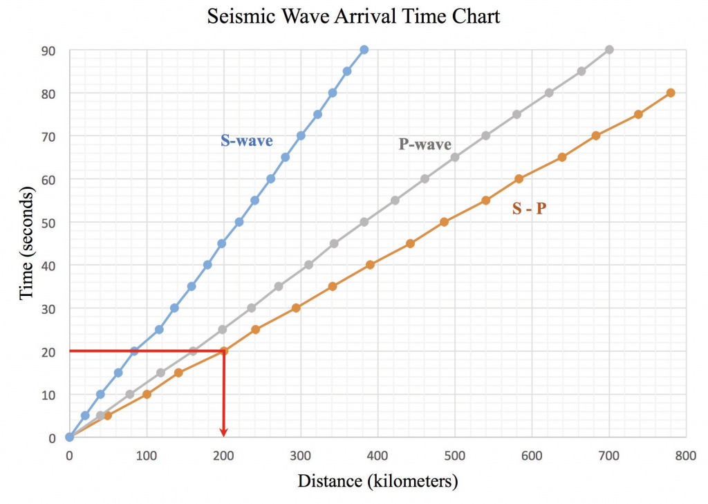
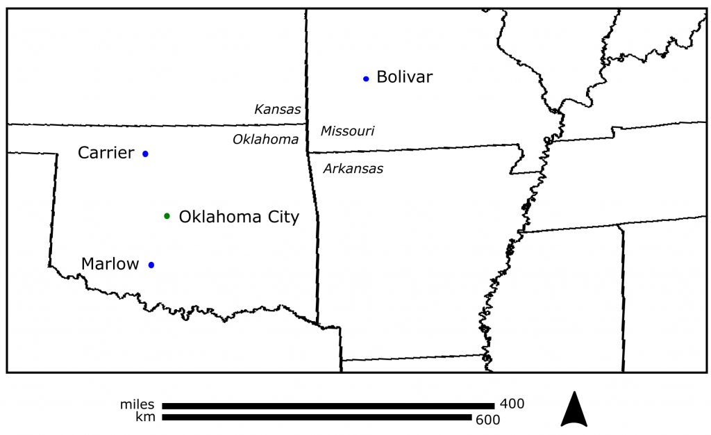
Figure 9-E4 is a map showing the three stations on it. Next, you will draw circles on this map to represent the distance of the earthquake epicenter from each station. Use a drafting compass to draw the circles. This map includes a legend in kilometers. For each station, note the distance to the epicenter. Measure the scale on the map in Figure 9-E4 in centimeters and convert your distances in kilometers to centimeters (e.g., if the map’s scale of 100 km = 2.1 cm on your ruler, and you had a measured distance from one station of 400 km, that would equal 8.4 cm on your ruler). For this fictional example, you would use a drafting compass to make a circle around the station that is 8.4 cm in radius (from the centre to the edge). Create a circle for each of the three stations, using their different distances to the epicenter. They should overlap (or nearly overlap) in one location. The location where they overlap is the approximate epicenter of the earthquake. (7 pts total: 2 points for each circle and 1 pt for location of epicentre)
1. (1 pt) For Carrier, Oklahoma, what is the approximate time of the arrival of the first P-wave?
a. 10 seconds
b. 15 seconds
c. 21 seconds
d. 30 seconds
2. (1 pt) For Smith Ranch, Marlow, Oklahoma, what is the approximate time of the arrival of the first S-wave?
a. 19 seconds
b. 22 seconds
c. 35 seconds
d. 42 seconds
3. (1 pt) For Bolivar, Missouri, what is the difference between the P and S wave arrival times?
a. 10 seconds
b. 20 seconds
c. 40 seconds
d. 55 seconds
4. (1 pt) What is the approximate distance to the epicenter from Carrier, Oklahoma?
a. 70 km
b. 130 km
c. 240 km
d. 390 km
5. (1 pt) What is the approximate distance to the epicenter from Smith Ranch, Marlow, Oklahoma?
a. 70 km
b. 130 km
c. 240 km
d. 390 km
6. (1 pt) What is the approximate distance to the epicenter from Bolivar, Missouri?
a. 70 km
b. 130 km
c. 240 km
d. 390 km
7. (1 pt) Look at the location that you determined was the earthquake epicenter. Compare its location to Oklahoma City. Which direction is the epicenter located from Oklahoma City?
a. southeast
b. northwest
c. northeast
d. southwest
9-E2 LAB EXERCISE – INDUCED SEISMICITY
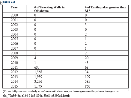
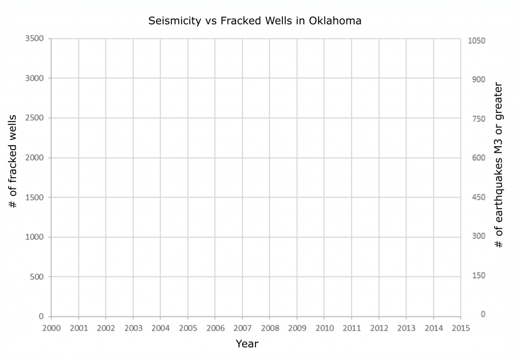
The table below contains data showing the number of fracking wells in the state of Oklahoma and the number of significant earthquakes (magnitude 3 or greater) that have occurred between 2000 and 2015. Before answering the questions for this lab exercise, plot the information in the table below on the graph that is provided. Note the graph has two y-axes, one for the number of fracking wells and the other for the number of earthquakes. Plot a line for each set of data on the graph, using the appropriate y axis for each set of data.
Your graph plot is worth 6 pts.
8. (1 pt) Referring to the graph, what year does the number of magnitude 3 or greater earthquakes begin to rise significantly?
a. 2007
b. 2009
c. 2010
d. 2015
9. (1 pt) What year does the number of fracking wells rise significantly?
a. 2007
b. 2009
c. 2010
d. 2015
10. (1 pt) Based on the graph that you constructed, do significant earthquakes and the number of fracking wells appear to be related?
a. Yes
b. No
9-E3 LAB EXERCISE – HISTORICAL EARTHQUAKE
The exercises that follow use Google Earth to explore a historical earthquake. The San Andreas Fault is ~1300 km long and it is located in California. In 1906, a major earthquake occurred along a portion of the fault.
Let’s start by examining the 1906 earthquake that hit Northern California using the USGS virtual tour of the 1906 earthquake website. Spend some time familiarizing yourself with the site. Scroll down to the section entitled “The Northern California Earthquake, April 18, 1906” and open the link. Scroll down and check out the Rupture Length and Slip.
11. (1 pt) How long was the rupture length (the length of the fault that was affected)?
a. 25 km
b. 194 km
c. 298 km
d. 477 km
e. 542 km
Horizontal slip, or relative movement along the fault, ranged from 0.5 to 9.7 meters. To envision this, imagine that you are facing an object directly across the fault from you. Suddenly, it moves up to 9.7 meters to your right! To visualize horizontal slip, geologists can plot the slip along the rupture as a histogram (a graph with distance on the x axis and the amount of slip on the y axis; higher bars in the plot represent regions with more slip). Check out the histogram of slip measurements along the fault by clicking the link Rupture Length and Slip; this will open a Google Earth file. If you do not have a computer with Google Earth available to you in the lab, your TA can open the file in Google Earth on the lab computer.
12. (1 pt) Locate the epicenter of the 1906 quake. Does the amount of horizontal slip decrease faster along the northern end or the southern end of the rupture?
a. northern end of the rupture
b. southern end of the rupture
Go back to the “The Northern California Earthquake, April 18, 1906” page in your browser and scroll down to check out the section on Shaking Intensity. Click on the link to the Shaking Intensity file to open it in Google Earth. If your map is difficult to read, remember that by clicking on a checked box in the Places folder in Google Earth, you can select the data you want to look at (and deselect data you do not want to look at). Use the search box to display the desired location for the questions below.
13. (1 pt) What was the shaking intensity like in Sacramento?
a. light
b. strong
c. severe
d. violent
e. extreme
14. (1 pt) What was the shaking intensity like in Sebastopol?
a. light
b. strong
c. severe
d. violent
e. extreme
Return to your browser window and navigate back to the main page of “The Northern California Earthquake, April 18, 1906”. Select “Earthquake Hazards of the Bay Area Today.” Check out the Earthquake Probabilities for the Bay Area.
15. (1 pt) Based on the map, would you be more likely to experience an earthquake of magnitude >6.7 by 2031 if living in the northwest Bay Area or southeast Bay Area?
a. northwest
b. southeast
Go back to the “Earthquake Hazards of the Bay Area Today” page and open the file “Liquefaction Susceptibility in San Francisco”. The red areas on the map are the areas in danger of liquifaction. Look at the overall trend in the areas affected by liquefaction.
16. (1 pt) Based on the liquefaction map, are areas more dangerous inland or along the coast?
a. inland
b. along the coast
