5
Joel Bruneau and Clinton Mahoney
Learning Objectives
- Define the concept of a market
- Describe a demand curve
- Derive market demand by aggregating individual demand curves
- Explain movements along versus shifts of the demand curve
- Calculate and interpret the price and income elasticity of a demand curve
- Derive and interpret an Engel curve
- Identify income effects and substitution effects that result from a change in prices
- Identify compensating variations and equivalent variations that result from a change in prices
Module 5: Individual Demand and Market Demand
The Policy Question: Should Your City Charge More for Downtown Parking Spaces?
Major cities have a significant number of parking spaces on public streets. In congested areas, such as downtowns, street parking is usually priced and limited in duration. Cities meter downtown parking for many reasons, including to raise revenue, ensure the frequent turnover of customers for local merchants, and ensure the availability of parking spot for those looking for parking. But how much should a city charge for parking in order to raise revenue or ensure available spots? The answer depends on understanding the demand for parking.
Demand is a natural next topic after the consumer choice problem of maximizing utility among competing bundles of goods, which we studied in Module 4. We saw in Module 4 that the solution to the consumer choice problem gives us, among other things, the individual demand functions. These functions tell us how much the individual consumer will demand of each good in order to maximize utility for any set of prices and income. And by taking into account all of the individual demands, we can come up with an overall market demand for a good.

Exploring the Policy Question
The main reason a city might want to set parking rates higher is to increase parking revenues or ensure enough available parking for those who drive downtown to conduct business—or both. For our policy question we’ll concentrate on the second objective: to ensure that customers who come downtown to shop will be able to find a place to park.
In order to think about the policy question we need to know the answers to two related questions: what factors affect the demand for parking and how sensitive is the demand for parking to price changes? Answering these questions will provide insight into the demand for parking in general and allow us to answer the central policy question of whether the price for parking in the downtown area should be higher.
5.1 The Meaning of Markets
LO 5.1: Define the concept of a market.
5.2 The Demand Curve
LO 5.2: Describe a demand curve.
5.3 Summing Individual Demands to Derive Market Demand
LO 5.3: Derive market demand by aggregating individual demand curves.
5.4 Movement along versus Shifts of the Demand Curve
LO 5.4: Explain movements along versus shifts of the demand curve.
5.5 Price and Income Elasticity of Demand
LO 5.5: Calculate and interpret the price and income elasticity of a demand curve.
5.6 The Engel Curve
LO 5.6: Derive and interpret an Engel curve.
5.7 Income and Substitution Effects
LO 5.7: Identify income and substitution effects that result from a change in prices.
5.8 Compensating Variation and Equivalent Variation
LO 5.8: Calculate and interpret compensating variation and equivalent variation for consumers.
5.1 The Meaning of Markets
LO 5.1: Define the concept of a market.
Broadly defined, a market is a place where people go in order to buy, sell, or exchange goods and services. Markets can be physical or virtual, large or small, for one good or many. In order to understand and derive demand curves we need to specify the particular market we are studying.
A market is always for an individual good at a specific price. We can define a collective good, like sandwiches, only if we can describe a single price—as opposed to distinct prices for cheese sandwiches, club sandwiches, and sub sandwiches, for example. There are many types of sandwiches, and therefore no one price exists. However, for a restaurant owner, the specific market for cheese sandwiches does not matter as much as how the market behaves for sandwiches in general. Just remember that when we are analyzing markets we are talking about a specific good with a specific price.
A market for a good is also defined by a place and a time. For example, we could study the market for iPhones in the United States in 2014 or in California in May of 2014, or even in Cupertino on May 5, 2014. In order to talk reasonably about a quantity demanded, we have to know who is demanding the quantity and when.
Sometimes the boundaries of a market are not entirely clear. Think about the market for telephone calls. Does this include wired home telephone service through dedicated wires (yes), telephone over coaxial cable (almost certainly), mobile phones (probably), voice over internet phones (maybe), texting (probably not)? We will return to this issue in future modules when we discuss market concentration, so for now just understand that market boundaries can sometimes be hard to define.
A market must have:
- A good specific enough to have a single price
- A defined time or time period
- A defined place
LO 5.2: Describe and draw a demand curve.
As we saw in Module 4, when we solve the consumer choice problem – that is we determine the optimal consumption bundle based on the current prices of the goods and the income of the consumer – we end up with a demand function.
A demand curve is a graphical representation of the demand function that tells us for every price of a good, how much of the good is demanded. As we saw from deriving the demand function in Module 4, other factors help determine demand for a good, namely the price of the other good and the buyer’s income. Holding the price of the other good and buyer’s income constant and changing prices, the demand function describes the optimal consumption quantity for every price–that is, what quantity the individual will demand at every price.
Figure 5.1 illustrates how the demand curve for coffee is derived from the consumer choice problem. In the upper panel, we see that as the price of coffee increases the consumer chooses to consume less and less coffee. In the lower panel we can plot the pairs of price and quantity of coffee consumed at that price to draw the demand curve.
Figure 5.1: Deriving individual demand curves from consumer consumption choices
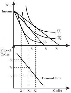
In the top graph of 5.1 the price of coffee increases from P1 to P2 and then to P3. Since this is an increase of the price of the good, this consumer chooses to consume less coffee as price increases. The bottom graph plot the combinations of prices of coffee and quantities consumed (demanded) of coffee: P1 and X1, P2 and X2 and P3 and X3.
Note that by keeping the price and income of other goods constant we are simply changing the slope of the budget line and anchoring it at the vertical intercept.
As an example, let’s consider Marco who eats burritos and pizza slices. Figure 5.2 describes his weekly consumption. The top panel shows his consumption bundles given the prices of burritos and pizza and his income. The bottom panel shows his demand curve.
In the top panel, we see that Marco has a weekly income of $15 to spend on burritos and pizza slices. Originally, when the prices are $1.50 each, he consumes 5 burritos and 5 slices of pizza. When the price of pizza falls to $1, Marco adjusts his consumption to 6 burritos and 6 slices of pizza. When the price of pizza slices falls for a second time to $0.50, Marco adjusts his consumption to 7 burritos and 9 slices of pizza.
For each price there is a unique solution to the consumer choice problem. By mapping the price and resulting optimal consumption pairs we can describe this individual’s demand curve for pizza slices, as shown in the bottom panel. At a price of $1.50 per slice, Marco demands 5. At a price of $1, Marco demands 6, and at a price of $0.50, Marco demands 9. We can plot these points on a graph that has price on the vertical axis and quantity of pizza slices on the horizontal axis.
By connecting these price-quantity points with a line, we graphically approximate the demand curve. These points are the same as the price and quantity pairs you would get directly from the demand function when you hold the price of the other good and income constant. The difference is that the demand function is continuous and therefore has a continuous graph that we can draw precisely. For our purposes now, the approximate demand curve is sufficient.
Figure 5.2 Marco’s consumption choices and demand curve for pizza slices
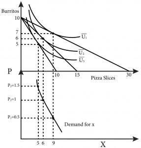
Note that as the price of a good declines, the consumer consumes more and more of the good because, holding the other price and income constant, the consumer’s income goes farther. In our example, this means that Marco consumes more of both burritos and pizza slices. His demand curve exhibits the law of demand: As price decreases, quantity demanded increases holding other factors such as income and the price of other goods constant. It is worth noting that this ‘law’ has limits – it does not hold for certain types of goods, as we will discuss later.
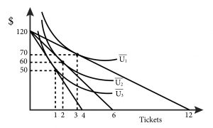
Figure 5.2.1
5.3 Summing Individual Demand Curves to Derive Market Demand
LO 5.3: Derive market demand by aggregating individual demand curves.
The demand curve we described for Marco’s weekly consumption of pizza slices is an individual demand curve. It tells us precisely how many slices of pizza Marco will demand for each price. But if you sell pizza slices in Marco’s neighbourhood, it does not tell you what the total demand for a week will be. In order to derive the market demand curve, we need to know the demand curve for every person in the neighbourhood.
As noted in Section 5.1, the market we are describing is the weekly demand for pizza slices in Marco’s neighbourhood. We are implicitly assuming that all pizza slices are identical, and that Marco and other demanders of pizza will buy it in the neighbourhood.
Suppose that there are only three people who eat pizza slices in the neighbourhood and one pizza vendor and that each customer has a demand curve for pizza slices identical to Marco’s. What is the correct way to think about the total or market demand for pizza? Consider what the pizza shop owner will experience:
- When she sets the price at $1.50 she sees three customers who each demand 5 slices of pizza or a total demand of 5+5+5=15 slices of pizza.
- When she lowers the price to $1, she sees a total demand of 6+6+6=18 slices of pizza.
- When she lowers the price to $0.50, she sees a total demand of 9+9+9=27 slices of pizza.
These are the three points on the total demand curve in Figure 5.3:
Q=15 at P=$1.50
Q=18 at P=$1
Q=27 at P=$0.50
Figure 5.3 The Total Demand Curve for Pizza Slices
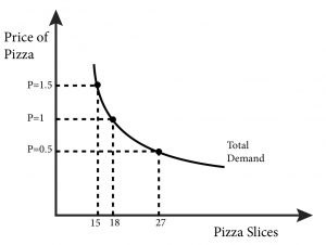
By connecting the three points with a line, we can approximate the actual demand curve. The key takeaway from this simple example is that we are summing up quantities at every price. Keep this in mind as we move on to demand functions.
What about making a total demand curve by aggregating demand functions? Let’s consider three simple individual demand functions for pizza for customer A, customer B and customer C:
PizzaA = 150 – p
PizzaB = 100 – p
PizzaC = 100- 2p
We want to sum them up to arrive at the total demand. Let’s start by graphing them, as shown in Figure 5.4.
Figure 5.4 Summing Three Demand Functions

We want total demand, which is the sum of all the quantities at every price or PizzaTOTAL =PizzaA + PizzaB + PizzaC. To get this, we can simply add up the left and right and sides of the equations above. If we did so we would get:
PizzaTOTAL = 350 – 4p.
Is this total demand function correct?
Consider a price of $25. From the individual demands, we know that qA = 125, qB = 75, and qC = 50, so the total demand is 250. If we put p=$25 directly into our total demand function, we get:
PizzaTOTAL = 350 – 4(25) = 250.
Another way of thinking about total demand is to sum the three demands in the individual graphs horizontally, which reveals a problem with our total demand function. Notice that at a price of 75:
PizzaA = 75, PizzaB = 25, and PizzaC = 0,
so the total demand is 100. Note that demands cannot have a negative number.
If we put p = $75 into the aggregate function we get:
PizzaTOTAL = 350 – 4(75) = 50.
In this case, we have not accounted for the fact that qC has stopped at zero. So we have not quite accurately described the total demand.
Note that the graph of each individual demand function has a different vertical intercept. So we have to account for the case where a demand goes to zero. For customer C this is at p=$50, for customer B this is at p=$100, and for customer C this is at p=$150. It’s important to note that for prices above $50 there are only two consumers who still demand, consumers B and A. And for prices above $100, only consumer A demands. We can express the demand curve by the function:
\begin{align*}
Pizza_{TOTAL} &= \\
350-4p, \,for\,p &\leq 50 \\
250-2p,\,for\,50 <p &\leq 100 \\
150-p,\,for\,100&< p
\end{align*}
This demand function is a bit complicated but makes sense if you focus on the prices when demand goes to zero for each consumer.
Figure 5.5 Total Demand Curve for Three Individual Demand Functions
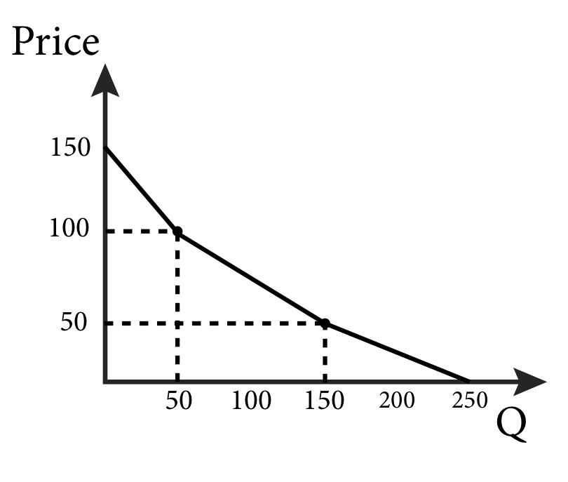
Graphing the total demand curve in Figure 5.5 reveals a kinked demand curve, but one that is downward sloping. When we examine a market with only a few potential customers, it is reasonable to expect kinks at the prices where potential customers turn into real customers. But it is easy to see that as we add more and more demand curves together, the individual kinks will become smaller and more frequent until. After we have added enough demand together, we get a smooth and downward sloping market demand curve.
5.4 Movements Along versus Shifts of the Demand Curve
LO 5.4: Explain movements along versus shifts of the demand curve.
The market demand curve describes the relationship between the price a good is offered at and the resulting quantity demanded. As the price of a good moves higher and lower, consumers demand different quantities of the good and the demand function and resulting graph change in response.
But we know that variables other than price can affect the demand for a particular good, for example:
- The income of consumers
- The price of complements and substitutes
A host of other factors might influence the consumer’s demand for a good as well, including advertising, the popularity of the good, and news stories about its health benefits or risks.
How do these potential impacts conform to our observation that the demand curve is simply a description of the quantity demanded for any given price? This is where the concept of ceteris paribus comes in: This Latin phrase means, roughly, all other things remain the same. Here, ceteris paribus means that any demand curve that we graph is for a specific set of circumstances–we are considering only the price of the good and holding all the other factors that affect demand constant.
Once we have a particular demand curve, we can observe what happens when a factor is allowed to change.
- Changes in price cause movements along the demand curve.
- Changes in factors other than the price of the good itself cause shifts of the demand curve.
Understanding shifts versus movements of demand curves can be challenging, so try a few examples in the Your Turn that follows.
Movement along the Demand Curve
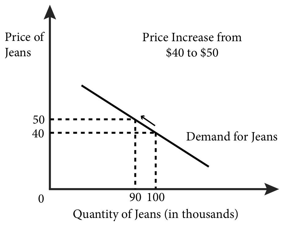
Figure 5.6 illustrates the market demand for jeans. We assume jeans are generic and leave unspecified the time and place of this market; these simplifications will make the analysis easier to follow. For a given and fixed set of factors – such as income, prices of other goods, and advertising – this demand curve describes the relationship between the price of jeans and the quantity of jeans demanded. We can see, for instance, that when the price of jeans increases from $40 to $50, the quantity demanded will decrease from 100,000 to 90,000. The change in price causes a movement along the demand curve.
Figure 5.6 A price increase or decrease causes movement along the demand curve.
Shifting the Demand Curve
So what happens when factors other than price change? Let’s start by thinking about incomes.
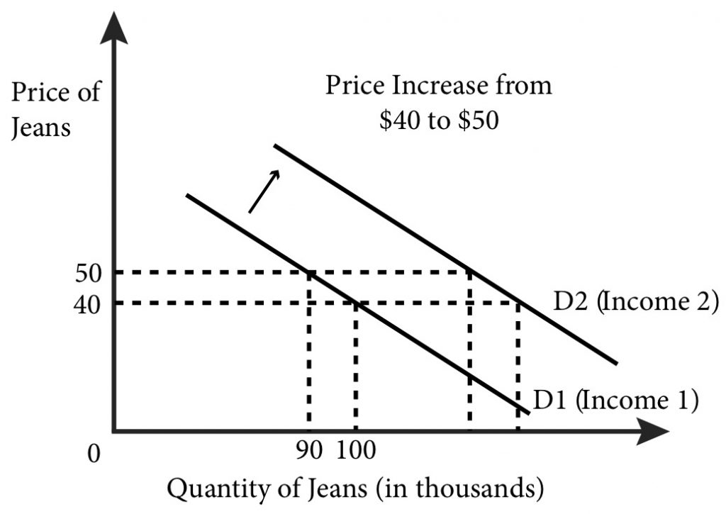
What would happen to demand if incomes increase, perhaps because the government sends everyone a tax rebate? It is reasonable to consider jeans a normal good, a good for which demand increases when incomes rise? How does this tax rebate affect our graph? When we say demand increases we mean that for every price we expect a greater quantity demanded after the income increase than before it. This means that at a given price, the quantity demanded increases, or shifts to the right, farther along the x-axis in our graph. In Figure 5.7, it is a parallel shift—the slopes of the original and revised demand curve remain the same–which might well happen. But in general we can only say that demand will shift rightward; the slope or shape of the graph could change after an income increase.
Figure 5.7 An increase in income shifts the demand curve to the right.
What about factors other than price, like the price of substitutes or an increase in advertising for jeans? Let’s try them both.
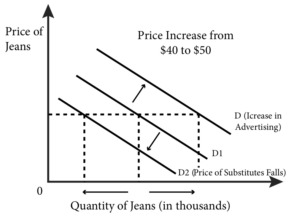
Suppose the price of khaki pants −a substitute for jeans − falls. It is reasonable to expect that consumers looking for new pants might decide to buy khaki pants rather than jeans? We should expect a decrease in the quantity demanded of jeans at any given price. This decrease causes the demand curve to shift to the left. Figure 5.8 shows the leftward shift of the demand curve due to a fall in the price of a substitute – khaki pants.
Suppose a jeans company hires a top model or celebrity to advertise its jeans. An increase in advertising for jeans should make potential consumers think more positively about jeans and increase their demand, which causes the demand curve to shift to the right. Figure 5.8 shows the rightward shift of the demand curve due to the new or increased advertising.
Figure 5.8 Changes in other factors shift the demand curve right or left.
For each change we have made in factors that affect demand, other than the price of the good, the demand curve shifted to the left or right. Here is a good rule to remember: Changes in the price of the good result in movements along the demand curve, while changes in any other factor that affects demand result in shifts of the demand curve.
5.5 Price and Income Elasticity of Demand
LO 5.5: Calculate and interpret the price and income elasticity of a demand curve.
Businesses, governments, and economists are interested in how sensitive demand is to changes in prices and income. For example, a city government might want to estimate the effect of a change in parking rates on its budget revenue. Because economists often like to compare markets across products, time, and units of measure, we prefer to have a measure of demand sensitivity that is unit-free. This means it doesn’t matter if we are talking about gallons of milk, liters of cola, pounds of flour, kilos of sugar, or pairs of socks. Similarly, we don’t want to worry about talking in 2014 Dollars, 1950 Dollars, or 1975 Pounds.
The way we measure demand sensitivity in a unit free way is to measure price elasticity of demand, which is the percentage change in the quantity demanded of a product resulting from a 1-percent change in price.
The price elasticity of demand is defined mathematically as:
[latex]E=\frac{Percentage\,change\,in\,quantity\,demanded}{Percentage\,change\,in\,price}=\frac{\Delta Q/Q}{\Delta P/P'}[/latex]
Where:
Δ (delta) indicates a change in a variable
| Value of Price Elasticity of Demand, ε | Description of Demand | Interpretation |
| 0 | Perfectly Inelastic | Quantity demanded does not change at all with price |
| From 0 to -1 | Inelastic | Quantity demanded is relatively unresponsive to price changes |
| -1 | Unit elastic | Percentage change in quantity demanded is equal to percentage change in price |
| From -1 to – | Elastic | Quantity demanded is relatively responsive to price changes |
| – | Perfectly Elastic | Quantity demanded goes to zero with any increase in price, and goes to infinity with any decrease in price. |


[latex]E_{x,y}=\frac{Percentage\,change\,in\,quantity\,demanded\,of\,good\,x}{Percentage\,change\,in\,price\,of\,good\,y}=\frac{\Delta Q_x/Q_x}{\Delta P_y/P_y}[/latex]
The cross-price elasticity of demand describes the sensitivity of demand for one good to a change in the price of another good. From this formula, we can quickly determine if two goods are complements or substitutes. A positive value of cross-price elasticity of demand means that an increase in the price of one good will increase the demand for the other. This indicates the two goods are substitutes: Consumers will substitute more of the other good as the price of the first good increases. Examples of substitutes are Coke and Pepsi, Apple computers, and PCs and private cars and public transportation. Similarly, if the cross-price elasticity of demand is negative, the goods are complements: Since they are consumed together, raising the price of one raises the price of the combination, so consumers cut back on both. Examples of complements are tortilla chips and salsa, iPods and headphones, and tennis rackets and tennis balls.
Economists are often interested in seeing how a change in income affects demand, for instance, how a government tax rebate will affect the demand for used economics text books. The income elasticity of demand is the percentage change in the quantity demanded for a product from a 1 percent change in income.
Income elasticity of demand is defined mathematically as:
[latex]E_I=\frac{\%\,change\,in\,quantity\,demanded}{\%\,change\,in\,income}=\frac{\Delta Q/Q}{\Delta I/I}[/latex]
Suppose that your income increases from $1,000 a month to $1,200 a month and your demand for songs on iTunes changes from 10 a month to 12 a month as a result. Let’s find the income elasticity of demand.
[latex]\frac{\Delta Q/Q}{\Delta I/I}=\frac{2/10}{200/1,000}=\frac{0.2}{0.2}=1[/latex]
Note that this value of 1 indicates that the income elasticity of your demand for iTunes is unit elastic. That is, the quantity response is proportional to the change in income.
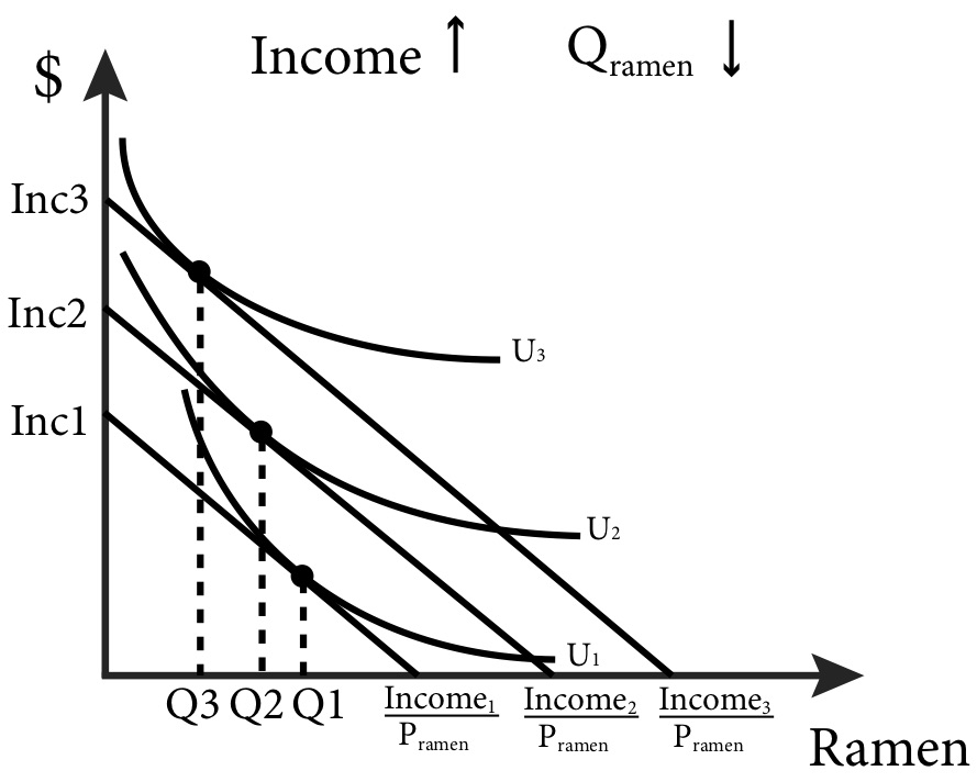
A positive value of income elasticity of demand indicates a normal good, a good for which the quantity demanded increases as income rises. We call goods for which the quantity demanded falls as income rises inferior goods. Inferior goods have a negative value of income elasticity of demand. Figure 5.9 shows an example of an inferior good: as income rises the quantity of ramen consumed falls.
Figure 5.9: Demand for an Inferior Good
Calculus: Appendix:
Elasticity Formulas Note that we can re-write the formulas for price and income elasticity of demand as:
[latex]E=\frac{\Delta Q}{\Delta P}\frac{P}{Q},E_{x,y}=\frac{\Delta Q_x}{\Delta P_y}\frac{P_y}{Q_x}[/latex] and [latex]E_I=\frac{\Delta Q}{\Delta I}\frac{I}{Q}[/latex].
Since the derivative gives the instantaneous rate of change, [latex]\frac{\Delta Q}{\Delta P}[/latex] can be expressed as the derivative [latex]\frac{dQ}{dP}[/latex].
Therefore, the elasticity formulas can be written as: [latex]E=\frac{dQ}{dP},E_{x,y}=\frac{dQx}{dPy}\frac{P_y}{Qx}[/latex] , and [latex]E_I=\frac{dQ}{dI}\frac{I}{Q}[/latex] .
EXAMPLE: If the demand function is: [latex]Q_D=100-\frac{1}{2}P[/latex] , the price elasticity of demand is:
5.6 The Engel Curve
LO 5.6: Derive and interpret an Engel curve.
Demand curves show the relationship between the price of a good and optimal consumption of that good. We can also identify the relationship between the income of the consumer and optimal consumption of a good. This relationship is called an Engel curve, named after the German statistician Ernst Engel.
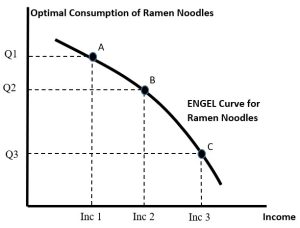
We assume that income is the independent variable that influences purchases. If we use figure 5.9 above, we can illustrate the Engel curve for ramen noodles. We start with income level 1 where the optimal choice of ramen noodles is Q1. This corresponds to point A in Figure 5.10 below. If we raise income to level 2, consumption of ramen falls to Q2 (point B). The downward sloping Engel curve tells us that ramen noodles are an Inferior Good. If we raise income even more to level 3, consumption falls even more (to point C).
Figure 5.10: Engel Curve for an Inferior Good
In general, Engel curves can be any slope and can change slope. See Figure 5.11 below.
Figure 5.11: Engel Curve with Changing Slope at Different Income Levels
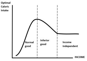
Consider the intake of calories from food. We know that if very poor households are given more income, they will spend more on food and so take on more calories. So for very low incomes, caloric intake is a normal good. But at higher incomes, it is entirely possible that households will lower caloric intake as they switch to more expensive foods, like fruits and vegetables, and away from high calorie fatty foods and carbohydrates. However, it is again possible that there is a minimum sustainable caloric intake that, once a household attains a certain income, will stay at that level. Hence, the Engel curve can change slopes depending on the nature of the good in question.
However, for most utility functions we will use, the Engel curve is upward sloping – reflecting that goods are normal. For instance, if [latex]U(x,y)=min[2x,y][/latex], then optimal consumption of goods x and y are [latex]x=\frac{M}{(P_x+2P_y)},\,and\,y=\frac{2M}{(P_x+2P_y)}[/latex].
Figure 5.12: Income Offer Curve (Income Expansion Path) and Engel Curve for Perfect Complements
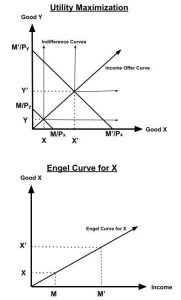
The slope of the Engel curve for good x is [latex]slope=\frac{\Delta x}{\Delta M}=\frac{1}{(P_x+2P_y)}[/latex], which is positive. Notice the higher the price of either good, the less responsive is consumption to changes in income. For instance, changes in Px or Py will rotate the Engel curve for good x downwards.
Note however, the elasticity of consumption to change in income is +1. That is, a 1% rise in income leads to a 1% rise in consumption of both x and y.
[latex]E_M=\frac{\frac{\Delta x}{x}}{\frac{\Delta M}{M}},\,or\,E_M=\frac{\frac{\Delta x}{\Delta M}}{\frac{M}{x}}[/latex].
Substituting the slope above gives us [latex]E_M=\frac{1}{(P_x+2P_y)}\frac{M}{\frac{M}{(P_x+2P_y)}}=+1[/latex].
This result makes sense. Since we are dealing with perfect complements, we can construct a composite good z made up of one unit of x and two units of y. Optimal consumption of the composite good is [latex]z=\frac{M}{P_z}[/latex]. So, if income doubles, consumption of the composite good will double. Therefore, consumption of x and y will also double.
5.7 Income and Substitution Effects
LO 5.7: Identify income and substitution effects that result from a change in prices.
Recall that the consumer choice problem is what gives us the individual demand curve. In Figure 5.10 changes in the price of jeans leads to different consumption choices of both jeans and khakis. We can see precisely how the fall in the price of jeans from $50 to $40 leads to the increase in demand for jeans. In the market, this increase was from 90,000 pairs of jeans to 100,000 pairs of jeans, but now we are back to an individual consumer who goes from purchasing 9 jeans to purchasing 10 jeans, let’s say in a year (yes, they buy a lot of jeans!).
Figure 5.13 Change in Consumption of Jeans in Response to a Price Change

Notice in the graph that after the price of jeans falls (again, assuming everything else held constant) the consumer increases not only the consumption of jeans but also their consumption of khakis. This result occurs because the real value of consumer income has increased; under the new prices the consumer can afford more of both goods. We call this an income effect: an increase in real income means the consumer purchases more of normal goods. Formally the income effect is in change in consumption of a good resulting from a change in a consumer’s income holding prices constant.
But something else has happened as well: the relative prices of the two goods have changed. Jeans are now relatively cheaper than they used to be compared to khakis. This change is a substitution effect – the change in relative prices means that consumers naturally consume more of the now relatively cheaper good compared to the now relatively more expensive good. Formally the substitution effect is the change in consumption of a good resulting from a change in its price holding the consumer’s utility level constant.
A question economists often ask is how much of the resulting change in consumption of jeans, what we call the total effect of the price change, is due to the income effect and how much is due to the substitution effect? They care about this because understanding how much of a change is due to each allows us to better predict the effect of changes in demand from changes in income and prices in the future. The easiest way to think about an answer is with a thought experiment: what if we could adjust the consumer’s nominal income after the change in price so that in the end they are no better or worse off? How would this income adjustment look on the consumer choice graph?
Let’s start with the condition that the consumer is no better or worse off after the change in price than before it. This means that, by definition, the consumer must still be consuming on the same indifference curve. So, after the change in price we adjust the nominal income such that the new budget line just touches the old indifference curve. Remember that changes in nominal income lead to shifts in the budget line but do not change the slope. If we shift the new budget line back to where it just touches the indifference curve, we can find the bundle that the consumer would choose under these hypothetical circumstances. By comparing the original consumption bundle to the hypothetical one, we can isolate the substitution effect. The change in jeans consumption in this case has nothing to do with income (in the sense that the consumer is just as well off) and everything to do with the change in the price of jeans.
As long as the indifference curve conforms to the three basic properties we require to be well-behaved indifference curves discussed in Module 1 the substitution effect will always act in the same way. When relative prices change, consumers will substitute away from the good that has become relatively more expensive and toward the good that has become relatively less expensive.
Figure 5.13 b – Decomposing Consumption Change into Income and Substitution Effects.
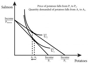
The income effect, however, may be either positive or negative depending on whether the good is a normal or inferior good. Recall that for an inferior good an increase in income leads to a decrease in consumption. The total effect can still be positive even for the case of an inferior good if the substitution effect is larger than the income effect. Only in the case of an inferior good whose income effect is larger than the substitution effect do we get a Giffen good: a good for which a decrease in price leads to a decrease in consumption (or an increase in price leads to an increase in consumption). (Figure 5.14).
Consider the case of a family that likes to eat salmon (expensive) and potatoes (relatively cheap) every meal. On a fixed budget they might start out with very small pieces of salmon and large portions of potatoes to meet their daily calorie needs. Now what if their income stays the same but the price of potatoes decreases? Their fixed income can now buy more of both goods, but they don’t need more calories. They would prefer instead to have larger portions of salmon and smaller portions of potatoes. So as their real income goes up due to the drop in the price of potatoes, they consume more salmon and fewer potatoes. For this family, potatoes are a Giffen good.
Figure 5.14: Potatoes as a Giffen good
5.8 Compensating Variation and Equivalent Variation
LO 5.8: Calculate and interpret compensating variation and equivalent variation for consumers.
When prices change, consumers re-optimize and choose new bundles that reflect changes in relative prices. If a price of a good rises, they tend to substitute away from it and towards the other good(s) – unless the goods are perfect complements. Regardless of their new choices, utility will fall as long as they had consumed the good. Conversely, falling prices will raise utility.
We want to measure the change in utility so that we can say something about consumer welfare. The problem is that utility functions only represent underlying preferences. Utility functions are ordinal – they can only rank bundles – and not cardinal. Thus, a doubling of utils does not mean welfare is doubled. All we can say about a change in utility is that it rises or falls.
We can illustrate this using Cobb-Douglas utility. Suppose we have [latex]U(A,B)=A^\frac{1}{2}B^\frac{1}{2}[/latex] and [latex]U(A,B)=A^2B^2[/latex]. Both utility functions represent the same preferences since their indifference curves are identical. So changing the utility function really has no impact on optimal choices (you can check this). Now suppose we go from an optimal choice of (10, 10) to (12, 8). With [latex]U(A,B) =A^\frac{1}{2}B^\frac{1}{2}[/latex], utility falls from 10 to 9.79, or about 2%. With [latex]U(A,B) = A^2B^2[/latex], utility falls from 10,000 to 9,216, or about 7%. Because there are many utility functions that represent a specific preference, we cannot use changes in utils as a measure of changes in welfare.
However, we can use the idea of substitution effects and income effects from section 5.7 to find a measure that captures the impact of a change in price(s) and get around this problem. We do so by expressing changes in outcomes in dollar terms by identifying changes to income that would have similar effects as a change in price.
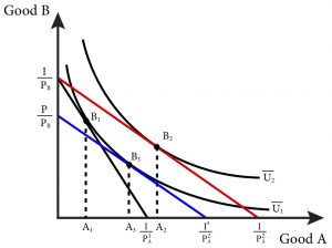
Consider figure 5.10. The consumer starts at an initial consumption bundle B1 given income and prices. Now allow the price of good A to fall. This rotates out the budget line and the consumer responds by moving to the new bundle at B2. In this case, consumption of good B falls and consumption of good A rises. Since the final bundle is on a higher indifference curve U2, we know that utility has risen.
To calculate the increase in welfare we can ask a hypothetical question: How much would we have to change income so that, after a change in price(s), the consumer is no better and no worse off then when we started? That is, with the new prices, we need to adjust income so that we are back on the original indifference curve U1. This change in income is called a Compensating Variation (CV) since it compensates income for changes in prices. If prices fall, the CV is negative since we would decrease income to compensate. If prices rise, the CV is positive since we would increase income to compensate.
[latex]CV=income\,\,needed\,\,to\,\,attain\,\,U_1\,\,given\,\,new\,\,prices\,-\,original\,\,income[/latex]
EXAMPLE: Suppose we have [latex]U(A,B)=A^\frac{1}{2}B^\frac{1}{2},\,with\,M=$200,\,P_A=$10,\,and\,P_B=$10[/latex]. Now suppose PA falls to $8.
STEP 1: We start at the original optimum: [latex]A_1=\frac{1}{2}\frac{M}{P_A}=\frac{1}{2}\frac{200}{10}=10,\,and\,B_1=\frac{1}{2}\frac{M}{P_B}=\frac{1}{2}\frac{200}{10}=10,\,with\,U_1=10.00[/latex].
STEP 2: The new optimum is [latex]A_2=\frac{1}{2}\frac{M}{P_A}=\frac{1}{2}\frac{200}{8}=12.5,\,and\,B_2=\frac{1}{2}\frac{M}{P_B}=\frac{1}{2}\frac{200}{10}=10,\,with\,U_2=11.18[/latex]. Hence the fall in PA raises utility.
STEP 3: We want to express utility as a function of income and prices using the demands for A and B.
We know from the consumer’s problem that [latex]A=\frac{1}{2}\frac{M}{P_A},\,and\,B=\frac{1}{2}\frac{M}{P_B}[/latex].
Substitute this into the utility function [latex]U(A,B)=A^\frac{1}{2}B^\frac{1}{2}[/latex] to get
[latex]U(M,P)=(\frac{1}{2}\frac{M}{P_A})^\frac{1}{2}(\frac{1}{2}\frac{M}{P_B})^\frac{1}{2}=\frac{1}{2}\frac{M}{(P_AP_B)^\frac{1}{2}}[/latex].
This is called indirect utility. It is the maximum utility the consumer can attain given income and prices. It shows that utility rises with income but falls with prices.
STEP 4: Using the indirect utility function, we can find the income require to obtain U1 but with the new prices PA=$8 and PB=$10.
[latex]U(M,P)=\frac{1}{2}\frac{M}{(P_AP_B)^\frac{1}{2}},\,hence\,M=2U(P_AP_B)^\frac{1}{2},\,where\,U=10[/latex].
This gives us [latex]M=(2)(10)(8*10)^\frac{1}{2}=178.86[/latex]
Check: [latex]A=\frac{1}{2}\frac{M}{P_A}=\frac{1}{2}\frac{178.86}{8}=11.18,\,and\,B=\frac{1}{2}\frac{178.86}{10}=8.94[/latex];
substitute [latex]U(A,B)=A^\frac{1}{2}B^\frac{1}{2}=(11.18)^\frac{1}{2}(8.94)^\frac{1}{2}=10,\,OK[/latex].
STEP 5: Compensating Variation is the change in income required to move us back to the original indifference curve but with the new prices.
[latex]CV=178.86–200=-21.14[/latex]. Hence the fall in price can be fully compensated (offset) by a fall in income of $21.14.
A fall in the price of Good A raises utility. But a rise in income would also raise utility. So, an alternative question is: How much would we have to change income so that, if the prices had not changed, the consumer could attain the level of utility that they would have achieved with the price change? Instead of changing prices, we change income to get an equivalent effect. This change in income is called an Equivalent Variation (EV) since the change in income is equivalent to the changes in prices. If prices fall, the EV is positive since we would increase income to have the equivalent effect. If prices rise, the EV is negative since we would decrease income to make it equivalent.
[latex]EV=income\,\,needed\,\,to\,\,attain\,\,U_2\,\,given\,\,original\,\,prices\,–\,original\,\,income[/latex]
EXAMPLE: Suppose again we have [latex]U(A,B)=A^\frac{1}{2}B^\frac{1}{2},\,with\,M=$200,\,P_A=$10,\,and\,P_B=$10[/latex]. Again suppose PA falls to $8.
STEP 1: We start at the original optimum. [latex]A_1=\frac{1}{2}\frac{M}{P_A}=\frac{1}{2}\frac{200}{10}=10,\,and\,B_1=\frac{1}{2}\frac{M}{P_B}=\frac{1}{2}\frac{200}{10}=10[/latex], with U1 = 10.00
STEP 2: The new optimum is [latex]A_2=\frac{1}{2}\frac{M}{P_A}=\frac{1}{2}\frac{200}{8}=12.5,\,and\,B_2=\frac{1}{2}\frac{M}{P_B}=\frac{1}{2}\frac{200}{10}=10[/latex], with U2 = 11.18. Hence the fall in PA raises utility.
STEP 3: Using the indirect utility function, we can find the income required to obtain U2 but with the old prices PA = $10 and PB = $10.
[latex]U(M,P)=\frac{1}{2}\frac{M}{(P_AP_B)^\frac{1}{2}},\,hence\,M=2U(P_AP_B)^\frac{1}{2}[/latex], where U = 11.18.
This gives us [latex]M=(2)(11.18)(10*10)^\frac{1}{2}=223.6[/latex]
Check: [latex]A =\frac{1}{2}\frac{M}{P_A}=\frac{1}{2}\frac{223.6}{10}=11.18,\,and\,B=\frac{1}{2}\frac{223.6}{10}=11.18,\,substitute\,into\,U(A,B)\,gives\,U=11.18,\,OK[/latex]
STEP 4: Equivalent Variation is the change in income required to achieve the new indifference curve but with the old prices
[latex]EV=223.6–200=+23.6[/latex]. Hence the fall in price is equivalent to a rise in income of $23.6.
Notice that the CV and EV are opposite signs but of similar magnitude.
SUMMARY
Review: Topics and Related Learning Outcomes
5.1 Defining markets
LO 5.1: Explain the concept of a market.
5.2 The Demand Function
LO 5.2: Describe a demand function.
5.3 Summing Individual Demands to Derive Market Demand
LO 5.3: Explain how individual demands are aggregated to find market demand.
5.4 Movement along, and shifts of, the demand curve
LO 5.4: Explain what causes movements along, and what causes shifts of, demand curves.
5.5 Price and Income Elasticity of Demand
LO 5.5: Determine the price and income elasticity of a demand curve and recognize normal and inferior goods.
5.6 The Engel Curve
LO 5.6: Derive and interpret an Engel curve.
5.7 Income and Substitution Effects
LO 5.7: Identify income and substitution effects from a change in prices and recognize a Giffen good.
5.8 Compensating Variation and Equivalent Variation
LO 5.8: Calculate and interpret compensating variation and equivalent variation for consumers.
Learn: Key Terms and Graphs
Terms
Cross-Price Elasticity of Demand
Graphs
Movement along the demand curve
Income and substitution effects
Equations
Supplemental Resources
Practice Questions
YouTube Videos
These videos from the YouTube channel ‘Department of Economics’ may be helpful.
- Normal and Inferior Goods – YouTube
- Intermediate Microeconomics: Luxuries and Necessities – YouTube
- Intermediate Microeconomics: Giffen Goods – YouTube
- Intermediate Microeconomics: Complicated Example, Continued: Normal, Inferior, and Giffen Goods – YouTube
- Intermediate Microeconomics: Adding Demand Curves – YouTube
- Intermediate Microeconomics: Final Example for Changes in Income and Prices – YouTube
Policy Example
Policy Example: Should Your City Charge More for Downtown Parking Spaces?
Learning Objective: Use elasticity to determine how much city officials should charge for parking.

The city of San Francisco would like to encourage shoppers and clients of local businesses and other day-trippers to visit the downtown area. City officials know that one main factor in people’s decision to come downtown is the availability of parking. The city controls the surface parking spots, the curb parking, and charges for parking through the use of meters, so officials know they can use the price of parking to change the number of shoppers and clients who visit through the law of.
- Price the parking too low, and day-trippers will increase their quantity demanded of parking spaces. Potential shoppers and clients will become discouraged by their inability to find parking.
- Price the parking too high, and day-trippers will decrease their quantity demanded of parking spaces. When too few day-trippers come downtown, the local merchants will complain about lack of customers (even though the parking is plentiful!).
Understanding the nature of the demand for parking enables the city to get the pricing just right.
By knowing the price elasticity of demand for parking in the downtown area, San Francisco officials can predict how much the quantity demanded will fall if they raise rates and, conversely, how much it will rise as rates decrease. Understanding the demand function allows city planners to anticipate changes in demand from other factors, including incomes, weather, and days of the week. In the days of mechanical coin-operated meters, cities were forced to pick one price. With modern electronic technology, cities can become much more flexible with pricing. Take, for example, San Francisco’s dynamic pricing scheme. In San Francisco, smart meters can adjust parking rates from as low as $0.25 and hour to $6 an hour. In times of high demand the rates will rise for local parking sports and in times of low demand rates will fall. This is the mission statement from SF Park, the local bureau in charge of setting rates:
SFpark charges the lowest possible hourly rate to achieve the right level of parking availability. In areas and at times where it is difficult to find a parking space, rates will increase incrementally until at least one space is available on each block most of the time. In areas where open parking spaces are plentiful, rates will decrease until some of the empty spaces fill. (Emphasis mine) [http://sfpark.org/how-it-works/pricing/]
Let’s take a simple hypothetical example. Suppose the City of San Francisco has exactly 1,000 one-hour parking spaces available over 100 city blocks. City planners have estimated the hourly demand for parking (QD) as 3,000-600P, where P is the hourly price of parking. Suppose that city planners have determined that to reduce congestion and pollution from drivers searching for available parking the optimal hourly demand for parking is 900 per hour (averaging one free space per block). What should they charge per hour of parking? The answer is $3.50. We find this price by setting QD at 900 and solving for P.
Since the precise demand curve is difficult to ascertain, a more realistic example is one where the city has a pretty good idea of the price elasticity of demand for hourly parking. Suppose the city estimates that the elasticity at current prices is close to 1. Currently the city charges $2 an hour, and the demand for spots is 1,000 hours. The city’s goal is to decrease this demand to 900 hours. Since a 100-spot reduction in demand represents a 10% decrease and the elasticity is 1, the city knows that a 10% increase in price should accomplish the goal. The city should therefore increase parking rates to $2.20 an hour.
Exploring the Policy Question
The demand for hourly parking in Cleveland, Ohio is given by the demand function:
QD = 3,600-400P
Suppose Cleveland has 1,600 hourly spots available. What should Cleveland charge for hourly parking if the goal is to keep 10% of the spots open at any given time in order to encourage shoppers, clients and day-trippers to come to the downtown core.
___ per hour
Answer:
10% of 1,600 is 160.
So Cleveland city planners want hourly demand to be: QD = 1,460 (or 1,600-140).
Therefore, 1,460 = 3,600 – 400P.
400P = 2,140
or P = 2,140/4,100
or P = $5.35 an hour.
Candela Citations
- Authored by: Joel Bruneau & Clinton Mahoney. License: CC BY-NC-SA: Attribution-NonCommercial-ShareAlike
- Module 5: Individual Demand and Market Demand. Authored by: Patrick Emerson. Retrieved from: https://open.oregonstate.education/intermediatemicroeconomics/chapter/module-5/. License: CC BY-NC-SA: Attribution-NonCommercial-ShareAlike
a physical or virtual place where people go in order to buy, sell, or exchange goods and services
a graphical representation of the demand function that tells us for every price of a good, how much of the good is demanded
the principal that as price decreases for normal goods, quantity demanded increases holding other factors such as income and the price of other goods constant
the Latin phrase meaning all other things remain the same
a good for which demand increases when incomes rise
is the percentage change in the quantity demanded for a product from a 1 percent change in price
is the percentage change in the quantity demanded of a product resulting from a 1-percent change in the price of another good
is the percentage change in the quantity demanded for a product from a 1 percent change in income
are goods for which the quantity demanded falls as income rises
expresses how the optimal consumption of a good changes as a consumer's income changes
is in change in consumption of a good resulting from a change in a consumer’s income holding prices constant
is the change in consumption of a good resulting from a change in its price holding the consumer’s utility level constant
is the sum of the income effect and the substitution effect
a graph of all of the combinations of bundles that a consumer prefers equally
indifference curves that have the following graphical properties: (1) They are downward sloping; (2) They do not cross; (3) They are bowed in to the origin.
a good for which a decrease in price leads to a decrease in consumption (or an increase in price leads to an increase in consumption)
means that utility functions only rank bundles – they only indicate which one is better, not how much better it is than another bundle
is a less realistic (than ordinal) theory of utility where the size of the utility difference between two bundles of goods has some sort of significance
are the units of measurement for utility
is the change in income required after a change in price(s) to attain the same level of utility as before the price change(s)
is the change in income required to attain the utility achieved after a change in price(s) if the price(s) had never changed

