
Appendix F: Presentation Aids
Learning Objectives
- Explain reasons why presentation aids are important in public speeches;
- Detail how presentation aids function;
- Discuss strategies for implementing and integrating presentation aids.
When you give a speech, you are presenting much more than just a collection of words and ideas. Because you are speaking live, your audience members will aesthetically experience your speech through all five of their senses: hearing, vision, smell, taste, and touch. In addition to your verbal and nonverbal embodiment, presentation aids assist in amplifying your content for the audience’s overall experience.
Presentation aids are the resources beyond the speech itself that a speaker uses to enhance the message conveyed to the audience. The type of presentation aids that speakers most typically make use of are visual aids: pictures, diagrams, charts and graphs, maps, and the like. Audible aids include musical excerpts, audio speech excerpts, and sound effects. A speaker may also use fragrance samples or food samples as olfactory (sense of smell) or gustatory (sense of taste) aids. Finally, presentation aids can be three-dimensional objects or they can change over a period of time, as in the case of a how-to demonstration. As you can see, you have a range of presentation aids at your disposal.
Effective presentation aids are guided by two questions:
- How can I best represent an idea in my speech through a presentation aid?
- When is best to introduce it to the audience?
If you’re able to answer these two main questions, the audience is more likely to understand your idea more fully. Each presentation aid a speaker uses must be a direct, uncluttered example of a specific element of the speech. It is understandable that someone presenting a speech about Abraham Lincoln might want to include a photograph of him, but if there’s a high probability that the audience knows what Lincoln looked like, the picture would not contribute much to the message unless, perhaps, the message was specifically about the changes in Lincoln’s appearance during his time in office.
In this example, other visual artifacts may be more likely to deliver relevant information—a diagram of the interior of Ford’s Theater where Lincoln was assassinated, a facsimile of the messy and much-edited Gettysburg Address, or a photograph of the Lincoln family, for example. The key is that each presentation aid must directly express an idea in your speech.
Moreover, presentation aids must be used at the time when you are presenting the specific ideas related to the aid. For example, if you are speaking about coral reefs and one of your supporting points is about the location of the world’s major reefs, it would make sense to display a map of these reefs while you’re talking about location. If you display it while you are explaining what coral actually is, or describing the kinds of fish that feed on a reef, the map will not serve as a useful aid—in fact, it’s likely to be a distraction.
In this chapter, we will discuss some principles and strategies to help you incorporate effective presentation aids into your speech. We will begin by discussing the functions that good presentation aids fulfill. Next, we will explore some of the many types of presentation aids and how best to design and utilize them. We will also describe various media that can be used for presentation aids.
Functions of Presentation Aids
Why should you use presentation aids? If you have prepared and rehearsed your speech adequately, shouldn’t a good speech with a good delivery be enough to stand on its own? While it is true that impressive presentation aids will not rescue a poor speech, it is also important to recognize that a good speech can often be made even better by the strategic use of presentation aids. Remember that your speech is an experience rather than the isolated transmission of information, so presentation aids can enhance or detract from the aesthetics.
Presentation aids can fulfill several functions:
- improve your audience’s understanding of the information you are conveying;
- enhance audience memory and retention of the message;
- add variety and interest to your speech;
- enhance your credibility as a speaker.
Let’s examine each of these functions.
Improving Audience Understanding
Human communication is a complex process that often leads to misunderstandings. If you are like most people, you can easily remember incidents when you misunderstood a message or when someone else misunderstood what you said to them. Misunderstandings happen in public speaking just as they do in everyday conversations.
One reason for misunderstandings is that perception and interpretation are highly complex, individual processes (remember that communication is always cultural and contextual rather than a universal set of symbols). Most of us have seen the image in which, depending on your perception, you see either the outline of a vase or the facial profiles of two people facing each other, known as the Rubin’s vase (Hasson et al, 2001). Or you may have listened to a song for years only to have a friend say, “uh, those aren’t the lyrics!” These examples demonstrate how interpretation can differ, and it means that your presentations must be based on careful thought and preparation to maximize the likelihood that your listeners will understand your presentation as you intend them to.
As a speaker, one of your basic goals is to help your audience understand your message. To reduce misunderstanding, presentation aids can be used to clarify or to emphasize. Use table 10.1 to identify questions that underly clarifying or emphasizing ideas.
|
Improving Audience Understanding |
||
|
To clarify : Simplifying complex information |
Am I describing a complex process that could represented differently? Am I referencing ideas that are visual or sensory in nature? |
If your speech is about the impact of the Coriolis Effect on tropical storms, for instance, you will have great difficulty clarifying it without a diagram because the process is a complex one. |
|
To emphasize : Impress your listeners with the importance of an idea
|
Is there an idea or aspect of the speech that needs to be underscored? |
Let’s say that you’re describing the increased prevalence of super tornadoes across the state of Kansas over the last 30 years. You may decide that a map will visually underscore the sudden increase in storms. |
|
|
Table 10.1 |
|
Aiding Retention and Recall
The second function that presentation aids can serve is to increase the audience’s chances of remembering your speech. An article by the U.S. Department of Labor (1996) summarized research on how people learn and remember. The authors found that “83% of human learning occurs visually, and the remaining 17% through the other senses—11% through hearing, 3.5% through smell, 1% through taste, and 1.5% through touch.”
For this reason, exposure to an image can serve as a memory aid to your listeners. When your graphic images deliver information effectively and when your listeners understand them clearly, audience members are likely to remember your message long after your speech is over.
An added plus of using presentation aids is that they can boost your retention and memory while you are speaking. Using your presentation aids while you rehearse your speech will familiarize you with the association between a given place in your speech and the presentation aid that accompanies that material.
Adding Variety and Interest
A third function of presentation aids is simply to make your speech more interesting. For example, wouldn’t a speech on community gardens have a greater impact if you accompanied your remarks with pictures of such gardens? You can imagine that your audience would be even more enthralled if you had the ability to display produce for your audience live. Similarly, if you were speaking to a group of gourmet cooks about spices, you might want to provide tiny samples of spices that they could smell and taste during your speech.
Enhancing a Speaker’s Credibility
The final function of a presentation aid is to increase your ethos, or credibility. A high-quality presentation will contribute to your professional image. Thus, in addition to containing important information, your presentation aids must be clear, clean, uncluttered, organized, and large enough for the audience to see and interpret correctly. Misspellings and poorly designed presentation aids can damage your credibility as a speaker. Even if you give a good speech, you run the risk of appearing unprofessional if your presentation aids are poorly executed.
In addition, make sure that you give proper credit to the source of any presentation aids that you take from other sources. Using a statistical chart or a map without proper credit will detract from your credibility, just as using a quotation in your speech without credit would. This situation will usually take place with digital aids such as PowerPoint slides. The source of a chart or the data shown in a chart form should be cited at the bottom of the slide and orally in your speech.
If you focus your efforts on producing presentation aids that contribute effectively to your meaning, that look professional, and that are handled well, your audience will most likely appreciate your efforts and pay close attention to your message. That attention will help them learn or understand your topic in a new way and will thus help the audience see you as a knowledgeable, competent, and credible speaker. With the prevalence of digital communication, the audience expectation of quality visual aids has increased.
Avoiding COMMON PRESENTATION AID PITFALLS
Using presentation aids can come with some risks. However, with a little forethought and adequate practice, you can choose presentation aids that enhance your message and boost your professional appearance in front of an audience.
One principle to keep in mind is to use only as many presentation aids as necessary to present your message or clarify a component of your idea. Too often, speakers fall into a “must have long and detailed presentational aids for the entire speech”—in these cases, the aid can overshadow or distract from the content, rather than clarify or add emphasis. Instead, simplify as much as possible, emphasizing the information you want your audience to understand rather than overwhelming them with too much text and too many images.
Another important consideration is context. Remember to survey the literal context of your speech to decide what aid is possible—is there technology? Is there a poster stand or a white board? Are there speakers? Is there WiFi? Keep your presentation aids within the limits of the working technology available to you. Whether or not your technology works on the day of your speech, you will still have to present. As the speaker, you are responsible for arranging the things you need to make your presentation aids work as intended. Carry a roll of duct tape so you can display your poster even if the easel is gone. Find an extra chair if your table has disappeared. Test the computer setup. Have your slides on a flash drive AND send it to yourself as an attachment or post to a cloud service. Have an alternative plan prepared in case there is some glitch that prevents your computer-based presentation aids from being usable. Most importantly, be sure you know how to use the technology.
Finally, presentation aids do not “speak for themselves.” When you display a visual aid, you should explain what it shows, pointing out and naming the most important features. If you use an audio aid such as a musical excerpt, you need to tell your audience what to listen for. Similarly, if you use a video clip, it is up to you as the speaker to point out the characteristics in the video that support the point you are making—but probably beforehand, so you are not speaking over the video. At the same time, a visual aid should be quickly accessible to the audience. This is where simplicity comes in. Just as in organization of a speech you would use 3-5 main points, not 20 main points, you should limit categories of information on a visual aid.
Types of Presentation Aids
Now that we’ve explored some basic hints for preparing presentation aids, the next step is determining what type of presentation aid is best. We’ll discuss types of aids that fall into two categories: representations of data and/or representations that display a real process, idea, person, place, or thing. In other words, ask yourself: “what type of information do I think needs to be accentuated? A statistic? An image of an idea?” Once you answer, the categories below can help you determine which aid would be the best to display that type of information.
Representations of Data
If you are looking to clarify a complex piece of data or piece of evidence from your speech, you may decide that a chart, graph, or diagram is best. Charts, graphs, and diagrams help represent statistics, processes, figures, or other numeric evidence that may be otherwise difficult to comprehend if just spoken.
Chart: A chart is commonly defined as a graphical representation of data or a sketch representing an ordered process. Whether you create your charts or do research to find charts that already exist, it is important for them to exactly match the specific purpose in your speech. Figure 10.1 (“Acupuncture Chart”) shows a chart related to acupuncture and may be useful in a speech about the history and development of acupuncture. However, if your goal is to show the locations of meridians (the lines along which energy is thought to flow) and the acupuncture points, you may need to select an alternative image.

There are two common types of charts: statistical charts and sequence-of-steps chart.
- Statistical Charts: For most audiences, statistical presentations must be kept as simple as possible, and they must be explained. When visually displaying information from a quantitative study, you need to make sure that you understand the material and can successfully and simply explain how one should interpret the data. This is surely an example of a visual aid that, although it delivers a limited kind of information, does not speak for itself. As with all other principles of public speaking, KNOW YOUR AUDIENCE.
- Sequence-of-Steps Charts: Charts are also useful when you are trying to explain a process that involves several steps. If you are working with a scientific or medical argument, you may need to visually map the sequence because the process is otherwise difficult to follow.
Graph: A graph is a pictorial representation of the relationships of quantitative data using dots, lines, bars, pie slices, and the like. Graphs show how one factor (such as size, weight, number of items) varies in comparison to other items. Whereas a statistical chart may report the mean (or average) ages of individuals entering college, a graph would show how the mean age changes over time. A statistical chart may report the number of computers sold in the United States, while a graph will use bars or lines to show the breakdown of those computers by operating systems such as Windows, Macintosh, and Linux.
Public speakers can show graphs using a range of different formats. Some of those formats are specialized for various professional fields. Very complex graphs often contain too much information that is not related to the purpose of a speech. If the graph is cluttered, it becomes difficult to comprehend. If you find a graph that has useful information, ask: “do I need to represent this graph as-is or can I represent a key portion of the graph that’s most relevant to my data?”
There are 3 types of graphs that we’ll introduce: line graphs, bar graphs, and pie graphs.
- Line Graph: A line graph is designed to show trends over time. You could, for example, use a line graph to chart Enron’s stock prices over time.
- Bar Graph: Bar graphs are useful for showing the differences between quantities. They can be used for population demographics, fuel costs, math ability in different grades, and many other kinds of data. The graph in Figure 10.2 (“Suicide vs. Homicide”) is well designed. It is relatively simple and is carefully labeled, making it easy for you to guide your audience through the recorded numbers of each type of death. The bar graph is designed to show the difference between rates of suicides and homicides across various age groups. When you look at the data, the first grouping clearly shows that eighteen- to twenty-four-year-olds are more likely to die because of a homicide than any of the other age groups.
- Pie Graph: Pie graphs are usually depicted as circles and are designed to show proportional relationships within sets of data; in other words, they show parts of or percentages of a whole. They should be simplified as much as possible without eliminating important information.
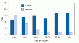
Figure 10.2
Diagrams: Diagrams are visual representations that simplify a complex process. They may be drawings or sketches that outline and explain the parts of an object, process, or phenomenon that cannot be readily seen. When you introduce a diagram, you are working to label parts of a process for your audience. For example, you may decide to diagram how human communication occurs because simply describing that process would be too complex.
Charts, graphs, and diagrams can present challenges in being effective but also in being ethical. To be both ethical and effective, you need a good understanding of what statistics mean, and you need to create or use graphs that show amounts clearly. Remember that clarifying is a key goal of presentational aids, so ask: is my graph or chart making my information more or less difficult to comprehend?
Representations of Real Processes or Things
In contrast, a second set of presentational aids represents real processes, things, persons, places, or ideas. While charts and graphs simplify more complex or abstract ideas, data, or evidence, this set of presentational aids attempts to add emphasis to actual people, places, or objects. Such aids may include maps, photos, videos, audio recordings, and objects (diagrams can also fall into this category, depending on what you’re mapping).
Maps: Maps are extremely useful if the information is clear and limited. There are all kinds of maps, including population, weather, ocean current, political, and economic maps, so you should find the right kind for the purpose of your speech. Choose a map that emphasizes the information you need to deliver and are trying to represent. For example, you might decide that a map outlining the Hawaiian Islands would be helpful to clarify the spatial dimensions of the state. Although the map may not list the names of the islands, it is helpful in orienting the audience to the direction and distance of the islands to other geographic features, such as the Pacific Ocean.
Photographs and Drawings: Sometimes a photograph or a drawing is the best way to show an unfamiliar but important detail. For example, if you gave a speech about the impact of plastics on ocean life, you may decide to include a photo of a beached whale who had suffered from plastic inhalation. The photo may emphasize the impact of plastic that speaking otherwise doesn’t capture.
Video or Audio Recordings: Another very useful type of presentation aid is a video or audio recording. Whether it is a short video from a website such as YouTube or Vimeo, a segment from a song, or a piece of a podcast, a well-chosen video or audio recording may be a good choice to enhance your speech.
There is one major warning to using audio and video clips during a speech: do not forget that they are supposed to be aids to your speech, not the speech itself! In addition, be sure to avoid these four mistakes that speakers often make when using audio and video clips:
- Avoid choosing clips that are too long for the overall length of the speech.
- Practice with the audio or video equipment prior to speaking. If you are unfamiliar with the equipment, you’ll look foolish trying to figure out how it works. Be sure that the speakers on the computer are on and at the right volume level.
- Cue the clip to the appropriate place prior to beginning your speech, and try to avoid any advertisement interruptions (which can make the aid look unprofessional).
- The audience must be given context before the video or audio clip is played, specifically what the clip is and why it relates to the speech. At the same time, the video should not repeat what you have already said, but add to it.
Objects: Objects refer to anything you could hold up and talk about during your speech. If you’re talking about the importance of not using plastic water bottles, you might hold up a plastic water bottle and a stainless-steel water bottle as examples.
Ways to Display Your Presentation Aid
Above, we’ve discussed why you might use a presentation aid and what aid might work best. “How do I display these?” you might be wondering. For example, if you decide that a graph would be helpful in clarifying a complex idea, you have options on how to present that graph to the audience, including presentation software or more low-tech means. We’ll talk through each below.
Using Presentation Software
Presentation software and slides are a common mechanism to display information for your audience. You are likely familiar with PowerPoint, but there are several others:
- Prezi, available at www.prezi.com
- Slide Rocket, available at www.sliderocket.com
- Google Slides, available in Google Drive and useful for collaborative assignments
- Keynote, the Apple presentation slide software on Macs
- Impress, an Open Office product (http://www.openoffice.org/prod-uct/impress.html)
- PrezentIt
- AdobeAcrobat Presenter
- ThinkFree
- E-Maze
Each software allows you to present professional-looking slides. For example, you can use the full range of fonts, although many of them are not appropriate for presentations because they are hard to read. Use Table 10.3 to track advantages and disadvantages of using slides.
|
Advantages to Using Slides |
Disadvantages to Using Slides |
|
|
| Table 10.3 |
Remember that presentation software aids are a way to display what you want your audience to know—a graph, an idea, an image. Presentation software is not the only way to display these, so slides should be a purposeful choice. What you display is the top priority.
Before we continue, we have one note: You’ll notice that “text from the speech” is not included in our list of types of presentation aids in the section above. You may decide that adding emphasis to a key word or concept from your speech is needed – and that’s OK! You may even decide that providing that concept, visually, for the audience is worthwhile by writing or displaying the words, and that’s OK, too. However, remember that presentation aids are included for a reason, and it’s often unnecessary to provide an entire outline of your speech’s text through a presentation software like PowerPoint slides. Speakers, too often, copy and paste parts of their speech onto a PowerPoint slide and think, “There! A presentation aid!” Ask: what purpose does this text serve for my audience? If your answer doesn’t result in clarifying, emphasizing, or retaining, it’s likely not needed.
Creating Quality Slide Shows
Slides should show the principles of good design, which include unity, emphasis or focal point, scale and proportion, balance, and rhythm (Lauer & Pentak, 2000). Presenters should also pay attention to tone and usability. With those principles in mind, here are some tips for creating and then using presentation software.
- Unity and Consistency: use a single (readable) sans serif font, single background, and unified animations for your visuals so that they look like a unified set. Each slide should have one message, photo, or graphic.
- Emphasis, Focal Point, and Visibility: all information should be large enough—at least 24-point font— for audiences. To guarantee visibility, follow the 7X7 rule: no more than seven horizontal lines of text (including the heading) and the longest line should not exceed seven words. Finally, provide higher contrast between text and slides.
- Tone: Fonts, color, clip art, photographs, and templates all contribute to tone, which is the attitude being conveyed in the slides. Make sure the tone of the presentation software matches the overall aesthetic tone of the speech.
- Scale and Proportion: Use numbers to communicate a sequence. If bullet points are used, the text should be short. Adjust graphs or visuals on the slide, avoiding small or multiple visuals on the same image.
- Balance and rhythm: Work to create symmetry and balance between each slide. When presenting, think about what’s being displayed on the slide to the audience and when. If you aren’t using it, insert a black screen between images.
- Usability: With any image or graphic, make sure to include “alt text” – or a description of what the image is. Proving alt text is helpful for users with screen readers.
We recommend that you survey your university’s resources for assistance with creating quality and accessible presentation slides.
Low-Tech Presentation Aids
In addition to presentation slides, there are other “low-tech” ways to display. Instead of providing a diagram on PowerPoint, you may decide that drawing it live is more beneficial. Below, we talk through a few additional means to display your information to the audience.
Dry-Erase Board
If you use a chalkboard or dry-erase board, what you display should still be thought-out, rehearsed, and clearly professional. You run the risk of appearing less prepared, but numerous speakers do utilize chalk and dry-erase boards effectively. Typically, these speakers use the chalk or dry-erase board for interactive components of a speech. For example, maybe you’re giving a speech in front of a group of executives. Chalk or dry-erase boards are very useful when you want to visually show information that you are receiving from your audience. If you ever use a chalk or dry-erase board, follow these five simple rules:
- Write large enough so that everyone in the room can see (which is harder than it sounds; it is also hard to write and talk at the same time!).
- Print legibly; don’t write in cursive script.
- Write short phrases; don’t take time to write complete sentences.
- Never turn your back to the audience while you’re talking.
- Be sure you have markers that will not go dry, and clean the board afterward.
Flipchart
A flipchart is useful for situations when you want to save what you have written for future reference or to distribute to the audience after the presentation. As with whiteboards, you will need good markers and readable handwriting, as well as a strong easel to keep the flipchart upright.
Posters
Posters often represent a key graph, idea, or visualization. For a poster, you likely want to display one key piece of information at one key part of your presentation. Otherwise, posters are probably not the best way to approach presentation aids in a speech. There are problems with visibility as well as portability. Avoid producing a presentation aid that looks like you simply cut pictures out of magazines and pasted them on.
Handouts
Handouts are appropriate for delivering information that audience members can take away with them. As we will see, handouts require a great deal of management if they are to contribute to your credibility as a speaker.
First, make sure the handout is worth the trouble of making, copying, and distributing it. Does the audience really need the handout? Second, make sure to bring enough copies of the handout for each audience member to get one. Having to share or look on with one’s neighbor does not contribute to a professional image. Third, consider timing. We recommend providing the handout at the conclusion of your speech.
Reminders for Integrating Presentation Aids
Regardless of what presentation aid you choose—a photo, chart, map—and the medium that you’ll display it—a handout, slide deck, audio device—all presentation aids require rehearsal. While we’ve included tips on integrating presentation aids in your speech throughout this chapter, use the following list of strategies to integrate your aid into the speech.
- Gather all citation information and provide it both visually and orally to your audience.
- In your speaking notes, mark where you will integrate the presentation aid so that you don’t forget about it due to nervousness.
- Determine where the presentation aid will be when it’s not being displayed.
- For a PowerPoint presentation, include blank/black slides that are used when your visual aid isn’t in use.
- Store other objects in non-distracting locations.
- Rehearse your transitions into and out of the presentation aid.
The Mythical Norm and Presentation Aids
When you’re an audience member, it’s important to reflect on the assumptions that we hold about the speaker. Are we judging a speaker based on our own assumptions of what’s normal?
Similarly, when you’re making decisions about presentation aids as a speaker, it’s important to be reflexive about who is in the audience. Are you making decisions about presentation aids based on our own assumptions about what’s normal and who’s normal? Are you assuming, for example, that all audience members are able-bodied and able to visually and audibly experience your presentation aid?
Creating an accessible experience for audience members must be a priority. For example, you may want to avoid red and green colors on your visual aids as they’re not perceivable to all audience members. While constructing presentation software of slides, make sure you include alt-text for images, especially if you provide the slides to the presentation. These are for audience members who may be sight-impaired. Check out guidelines for the presentation software you’re using on how to embed alt-text. Additionally, be weary of smells that may be intense or irritate audience members. Overall, be careful not to assume that audience members also fit the mythical norm as you construct your presentation aid.
Conclusion
To finish this chapter, we will recap a few key pieces of information. Whether your aid is a slide show, object, or dry erase board, these standards are essential:
- Presentation aids must be easily experienced by your audience.
- Presentation aids must be portable, easily handled, and efficient. They should disappear when not in use.
- Presentation aids should be aesthetically pleasing and in good taste. Additionally, electronic media today allows you to create very “busy” slides with varieties of fonts, colors, collages of photos, etc. Keep in mind the principles of unity and focal point.
- Color is another aesthetic aspect. Some colors are just more soothing, readable, and appropriate than others. Also, the color on your slides may be different when projected from what is on your computer.
- Provide credit when using images that aren’t your own.
- Finally, presentation aids must support your speech and have high relevance to your content.
This chapter has covered a wide range of information about all kinds of audio and visual aids, but audiences today expect and appreciate professionally designed and handled presentation aids. The stakes are higher now, but the tools are many.
Attribution
This chapter is adapted from “Speak Out, Call In: Public Speaking as Advocacy” by Meggie Mapes (on Pressbooks). It is licensed under a Creative Commons Attribution-NonCommercial-ShareAlike 4.0 International License.
