
Chapter 30: Figures and Tables
Learning Objectives
By the end of this chapter, you should be able to:
- Determine which type of graphic is best for the information you are trying to present
- Evaluate the quality of different graphics using the five rules for integrating graphics into a document
- Explain how graphics can be manipulated to benefit the writer/speaker and why this is ethically problematic
The more formal the report you are writing, the more likely the need for non-textual material such as tables, graphs, charts, maps, drawings, and photographs. Keep in mind that you are required to use at least one type of graphic, correctly cited, in your formal research report for RCM 200.

These visual elements can take many different forms, but they all have the same basic purpose: to help clarify information presented in the report. They also help break up a text-heavy report, making it more visually appealing.
The key concept to remember here is that visuals clarify, illustrate, and augment your written text. They are not a replacement for written text. Similar to when you present facts from an outside source to the reader in your writing, you are responsible for interpreting your graphics for your reader.
The old adage, “a picture is worth a thousand words” does not hold true in technical writing, but adding visuals may save you a hundred words of additional explanation and clarification. If you have visual elements in your document, they must be based on and supplement your written content. Throwing in “gratuitous graphics” just to decorate or take up space can confuse your reader.
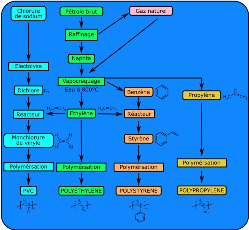
It is important to choose the right kind of visual to convey the story you want your reader to understand. If visuals are poorly chosen or poorly designed for the task, they can actually confuse the reader and have negative consequences. For example, it’s very likely that the first thing you noticed when you opened this page was the image above. Did you wonder why it is there? Has it distracted you? Our eyes are naturally drawn to visuals that stand out, so make sure the ones you pick for your reports are essential to your purpose.
Deciding Which Graphics to Include
As you review your research and consider possible visuals to include in your report, the first step is to think about which graphics are most appropriate given the data you wish to convey.
Table #1 below provides some general guidelines on the kinds of graphics most suitable for different types of information:
Table #1: General Guidelines for Graphics
| Information to Convey | Visual Type |
| Numbers, percentages, categories | Tables, charts |
| Processes | Flow charts |
| Geographic data | Maps |
| Chronological or prioritized lists | Numbered lists |
| Non-chronological lists | Bulleted lists |
For more specific reasoning for using individual types of graphics, see table #2 below:
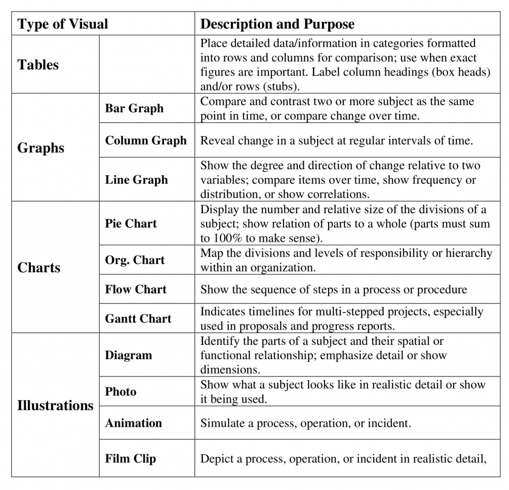
Table #2 Common Types of Illustrative Graphics
Formatting Graphics
Once you have selected the correct graphic for your report, you will need to create it. Unfortunately, there is no universal way to format graphics. However, your employer may have an in-house style guide that you are expected to use.
For the purposes of our RCM 200 class, you are expected to use the rules outlined in APA Style (7th Edition) for formatting your tables and figures.
The key takeaway here is to always aim of consistency—especially if you are ever in a situation where you do not have a style guide. This means that elements such as titles, numbers, and headings should be formatted the same across the entire document. Small inconsistencies may not seem like a big deal, but they can imply to a supervisor or client that you are not thorough or detail-oriented.
Placement and Context
As you develop visuals for your report, you will want to also consider two things:
- where the visuals should be placed
- what information you need to provide in your report to adequately prepare your readers for the message within that graphic
While there are different requirements depending on the visual you choose, there are five main rules you should follow to integrate your graphics:
Five Rules For Integrating Graphics into your Document
- Give each visual a numbered caption that includes a clear descriptive title
- Refer to the caption number within the body text and discuss its content
- Label all units (x and y axes, legends, column box heads, parts of diagrams, etc.)
- Provide the source of the data and/or visual image if you did not create it yourself
- Avoid distorting the data or image.
In addition, visual elements should also be surrounded with sufficient passive space to emphasize the image and enhance its readability. If copying and pasting an image, make sure all elements are clear and the print size is readable. A visual that has been shrunk down to an unreadable size does not help the reader understand your ideas.
Exercise #1: Examine and Compare the Figures
Examine Figure #1.1 below. Do you understand what the information conveys? What is missing? Use the five rules above to determine where this figure goes wrong.
If you look carefully, you might be able to guess what story the graph above is telling. However, the lack of a descriptive caption and labeling of axes makes it impossible to know for sure.
Compare that figure to Figure #1.2 below using the same five rules.
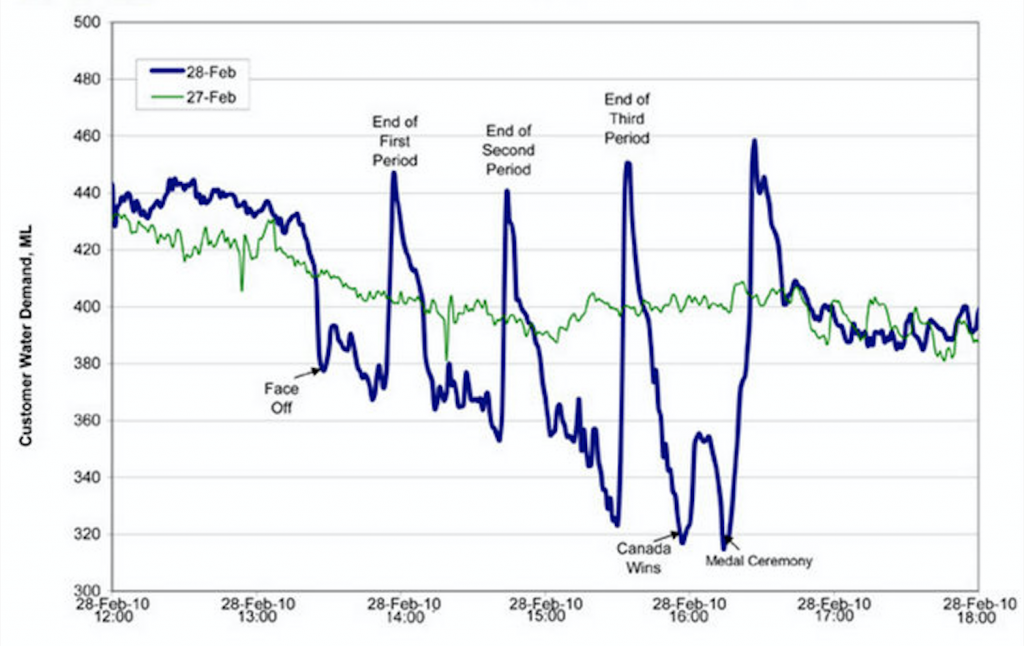
Figure #1.2 Water Consumption in Edmonton during the 2010 Gold Medal Hockey Game (Flowingdata).
Figure #1.2 has a numbered caption, a descriptive title, and it has properly labelled x and y axes and legends. It also cites the source the graph was retrieved from in the caption using an in-text citation. The original image has not been distorted in any way. Thus, it follows the five key rules listed above.
Putting Graphics in Context
The following examples show how you can introduce, present and discuss a graphic in your paper. The first example is a pie chart created with information the writer obtained from an interview. Notice that the writer provides a name for the visual, includes introductory sentences to provide context for the graphic, lists source information at the bottom of the chart, and finally, includes some closing remarks to tie it all together.
Not all gardeners will experience success with growing vegetables in Central Oregon, and the town of Sisters is especially challenging because of the varied temperatures all year long and the chance of frost or even freezing temperatures during any month of the year. Central Oregon and Sisters resident, Jane Doe, had the greatest success with the following vegetables in the year 2015 as noted in the pie chart below.
Table 1: Vegetables grown in 2015
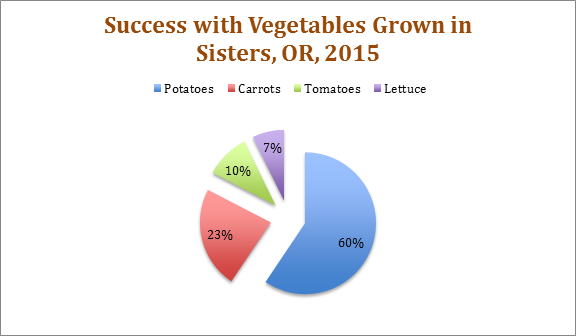
It is important to note that depending on the hardiness zone of the city, some vegetables may do better than others. Doe also commented that she protected her tomatoes either inside a green house or under a hoop house.
Here is a second example. This simple table conveys information about plant hardiness zones for growers in Central Oregon. Notice again that the table isn’t simply inserted and left on its own for readers to interpret; the writer introduces the table with some remarks and also provides follow-up commentary after the table.
The U.S. Department of Agriculture publishes a Plant Hardiness Zone Map which growers and gardeners use to help determine which plants, including vegetables and trees, will be most successful at a particular location. The table below shows the hardiness zone for four cities in Central Oregon and includes the annual minimum winter temperature—important information to keep in mind when determining not only which vegetables to plant but how long the growing season may be.
Table 1: Hardiness Zones in Central Oregon
| Central Oregon City | Hardiness Zone | Winter Temperature Range |
| Sisters | 6a | -10 to -5 (Fahrenheit) |
| Bend | 6b | -5 to 0 (Fahrenheit) |
| Redmond | 6b | -5 to 0 (Fahrenheit) |
| Tumalo | 6b | -5 to 0 (Fahrenheit) |
Source information: “United States Department of Agriculture.” USDA Plant Hardiness Zone Map. 2012. Web. 05 May 2016.
Before purchasing any plants or vegetables for your own garden, make sure you look at the hardiness number on the label to be sure that item will grow successfully in your climate zone.
Now that you have had a chance to learn about strategies for creating effective graphics and have examined some strong examples, let’s look at a few that could use some revision.
Exercise #2: Evaluating Graphics for Revision
As you look at the following visuals, note the possible strengths and weaknesses of each one. Consider what advice you might give the writer on how to improve these graphics. You can use the five rules for integrating graphics as a guide. The five rules are below:
- Give each visual a numbered caption that includes a clear descriptive title
- Refer to the caption number within the body text and discuss its content
- Label all units (x and y axes, legends, column box heads, parts of diagrams, etc.)
- Provide the source of the data and/or visual image if you did not create it yourself
- Avoid distorting the data or image.
Using Graphics Ethically
Like with everything we’ve discussed up to this point, the graphics you use can have an impact on your modes of appeal. If the graphics are misleading in any way, and your audience realizes this, it can negatively impact how credible or trustworthy they consider you.
Exercise #3: The Ethics of Graphics
Watch the video below on misleading graphics. After watching, answer the following questions:
- Why might a person trying to persuade you toward their point of view use a graph to present information?
- How can graphs present an opinion?
- List three methods of “cherry picking data” and the advantages each provides.
Link to Original Video: tinyurl.com/spotbadgraphs
The next time that you feel persuaded by a graphic representation of data, check the labels, numbers, scales and context and ask yourself what story the picture is trying to tell. As you edit your own report, check to make sure your own use of graphics is ethical and complete.
Key Takeaways
- Graphics can take many different forms, but they all have the same purpose: to help clarify information. They also can make reports more visually appealing by breaking up the text.
- Graphics should always clarify, illustrate, and augment your written text or presentation. They should always be explained to your audience in some capacity.
- There are five rules for integrating graphics into your document or presentation:
- Give each visual a numbered caption that includes a clear descriptive title
- Refer to the caption number within the body text and discuss its content
- Label all units (axes, legends, column and row headings, parts of a diagram, etc.)
- Provide the source of the data and/or graphic if you did not create it yourself
- Avoid distorting the data or image
- Not following the five steps above can negatively impact your credibility. If the audience believes you have falsified your graphics, or it seems like you are misleading them, they are less likely to trust you.
Attributions
This chapter is adapted from “Technical Writing Essentials” by Suzan Last (on BCcampus) and is licensed under Creative Commons Attribution 4.0 International License
This chapter is also adapted from “Technical Writing” by Allison Gross, Annemarie Hamlin, Billy Merck, Chris Rubio, Jodi Naas, Megan Savage, and Michele DeSilva (on Open Oregon) and is licensed under Creative Commons Attribution-NonCommercial-ShareAlike 4.0 International License
Figures #2 – 4 are in the Public Domain from openclipart.org
References
Flowingdata. (2010, March 9). Canada: The country that pees together stays together. https://flowingdata.com/2010/03/09/canada-the-country-that-pees-together-stays-together/
an account of your investigation into a subject, presented in a written document or oral presentation that has conventional formatting
Aristotle's means for persuading an audience. The modes are ethos, pathos, and logos
a quality that allows others to trust and believe you
